
how to do it in Excel: a shaded range
Do you want to learn to create and communicate a powerful data story? Join our upcoming 8-week online course: plan, create, and deliver your data story. Data storytellers Amy and Simon will guide you through the world of storytelling with data, teaching a repeatable process to plan in helpful ways (articulating a clear message and distilling critical content to support it), create effective materials (graphs, slides, and presentations), and communicate it all in a way that gets your audience’s attention, builds your credibility, and drives action. Learn more and register today.

Today's post is a tactical Excel how-to: adding a shaded region to depict a range of values.
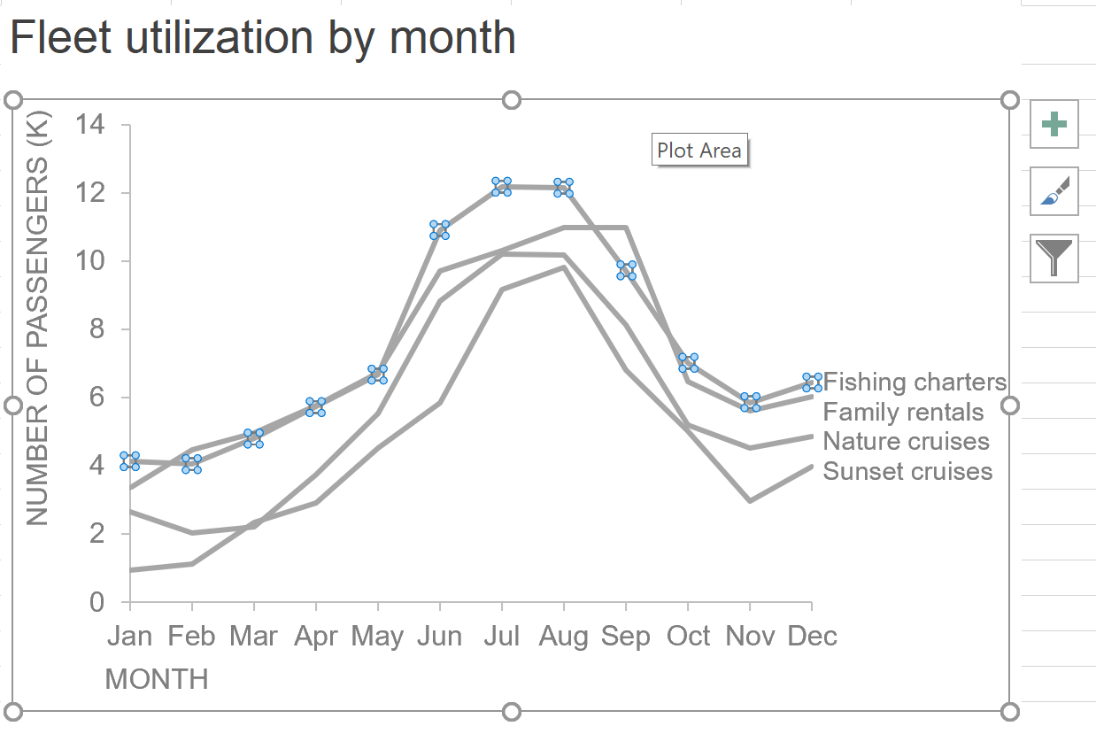
To illustrate, let’s consider an example from the tourism industry. Suppose a watersports company offers four categories of outings: fishing charters, family rentals, nature cruises and sunset cruises. The graph below shows the monthly volume of passengers for each offering over a year.

We can see there’s clear seasonality in this business—overall volume is highest in the summer and each outing type generally follows the same monthly pattern. Let’s say you manage the Family rentals and you’d like to compare your monthly volume to what you’re seeing across the entire fleet.
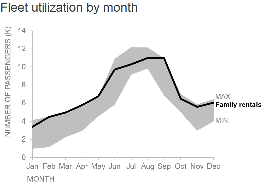
For the purpose of this tactical illustration, let’s assume the shape of the data—relative peaks and valleys—is more important than the specifics of each category individually. If that’s the case, I can simplify by showing a shaded region to depict the range of absolute passengers each month.
My resulting graph looks like this:
Creating this shaded region in Excel requires some brute-force formatting utilizing area charts. Here’s a step-by-step overview of how I accomplished this—you can download the file to follow along.
In my Excel spreadsheet, the data graphed above looks like this:

The first thing I’ll do is add two new columns calculating the minimum and maximum values for each month. I used a =MIN() and =MAX() function and my resulting series looks like this:

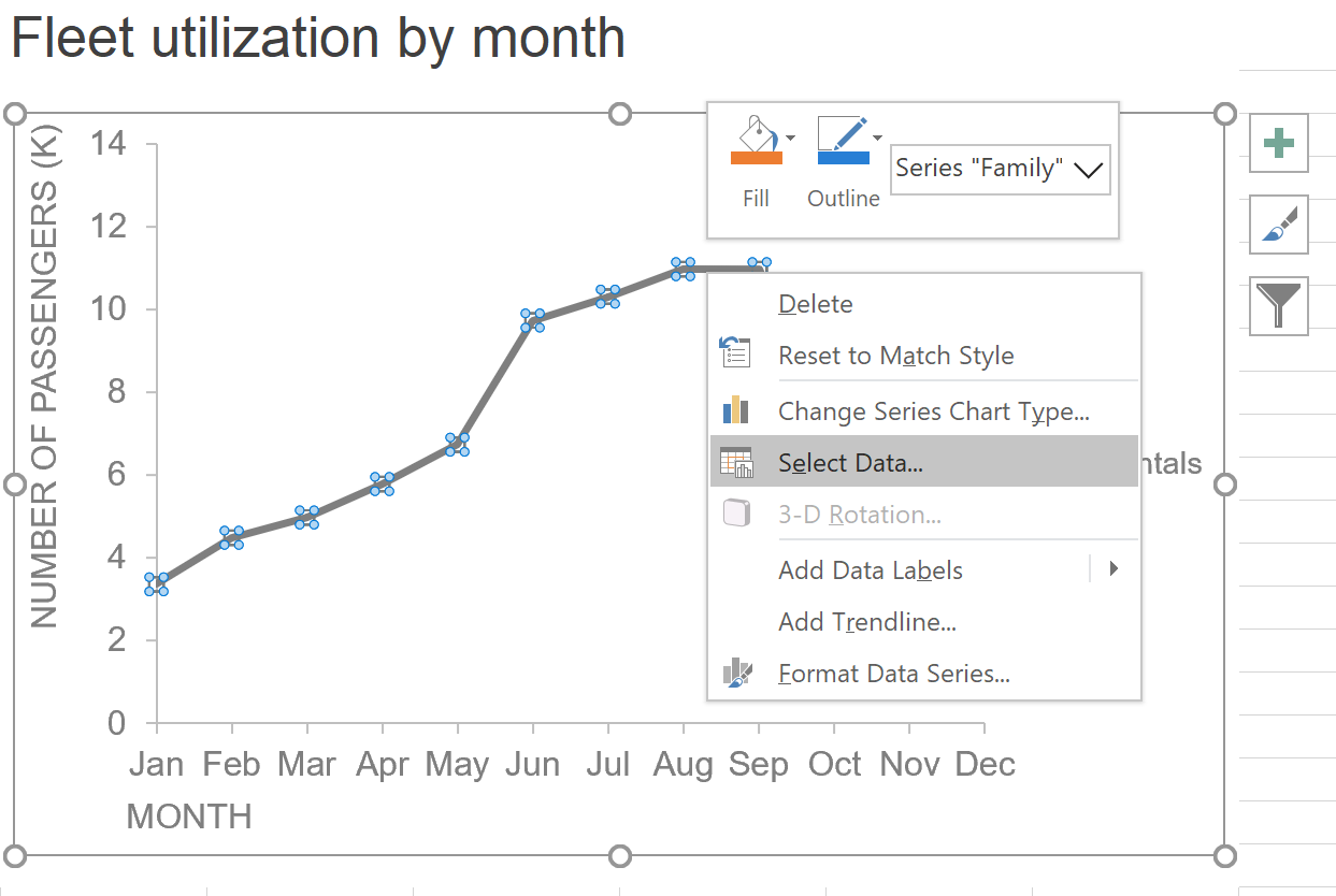
To create the shaded region, first I added the Min and Max as new data series and deleted the lines depicting fishing, sunset and nature. Then I adjusted the formatting of Min and Max to create the grey band around family rentals. The following steps show how I accomplished this:
Next, delete the series for fishing, nature and sunset cruises (leaving only family rentals displayed) by highlighting each individual line and pressing delete.
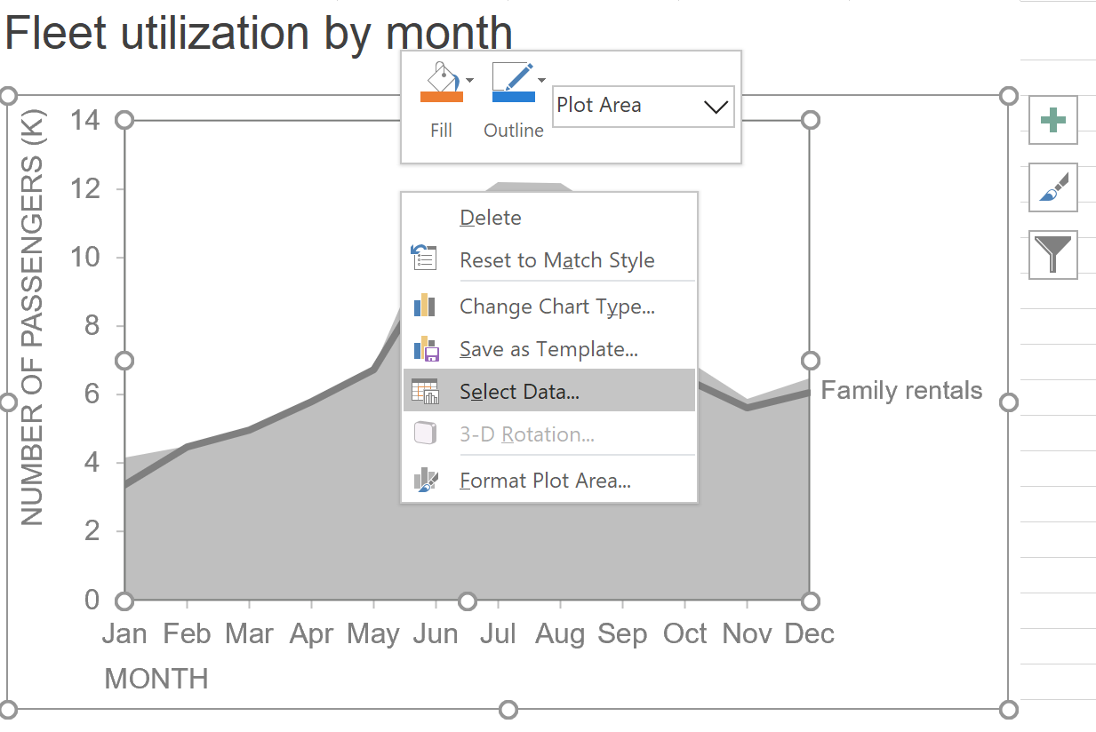
Add a new data series for the Maximum by right-clicking the chart and choosing Select Data:
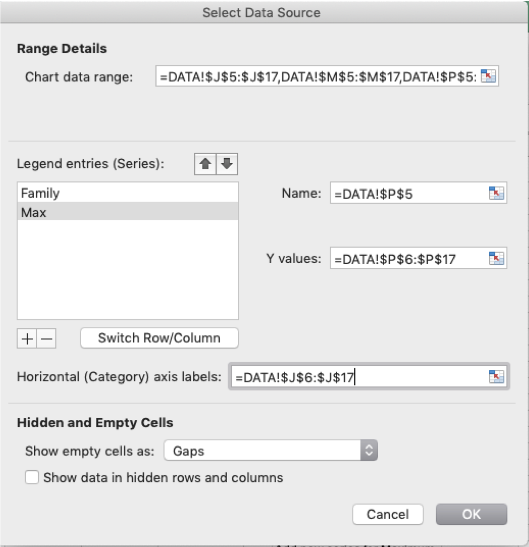
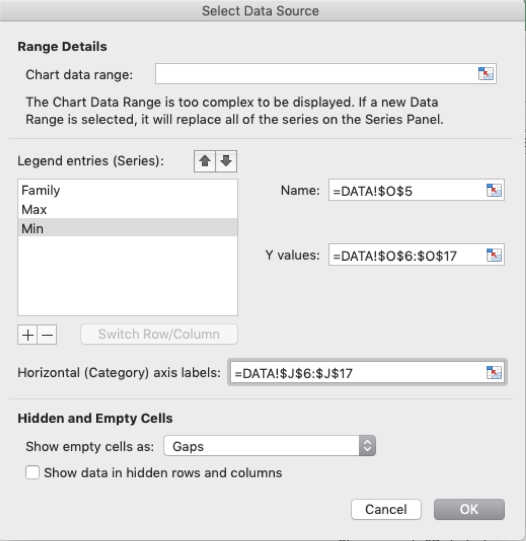
In the Select Data Source dialog box, click the + button to add a new data series for the Maximum (my Max series is in cells P6:P17 with Name in P5). Click OK when done.
My resulting chart looks like this:

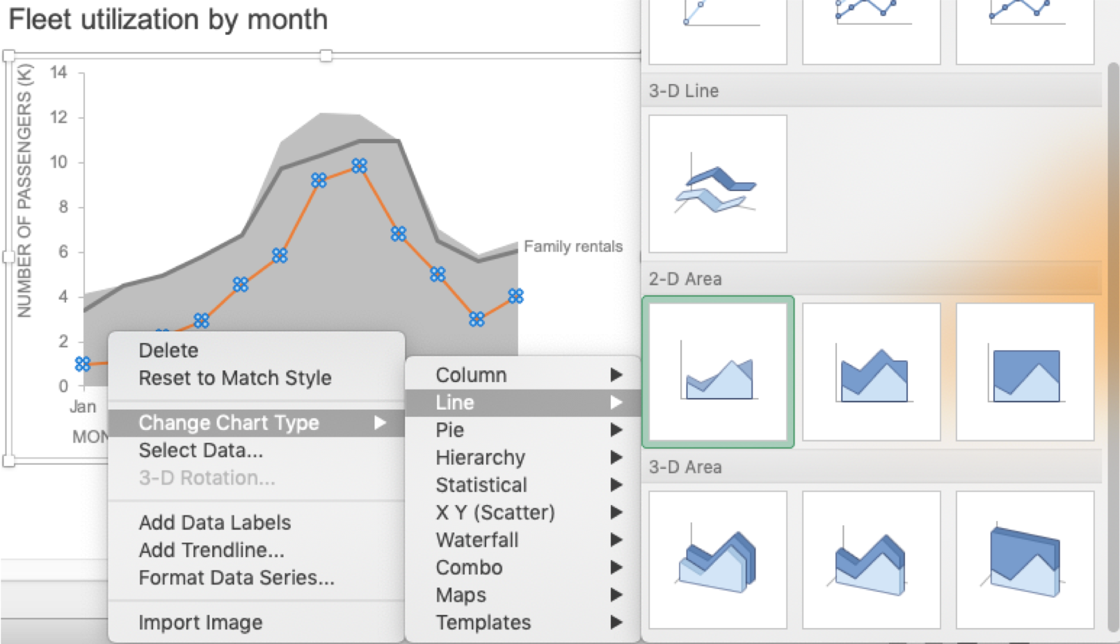
Reformat the the Max line by changing it to a 2D stacked area: right click the “Max” line, go to “Choose Chart Type” then select “Line”. Scroll down to the 2D area types and select the 2D stacked area chart (It’s the middle one for my version of Excel):

My resulting graph looks like this:

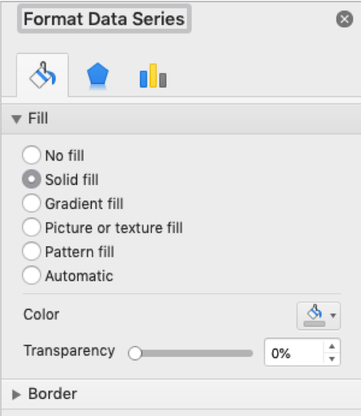
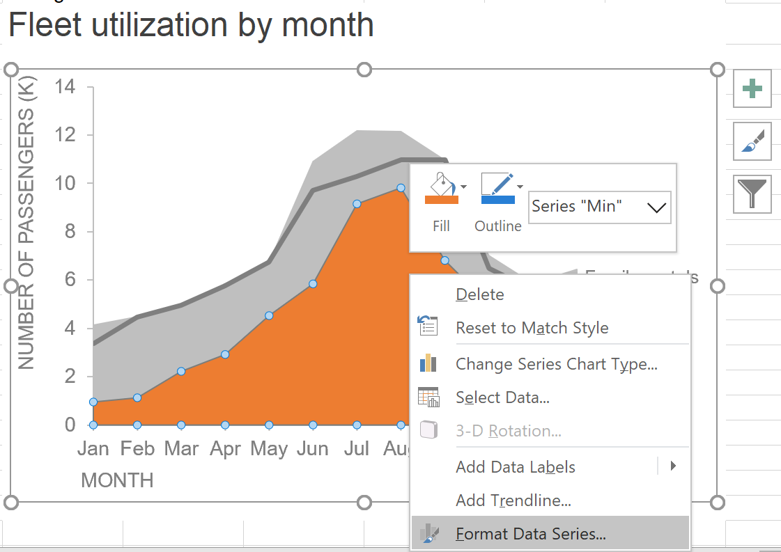
Change the Max 2D stacked area to grey fill by right-clicking the series, choosing Format Data Series:

In the Format Data Series dialog box, select Fill and choose the Solid fill option. My selected grey is RGB 191-183-185.
My resulting chart looks like this (note: my Max stacked area chart is set to display as Series 2 although we’ll adjust this in a later step):

Add a new data series for the Minimum by right-clicking the chart and choosing “Select Data”:
In the Select Data Source dialog box, click the + button to add a new data series for the Minimum (my Min series is in cells O6:O17 with Name in O5). Click OK when done.
My resulting chart looks like this:

Reformat the Min line by changing it to an area: right click the “Min” line, go to “Choose Chart Type” then select “Line”. Scroll down to the 2D area types and this time, we’ll select the 2D area chart (mine is the first one in my version of Excel):
My resulting graph looks like this:

Reformat the Min 2D area to grey fill by right-clicking the series, choosing Format Data Series:
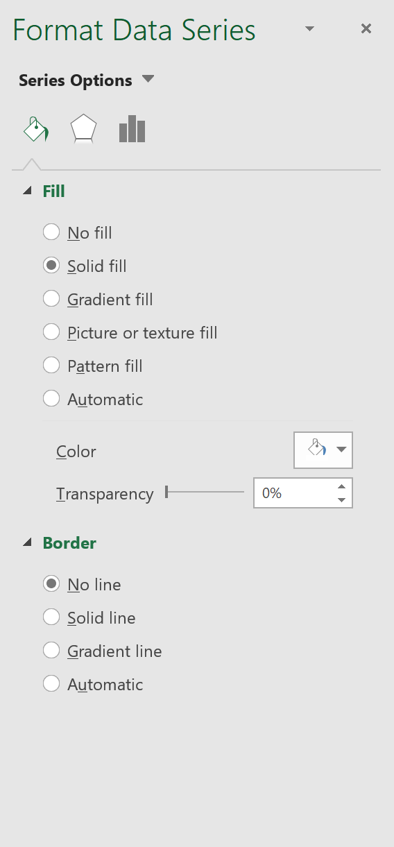
In the Format Data Series box, change to Solid fill with Color = White. Under Border, select No line.
The result is this:

For final formatting changes, I added text boxes for the Max and Min labels and changed Family rentals to render in black for sufficient contrast against the grey band. Depending on where your Max series is displayed, you may also need to ensure that the white Min series is displayed on top if it is not rendering. Highlight the Max series and in the formula bar, ensure the last option is 2. You can also adjust the display order in the “Select Data Series” dialog box.
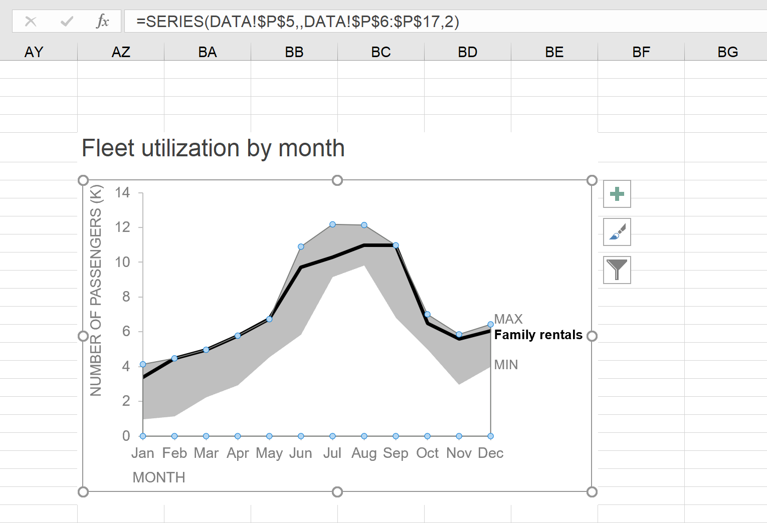
Voila! A shaded region to emphasize a range around my data point of interest:

Are there other brute-force Excel methods you’re aware of for achieving this effect? Or other considerations with embedding this shaded region? Leave a comment with your thoughts and stay tuned for a new resource coming soon where you can practice and share similar tips!