

If you decided to read this article, you probably already know what a histogram is, but if not, here’s a good explanatory video of this useful chart type.
When developing the section of my Practical Charts course that discusses histograms, I wanted to include guidance on how to choose the number of bins to include in a histogram since this can be a tricky design decision. I had some ideas about this but wanted to see what others thought and so did some Googling. After reading about half a dozen articles on this topic, I was surprised to discover that I didn’t agree with any of their recommendations. Since I seem to be in the minority on this, I thought I’d put my guidelines out there so that others can set me straight if I’m off base. Let me have it!
Let’s start by looking at an example: Say we’re conducting a research study and we’ve recruited 287 volunteer subjects. We want to show how our subjects are distributed in terms of age, so we decide to create a histogram. Three versions of this histogram are shown below, each with different numbers of bins. Have a look at each version and decide which one you think has the optimal number of bins for this data set:
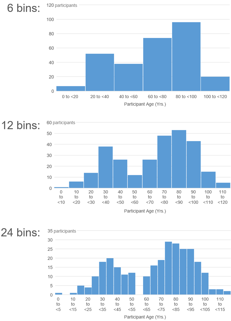
As I see it, I just asked you a trick question. (Sorry.) IMHO, any of these could be the “optimal number of bins”, depending on the specific reason why we’re showing this data to the audience in the first place:
If the insight that we need to communicate is that there are generally more older participants than younger, then the six-bin version is the simplest, most effective option for communicating that insight.
If the insight that we need to communicate is that there are two “clusters” of participants (one clustered around 35 and another around 85), then the 12-bin version is the simplest, most effective option for communicating that insight.
If the insight that we need to communicate is that we have no participants between 55 and 60 years old, then the 24-bin version is the simplest, most effective option for communicating that insight.
Is any one of these the “optimal” or “overall best” number of bins for this data set? I can’t see how. I think that this scenario illustrates that the “optimal number of bins” always depends on the specific reason why we’re showing the data to the audience in the first place. There is no single “optimal” number of bins, just an optimal number for communicating whatever it is that we need to say about the data.
All the articles that I read, however, did offer guidelines for choosing the optimal number of bins for a histogram based on the data alone. They proposed calculations or rules of thumb based on the number of values, spread of the values, presence of outliers, etc. Indeed, the Wikipedia page on histograms lists eight such calculations.
A calculation will always recommend the same number of bins for a given data set regardless of the specific reason why that data is being shown to the audience in the first place, so I can’t see how any calculation would be reliable. The only use I see for such calculations is in situations in which the histogram must be generated automatically, such as on a dashboard of live data. The drawback in those cases, of course, is that the calculation will often choose a number of bins that fails to show insights that would be of interest to the reader.
So, how do I suggest that you choose the number of bins to show in a histogram, then? I think that the best guidance that can be offered is:
“Choose the smallest number of bins that communicates the specific insight that you need communicate about the data.”
This means that you’ll usually have to try several different bin counts to find the one that best illustrates the specific insight that you want to communicate.
This also means that you have to know exactly why you’re showing the data to the audience in the first place in order to make this design decision. This can sometimes be hard to figure out, but I think it’s unavoidable. Creating a chart without knowing why you’re creating it is like designing a building without knowing what it will be used for (hospital? hotel? condos?). You’re forced to make a lot of random design choices and will probably end up with unhappy residents/readers. It would be great if we could design “general purpose” charts that would work well regardless of why the audience needed to see that data, but I don’t think such charts exist. It’s like trying to design “general-purpose buildings”.
This topic is a good example of what I consider to be the biggest misconception in data visualization. Many people seem to believe that the goal when designing a chart is to find “the best way to visualize the data”, i.e., that most design decisions can be made based on the nature of the data alone (e.g., how many values there are, if they're associated with points in time, if they're parts of a total, etc.) They don’t seem to realize that the specific reason why they’re showing the data to the audience is actually at the center of most design decisions, not the nature of the data. Unfortunately, I see this misconception at work all the time; this just happens to be the latest example that I’ve stumbled across.
Let me know in the comments if you disagree, though! I’ve been wrong before and will be wrong again…
By the way...
If you’re interested in attending my Practical Charts or Practical Dashboards course, here’s a list of my upcoming open-registration workshops.