
Emotions and Colors in a Design Archiving System: Applying AI Technology for Museums


1
Department of Urban and Environmental Engineering, Ulsan National Institute of Science and Technology (UNIST), Ulsan 44919, Korea
2
Division of Culture & Design Management, Underwood International College, Yonsei University, Seoul 03722, Korea
*
Author to whom correspondence should be addressed.
Appl. Sci. 2022, 12(5), 2467; https://doi.org/10.3390/app12052467
Submission received: 10 December 2021
/
Revised: 16 February 2022
/
Accepted: 23 February 2022
/
Published: 26 February 2022
(This article belongs to the Special Issue State-of-the-Art in Human Factors and Interaction Design)
Abstract
:This study proposes a new museum archiving system that uses artificial intelligence (AI) technology. It suggests a new retrieval interface to extract emotional characteristics of the design work to enrich the archiving database. A virtual curation was organized to showcase the proposed archiving system. We focused on finding emotional signals with advanced technology because humans build trust and connect with each other through emotional cues. There are numerous characteristics of a single work of art, but we focused on the emotions that viewers can feel when they appreciate the art and share a connection with the artists who made the work. The research was focused on design works, and the metadata were designed to extract three dominant colors and match them with emotional adjectives to enrich the data on the paintings. The purpose of this study was to provide information for new techniques of color utilization that encapsulate emotional adjectives. Through this research, we developed an image retrieval system based on metadata and transformed intangible emotions of design work into data. With the emotion archiving system, we organized virtual curation, adding a Korean design history collection with emotional words.
1. Introduction
With the advent of the Fourth Industrial Revolution, future products and services combining the technologies of automation, artificial intelligence (AI) and the Internet of Things (IoT) are emerging [1,2,3]. The Fourth Industrial Revolution is digital revolution and fusion of technology with big data in the industry, so it is distinguished from the Third Industrial Revolution, which focused on emergence and wide use of computers and the Internet. In the new digital revolution, museums and galleries are also changing their digital archiving technology to manage collections. In the process of collecting artwork, they are constructing institutional archives and working on documenting collections in digital data formats [4,5,6]. Collection and preservation work in museums is an area in which collection managers number, catalog, collect, and preserve artwork with artistic value [4]. These most fundamental of museum activities help in the curation of exhibitions; therefore, digital database construction is underway to utilize relevant data [7]. The status of museums regarding the utilization of digital technology is described below.
First, one representative example of managing collection technology offline is The Museum System (TMS), a relational database capable of managing hundreds of museums and cultural and scientific collections worldwide [8]. TMS services are mainly provided by private companies, and major museum and art galleries use them to manage in-house documents regarding their collections. Secondly, Google’s Art Project, launched online on 1 February 2011, allows website visitors to view collections of more than 1200 leading museums around the world [9,10]. Google Art Project websites have been uploaded and published by major museums around the world, and users who access the websites can enjoy vivid, high-definition artwork online. Third, in the operation of exhibitions, the Brooklyn Museum in New York utilizes Internet of Things (IoT) technology and Beacon to provide data-use services, such as providing a docent application whereby viewers can individually listen to descriptions of artwork and artists while standing in front of a certain work of art. Fourth, studies to improve visitors’ experience have been conducted by analyzing the movement behavior of visitors in exhibition halls using Bluetooth or by identifying viewers’ interests through social network (SNS) tags and texts. In this way, visitor satisfaction analysis with regard to exhibition service quality is being actively conducted. As it can be seen from the previous examples, with the advent of the Fourth Industrial Revolution, museums are applying technologies that digitize their artworks and improve service quality for visitors with big data. However, although technology utilization for digitization of artworks for visitors and visitor-oriented services is active, there are few services for technology utilization for curators who plan exhibitions. Therefore, now is the right time for research to help curators, who play a key role in museum exhibitions.
Design work contains a large amount of information. The mood of design work varies according to style, which is rooted in basic principles of art such as points, lines, and planes, as well as elements of art such as hue, saturation, and brightness [11]. Color is also the single most important design element [12]. It is widely recognized that colors also have a strong impact on people’s emotions and feelings [13]. Color stimulates the eye and brain, creating an immediate unconscious response from the viewer [12]. In this regard, color is an integral element when it comes to recognizing objects; furthermore, it can move the soul and sway emotions [12]. Ambience is the invisible fog that envelops an exhibition and magically affects the visitor both intellectually and emotionally [14]. It is a curator who creates this kind of ambience in the exhibition. Ewin and Ewin [15] described a curator as someone who thoroughly understands the collections, their context in history and culture of the communities they serve, and in many cases, the academic subjects they pertain to; that is, they are an expert or a specialist on the collections held by a museum in trust for society. Curators must continually find ways of translating curatorial knowledge into forms that make it accessible and relevant to the public [16]. Therefore, it is important for curators to determine the emotions in works of art and share them with public to create the proper ambience in the museum. In this sense, recognizing emotional connection is the most important value in the museum, because it becomes a good source of planning exhibition for curators, leading to proper appreciation of artworks by viewers.
In this regard, we see the necessity of visualizing the emotional connection to design works by forming it into data and archiving it in a museum system. Naturally, the more archived information there is pertaining to the visually recognizable characteristics of a work, the more the digital content representing the design work will be enriched. Thus, as information about images can now be captured by machine learning, and creating and classifying data have become technically possible, it is necessary to study methods of redefining data structures and of utilizing them to archive artworks. This will facilitate the efficient management of works of art through the archiving of data from museums and art galleries, as well as improve the planning of exhibitions by using such data.
This study proposed a museum archiving method for curators by establishing new metadata that reflected a design work’s emotions using AI technology. We extracted the emotions of the work through its main colors and perceived emotions, and archived the results as characteristics of the work to enrich the archiving database. Finally, we built a search engine by creating a system with the archiving database to explore the possibilities of searching design works through collection of emotions.
2. Background and Related Research
2.1. The Connection between Colors and Emotion
The word “emotion” comes from the Latin word “emovere”, which means “energy in motion” [17]. Energy affects people’s behavior, minds, and even their social relationships. A work of art can be said to express in form and color the artist’s own inner and mental emotions on a plane or in a space [18,19,20]. An artwork combines fundamental forms such as points, lines, and planes to realize an object or to render human thoughts and internal experiences by giving shape to them in space [21,22].
Research on the connection between color and emotion has been active since the 1950s. A study was conducted on dynamism and sensibility related to the brightness and saturation of color in which artists caught viewers’ attention by varying the brightness and saturation of their objects to add emphasis in their artwork [23,24]. In 1980s, the psychophysiological effects of color on humans were studied by Gerald [25]. He attempted to experiment in a scientific way to detect emotions from color by measuring test subjects’ response of the autonomic nervous system, breathing rate, pulse rate, muscle relaxation, and eye-blinking rate with an electroencephalogram (EEG) when the subjects were exposed to different colors. The following are examples from the literature of connections between colors and emotions in general: red evokes excitement in people; orange is perceived as vibrant, energetic, and outgoing; yellow resonates with hope, wisdom, and vastness; green feels refreshing and natural; and blue evokes passivity, cleanliness, and quiet [13]. Color can be specified by its hue (e.g., green, red, blue, or yellow) and by two additional perceptual color dimensions: saturation (difference from an achromatic stimulus; that is, a neutral gray or white) and brightness (perceived intensity of the light) [26]. Other studies have indicated that the saturation of a color stimulus has a stronger effect on the emotional response than the hue [27].
Paintings consist of a mixture of colors. It is important to determine the connection between colors and emotions in order to read the emotions of the artwork. The representative studies that closely bridged colors and their corresponding emotions were conducted by Shigenobu Kobayashi and the Image Research Institute (IRI). Firstly, Shigenobu Kobayashi of the Color Research Institute of Japan developed a color image scale to classify and organize colors in terms of linguistic expressions for the purposes of conveying color meanings with emotions and expressing the similarities and differences regarding visual images [28]. He expressed feelings described by a total of 174 adjectives that were positioned at coordinates on a plot of dynamic–static versus soft–hard axes; thereby, he classified these adjectives into 15 categories: “romantic”, “pretty”, “casual”, “cool-casual”, “dynamic”, “elegant”, “gorgeous”, “natural”, “ethnic (strong-wild)”, “classic”, “chic”, “dandy”, “clear”, “modern”, and “formal” [28].
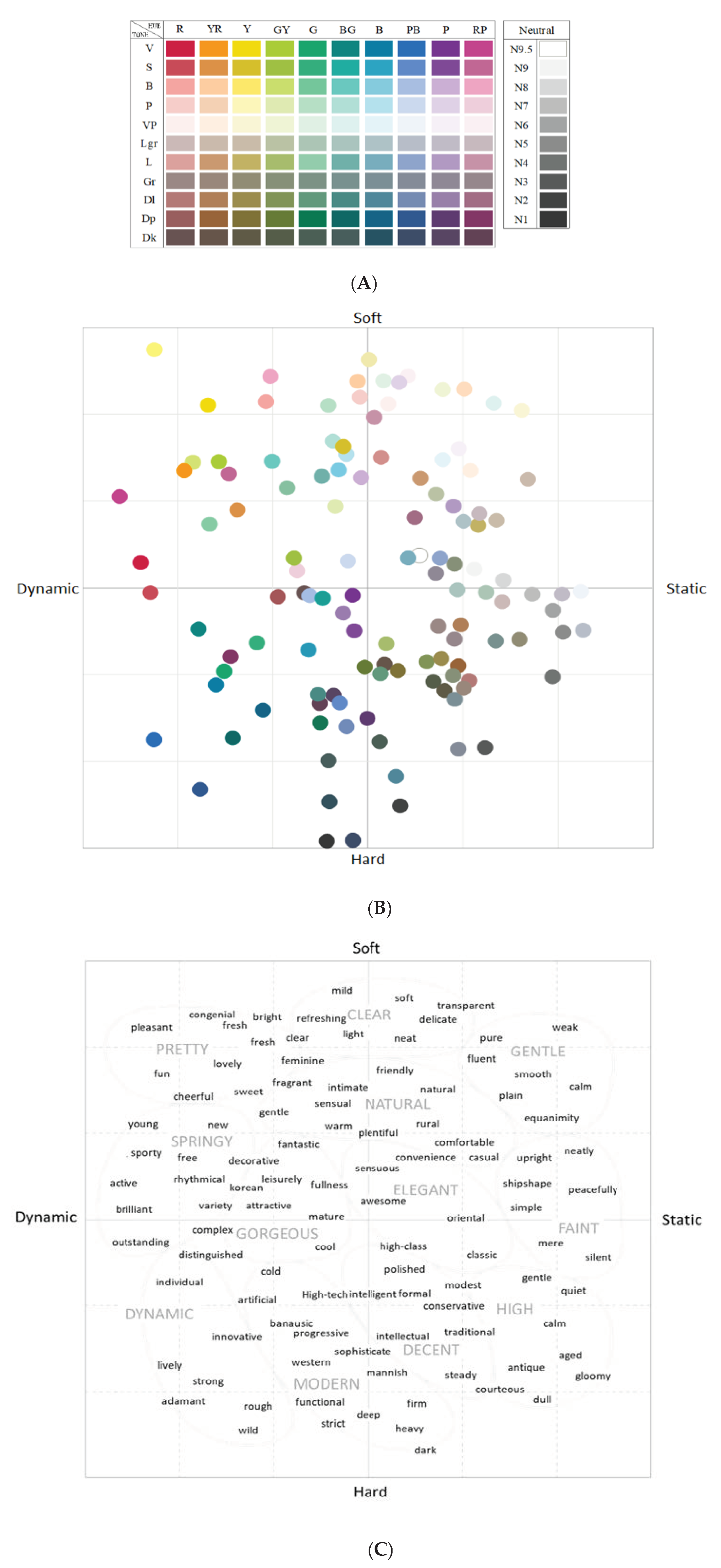
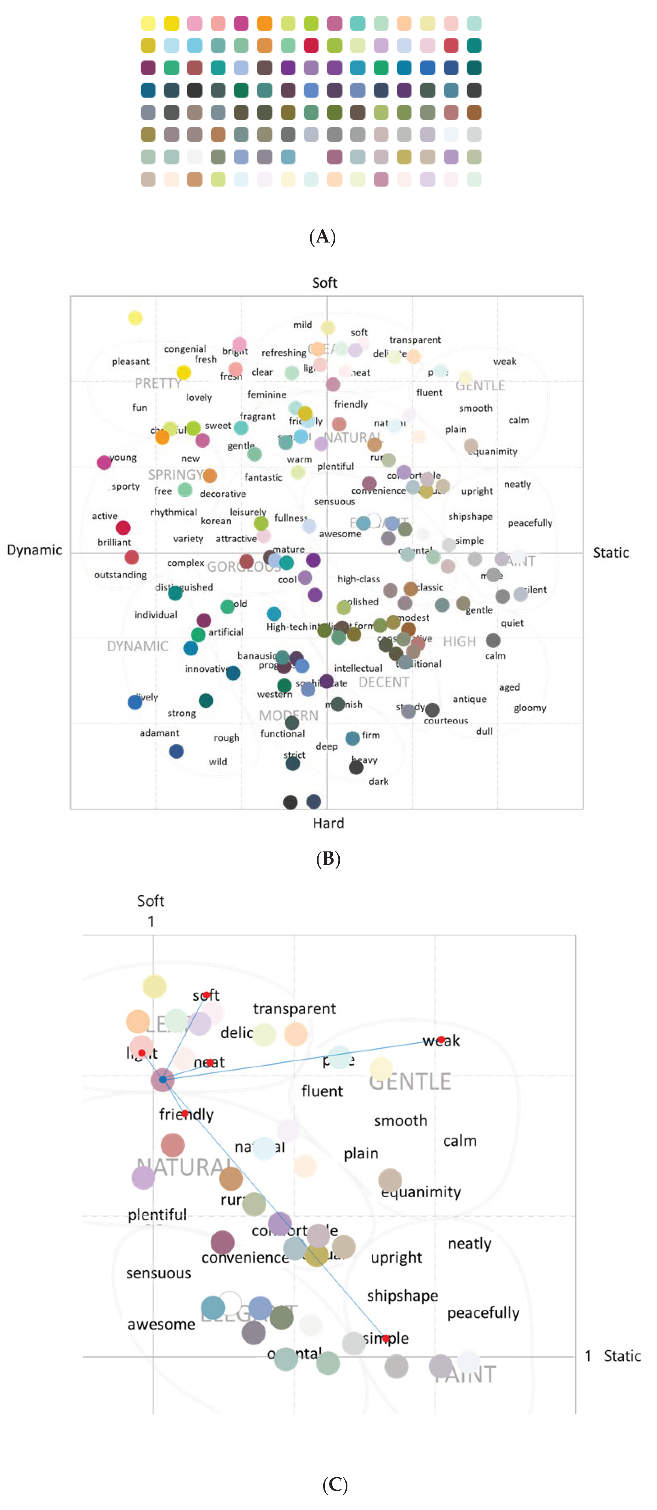
Later, the Image Research Institute (IRI) image adjective scale was developed by the IRI Design Color Research Institute in Korea to assist in the objective understanding of color by investigating the relationship between color and the corresponding adjectives from the survey. It is an objective index in the design field that understands color as sentiment and an abstract idea. The IRI Design Color Research Institute adapted Kobayashi’s method to build an emotional adjective and color image scale for use with Korean impressions of emotion and color [29]. To develop a color scale model, the IRI conducted a survey that asked Korean people about the connection between the IRI hue and tones palette of the 120 monochrome system (Figure 1) and their corresponding reaction as emotional adjectives. The resulting color scale model is widely used in design methodology. The monochrome image scale (Figure 1) and the emotional adjective scale of the IRI Institute visually present the emotions related to various colors on a two-dimensional scale by conducting a semantic differential (SD) factor analysis and projective methods [30]. The scale is a quadrant divided according to dynamic–static and soft–hard axes. A total of 118 words are positioned at coordinates on the plot and divided into 12 categories: “clear”, “gentle”, “pretty”, “natural”, “springy”, “gorgeous”, “elegant”, “faint”, “dynamic”, “modern”, “decent”, and “high” (Figure 1). Descriptive emotional adjectives are grouped with the main emotional adjectives. For instance, the main emotional adjectives include descriptive emotional adjectives such as “clear”, “soft”, “mild”, “delicate”, “neat”, “transparent”, “light”, and “refreshing”; other emotional adjectives groups can be found in Figure 1. This IRI image scale provides color analysis tools and a color image scale that can be used offline or online at the IRI Institute [29].
It is important to know the relationship between color and emotion from an exhibition design perspective for curators. Colors must be selected that will instantly convey the desired messages, because colors create a particular mood and ambiance [14]. Visitors respond to color both emotionally and physically, and it is important that exhibit colors evoke the correct response and convey the proper messages [14]. In this sense, how a particular color affects a visitor is always a major concern for the designer during the color selection process [14].
As visitors move from one exhibit area to another, there are times when it is necessary for them to be relaxed, and at other times, to be stimulated [14]. A good rule to remember is that warm colors such as yellow, yellow-orange, orange, red-orange, red, and red-violet stimulate, and cool colors such as yellow-green, green, green-blue, blue, blue-violet, and violet calm and relax [14]. Meanwhile, the previous studies presented above focused on the use of color to provoke an emotional response from the audience, but few studies have been conducted that bridged emotions and artworks. In addition, few archival systems have been designed for this purpose. If there is a system that reads the emotion of artworks based on colors, it will assist curators when they are designing exhibitions.
Considering the literature, it is evident that color stimulates a person to perceive specific emotions and symbolism [31]. The symbolism of colors, especially those related to emotions, has been extensively explored through previous studies, but this has not been properly archived. In the current research, we studied how we can utilize these emotional data from color to build a new design archiving system.
2.2. Reflection of Emotion in the System
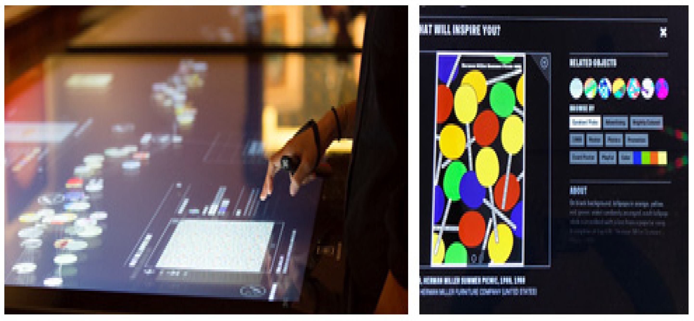
Museum documentation employs strictly formed data banks that include inventories, topographies of cultural and natural heritage, various types of recordings, and formatted data that are immanent to or connected with heritage objects [32]. This information has become a very important resource for curators who are planning their next exhibition and for determining the theme, space composition, and layout design in a museum [5]. It is currently used in the Museum of Fine Arts, Boston, and the Cooper Hewitt, Smithsonian Design Museum, among others. The system digitizes real artworks to manage them as digital assets, and art museum staff must learn how to use it through basic instruction [5,33]. The Cooper Hewitt museum also is offering personal collection services for visitors by applying their collection database. By placing multitouch display tables in the exhibition (see Figure 2), visitors can search design works by related shapes and tags that curators applied in the database.
In museum archives, according to our analysis of the metadata record of museum collections, artwork entries consist of numbering, the artist’s name, the title of the artwork, the production year, the materials and technique, the size, and the collection route in the database [30,34]. This format is the typical museum archival system. Beyond this, there are important considerations in data utilization and technology advancement regarding museums and design work. In real life, an important factor in remembering things, including spaces, objects, and people, is emotion, which is the informal aesthetic-affective concept [35]. By emotion, we mean the good or bad atmosphere that people sense from a person or in a place. In this regard, emotion is what people feel and is closely related to people’s “vibe”. In the case of a space, the surrounding environment imparts a feeling tone to us with the size of the space, the arrangement of the objects, and the lighting, while an object sends us the “vibes” with emotional information in reaction to, for example, its shape or color. In the case of people, we can get emotion from their speaking tone and behavior.
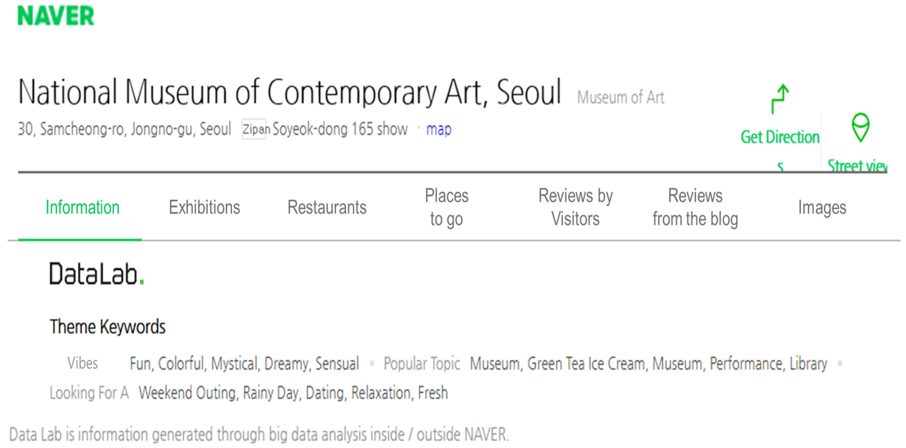
Here is one example of an archival system utilizing the emotion data and offering it online [36]. Naver, a Korean Internet portal site, provides local information to users by describing the emotion of places derived from analyzing big data, thereby assisting users who are searching for places for recreation and enjoyment. Naver has set up a data lab section on its web page where it provides “Theme Keywords” for searching places such as restaurants, museums, and other leisure activities and destinations; these keywords include emotion, popular topic, and looking for a (see Figure 3 below).
For example, as of 21 July 2021, a search using the Theme Keyword emotion for Korea’s National Museum of Modern and Contemporary Art yielded search results expressed in the form of emotional adjectives such as fun, colorful, mystical, and so on [36]. This information, above and beyond the facts related to the museum, gives people an idea of possible emotional reactions they might have when they visit the place. The emotional adjectives data is based on people’s reviews in blogs or other multimedia sources, so in the case of museums with various seasonal exhibitions, adjectives describing the emotion keep changing, depending on the characteristics of the exhibition.
Like Naver’s DataLab, reflecting emotional data in a system gives benefits not only for the museum’s manager, but also for potential visitors, since it provides deeper insight into the characteristics of the museum and reasons to visit it. Therefore, a design work archiving system, such as The Museum System, can apply this method by extracting emotional data from the works and storing them in the archiving system so people who use the system can utilize the emotions, which are formed as the source of their work. Naver’s data lab method of extracting emotion is based on previsitor reviews, so the emotional adjectives are subjective and changeable. To overcome this, our research on a museum archiving system focused on extracting emotional adjectives from the color of the works, because color has particular ambience to viewers.
In this research, we applied AI to extract the main colors of design works, and detected emotions related to the colors using the IRI color image scale, which is the recent research on emotional adjectives and color. This emotional data was implemented in the new archiving system, so this can offer the “vibes” of design works to users of the system. In the Section 3, we illustrate how we designed the image archiving system, starting from extracting the main colors of design works.
3. Methodology
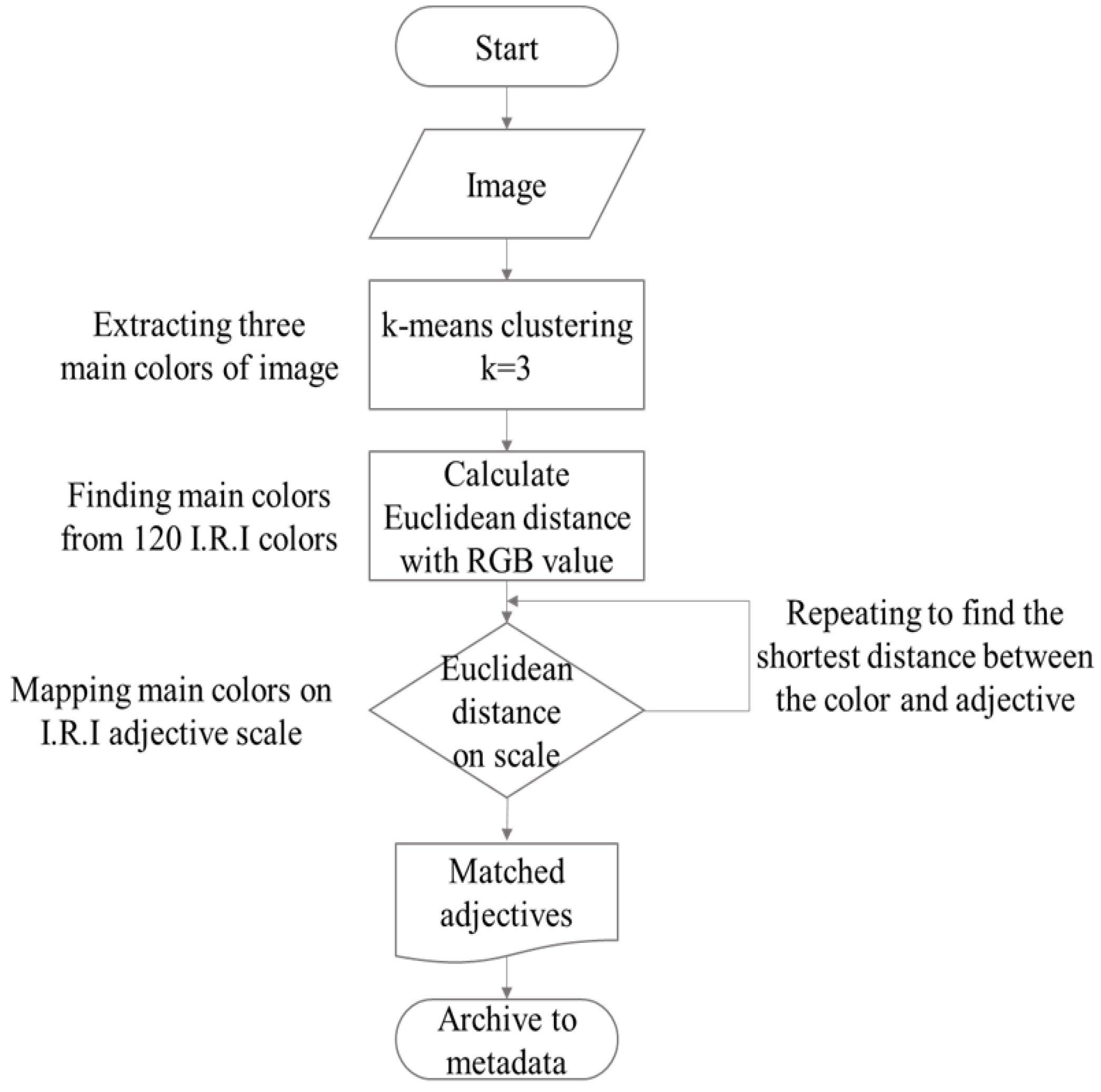
The current study proposed a design archiving system that stored the contents that illustrated the colors and emotions in design works by forming metadata using AI technology. A new data category—emotional adjectives and descriptive adjectives—which are coherent with the main colors of the design work, was added. This new category reinforced the traditional data classification method of storing, classifying, and retrieving design work information consisting only of the artist’s name, production year, and style. The methodology was built as follows. To extract the dominant colors and save emotional adjectives related to the colors to the database, AI and automation technology were used. To collect emotional feature data from design work, we used the monochrome image scale and emotional adjective scale from the IRI Design Color Research Institute. To utilize the emotional characteristics of design works as a new way of archiving data, we extracted the three main colors used in the design work, matched the related emotional adjectives, and archived them as characteristics of the work. Finally, we implemented a searching system to study the effect of the utilization of the new system.
Each pixel of the image was considered as one data point in a three-dimensional RGB (red, green, blue) data format. The colors ranged from 0 to 255. A clustering technique with RGB was performed to derive the main colors of the images in the design work. Clustering is unsupervised learning, a machine learning technique that clusters data with similar characteristics. Suppose there is a data set and disjoint subsets partitioning the data set into clusters , [37]. The clustering equation is as follows:
where if is included in the subset , and 0 otherwise. is the centroid as cluster center and mean value of cluster . The most widely used clustering criterion is the sum of the squared Euclidean distances between each data point and centroid of the subset , which contains such that a clustering criterion is optimized [37].
In the current study, RGB values were used to manage design works in digital systems, and K-means clustering was used to cluster the colors of pixels to derive the main colors. The equation takes K centroids, finds the location of the center point K where the sum of the distances between the data points is minimized, and clusters the data surrounding the center point. This center point is eventually located at the mean value of each cluster’s data, which is the reason it is called K-means clustering. The algorithm is executed only when the number of clusters (K) is set in advance; hence, K becomes a hyperparameter. The methodology and flow chart of this study as follows in Figure 4.
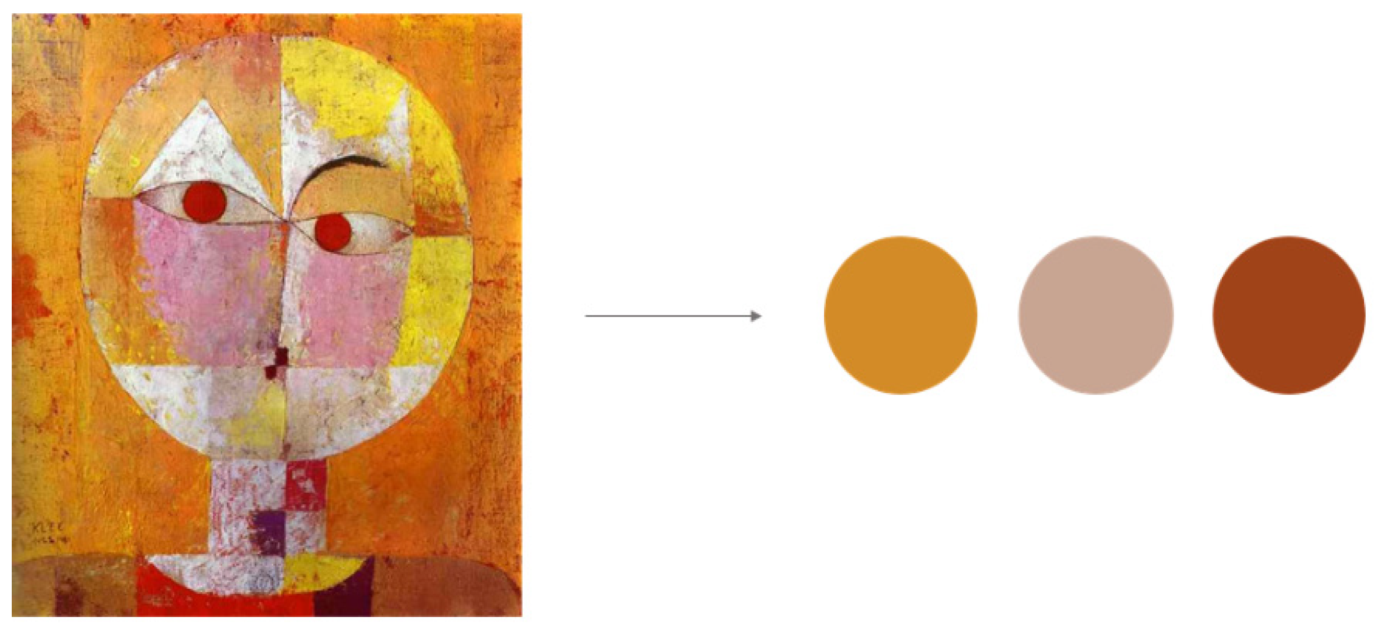
In the present study, Python 3.0 was used for the analysis. We used the free, open-source Python Imaging Library (PIL) to perform a variety of image processing and graphics functions to extract the colors of the image and resize the image to 200 × 200 in the Python interpreter. Since we extracted three dominant colors from each design work, we set K = 3 to create three clusters and conducted the analysis. To extract the main colors from the image for a pilot experiment, we selected the work of Paul Klee, famous for experimental and colorful artworks, along with Wassily Kandinsky and Piet Mondrian, who were professors at Bauhaus. We used an image of Paul Klee’s Senecio from the Mu-um digital archiving website to conduct the K-means clustering analysis, and the three dominant sets of RGB values were found to be (211, 139, 40), (200, 164, 146), and (161, 67, 24) in order, with ratios of 46%, 30.7%, and 23.2%, respectively (see Figure 5).
The IRI hue and tone palette of 120 monochromatic systems (see Figure 6A) and the IRI adjective image scale were used to match emotional adjectives using the three main colors extracted from the design work images. Prior to adjective derivation, the distance between the main RGB color extracted from the design work image and 120 monochromatic RGB values provided by the IRI hue and tone palette was calculated and matched.
The distance calculation between the main color of the design work and the 120 monochromatic RGB values was applied to the shortest distance between the two data points on the scale using the Euclidean distance formula, as follows:
The RGB value from the IRI monochromatic color was found to be the closest to the main color extracted from the design work image. The closest monochromatic color among the 120 colors on the IRI image scale was selected as the main color of the design work, and the main color data were automatically archived in the archiving system.
Once the dominant three main colors had been selected, the corresponding emotional adjective extraction was performed. The IRI emotional adjective image scale quadrant image was referenced. The image scale and adjective scale consisted of a horizontal dynamic–static axis and a soft–hard vertical axis (see Figure 6B). Among the quadrants, there were 12 emotional adjectives: gentle, clear, pretty, natural, and so forth (see Table 1 and Figure 6C). There are emotional adjectives and descriptive adjectives in Table 1, and some descriptive adjectives are a subset of a certain emotional adjective. As an example, the emotional adjective “clear” is positioned in the first quadrant and comprises other descriptive adjectives such as light, soft, delicate, transparent, mild, neat, and refreshing.
The IRI image scale and adjective scale were developed based on SD measurement in a previous study, with scales ranging from 0 to 3 for all quadrants. In the present study, the two scales were used for color and adjective mapping, as shown in Figure 6B. We normalized the measurement from 0 to 1 and the matching process as follows. We used points of colors and adjectives to plot the points on the map. The distances between a point of a certain color and all the points of the adjectives were calculated by applying the Euclidean distance formula based on their coordinates, and the closest color and emotional adjectives were paired (see Figure 6C). The Euclidean distance formula was as follows:
In the case of Paul Klee’s Senecio, for instance, the result of matching the dominant RGB values of the design work with emotional adjectives was as follows. The second dominant color of Senecio, RGB (200, 164, 146), matched RGB (199, 147, 168) among the IRI 120 monochromatic colors from the hue and tone palette. It was located in the first quadrant (soft–static) on the IRI image scale. To illustrate the calculation of the distance, we marked a blue dot on the coordinate in Figure 6C. The distances between the blue coordinate and all the emotional adjectives were calculated using the Euclidean distance formula based on RGB values. Figure 6C shows the middle of the calculation, and the red coordinates are some of the descriptive adjectives, with the blue lines being the distance between them. As a result, the descriptive adjective light was the closest to the blue coordinate, which referred to the second dominant color of Senecio at a distance of 27.8208, which belonged to the emotional adjective “clear”. Thus, the adjectives describing the second dominant color of Senecio were selected as “clear” for the emotional adjective and “light” for the descriptive adjective.
The adjectives matching the dominant colors of Senecio are shown in Table 2. First, the IRI color, which had the largest proportion at 46.0222%, was composed of 85.88% red, 56.86% green, and 28.24% blue, showing an orange tint. It was a relatively dark and medium color scheme. This color was located in the soft–dynamic fourth quadrant of the IRI monochrome image scale. The emotional and descriptive adjectives corresponding to the colors were springy and decorative, respectively. The least-represented IRI color had a proportion of 23.2389%. It consisted of 59.22% red, 38.82% green, and 21.96% blue, also showing an orange tint, but slightly darker. This color was located in the static–hard second quadrant of the IRI monochrome image scale. The adjectives corresponding to this color were “decent” and “modest”.
4. Results
4.1. Matching Clustered Color and IRI Color to Extract Main Colors to Validate the Results
In this research, it was important to rely on IRI colors to extract emotions from design works at the end, because IRI colors are closely related to emotional adjectives. We extracted three clustered colors using K-means clustering, and it was crucial to closely match the colors with IRI monochrome colors. Therefore, in this section, we will compare the clustered colors and IRI colors to extract the final three main colors, which were calculated using Euclidean distance analysis. The color values were compared with RGB values, and we analyzed the correlation to see how the colors matched each other.
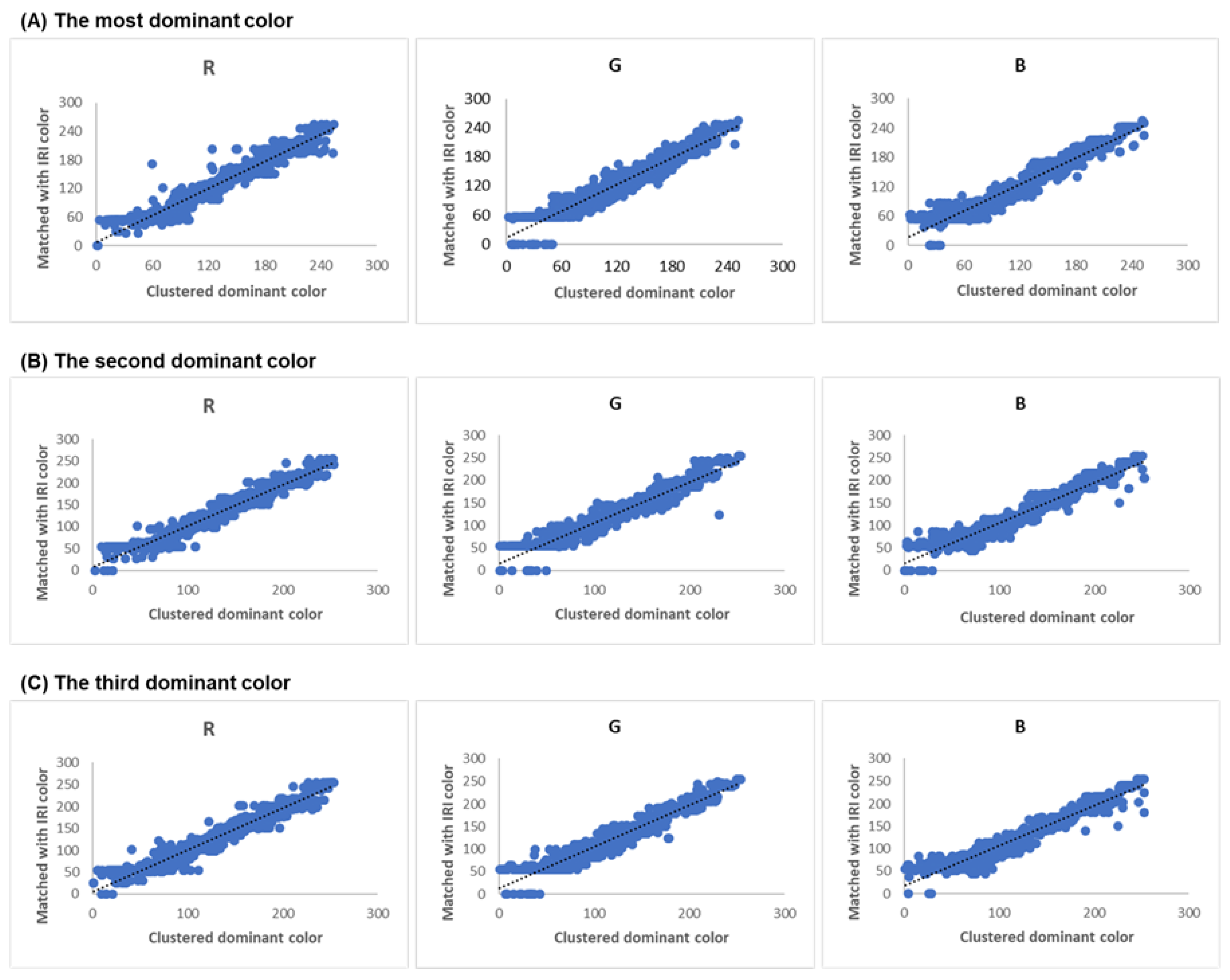
Images of 1214 pieces of design works were randomly collected from the Mu-um artist database and digital archiving website. Cultural journalists, exhibition organizers, collectors, and others can obtain more information about artists from this website. There are artworks by famous artists, but they especially collect images from Korean artists. Artists register their biography and portfolio and upload their design works as images on this website. The main colors were extracted from these digitized images. Figure 7 shows a comparison of the RGB values of the dominant colors of the design work measured by clustering and IRI colors matched by Euclidean distance. We extracted three dominant colors from the design works, and the color values were compared by calculating the correlation. The correlation coefficient between the RGB values of the dominant colors measured by clustering and IRI colors matched by Euclidean distance was more than 0.9731 for the first dominant color of the design works. The correlation coefficients for the second and third dominant colors were more than 0.9685 and 0.9715, respectively. This positive correlation coefficient indicated that the distance between the RGB values of the dominant colors measured by clustering and IRI colors was the closest, and these were well matched when applying Euclidean distance.
Table 3 shows the IRI RGB color numbers of 12 emotional adjectives from 1214 design works that were measured for their dominant colors. This shows how the museum archiving system classified the IRI RGB color according to emotional adjectives, and the data became a part of metadata of the system. We eliminated duplicated color numbers in the table. For the adjective springy, it had 128 design works. We identified that the colors in springy were located in the second quadrant in the IRI color and adjective scale (see Figure 6B). For the adjective high, it had 354 design works. We identified that the colors in high were located in the fourth quadrant in the IRI color and adjective scale. Other emotional adjectives were also analyzed for their content of color, and we were able to categorize the colors according to these emotional adjectives. The emotional adjectives and IRI colors were added to metadata, so it became possible to build the museum archiving system and retrieve design works based on colors.
4.2. Design Works Archiving System
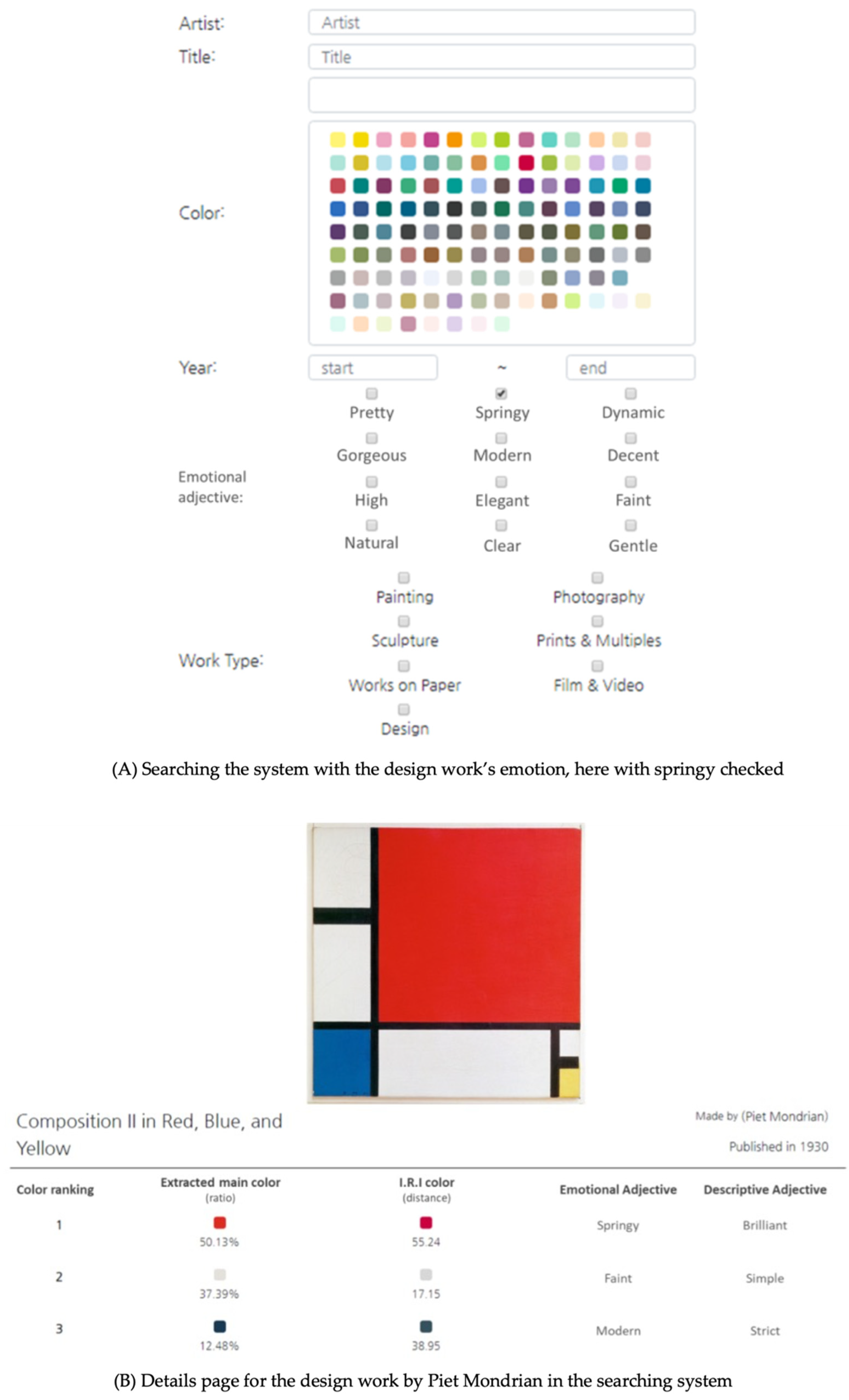
With these 1214 images and emotional and descriptive adjectives, we finally constructed metadata to build a database and archiving system based on the information and characteristics of the design works. The basic metadata units were artist, title, year, material, size, type, and so forth, to which we added the dominant color and emotion data of the design works. We connected data to emotions by combining emotional and descriptive adjectives related to colors that viewers had seen physically and intuitively when they viewed these design works. After linking to the database that stored the main color and emotion data for the design works, we created a web-based archive-searching system, as shown in Figure 8A. System users, especially exhibition experts, can type in the name of an artist or title of design work in the search engine. In the case of searching by colors, the 120 monochromatic colors of the IRI image scale were designed into a badge shape, allowing the archive users to select the dominant colors of the design work easily. In addition, the users can search design works according to emotional adjectives by selecting from among 12 adjectives. Figure 8A shows a search for design works using the emotion springy.
When we searched for the design work Composition II in Red, Blue, and Yellow by Piet Mondrian, we brought up what is shown in Figure 8B. There was information on the details page about the dominant three colors from the image with the ratio of IRI color with distance value between the extracted RGB and the closest IRI RGB. The results of the IRI RGB from the design work were red tint (202, 0, 63), gray tint (215, 215, 215), and dark tint (53, 81, 92) in ratio order. From the work, the most dominant emotional adjective was springy, and its descriptive adjective was brilliant. The second dominant adjectives were faint and simple, respectively, and the third adjectives were modern and strict, respectively.
4.3. Virtual Exhibition of Korean Design Works Utilizing the New Archiving System
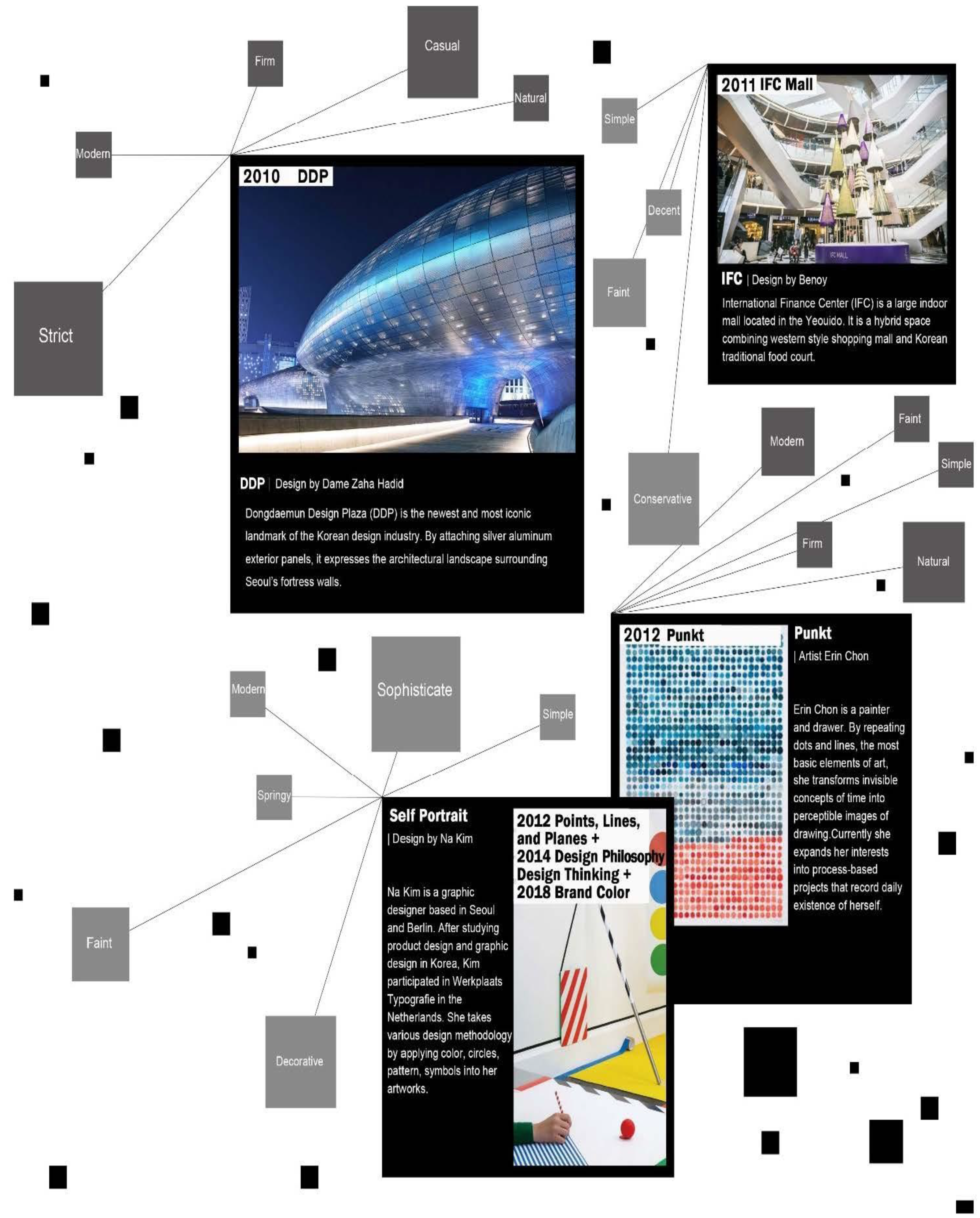
This new design work archiving system can be used to organize exhibitions. With the system, we used it to see one part of the history of Korean design works in a pilot test by organizing an exhibition. We organized a virtual exhibition using the archiving system that we developed to show the possibility of curation by delivering information about emotions to viewers. This small virtual exhibition was organized in collaboration with Design House, a Korean monthly magazine, in 2020. As the curator, we designed the exhibition to provoke an emotional response to design works by viewers under the theme of collaboration with the AI archiving system. The way of portraying the design works to viewers in this virtual magazine exhibition was as follows. The representative Korean design works were curated with titles on the top of the design works, and emotional adjectives and descriptive adjectives were mixed in gray boxes (see Figure 9).
Figure 9 shows the part of the history of Korean design from 2010 to 2012. The representative design of 2010 was Dongdaemun Design Plaza (DDP), designed by Dame Zaha Hadid, a British architect. By attaching silver aluminum exterior panels, it expressed the architectural landscape surrounding Seoul’s fortress walls. The IRI colors were analyzed as black tint RGB (54, 55, 55), blue tint (80, 134, 152), and grey tint (174, 193, 199). The emotional adjectives of the image of DDP were “strict”, “modern”, “firm”, “natural”, and “casual” by design works archiving system. An image of the International Finance Center (IFC) was the main image for 2011. Designed by Benoy, it is a large indoor mall located in the Yeouido, and is famous for being a hybrid space combining a Western style shopping mall and a Korean traditional food court. The IRI colors were analyzed as grey tint RGB (163, 164, 164), dark grey tint (84, 92, 73), and white-grey tint (215, 215, 215). The emotional adjectives of the image of IFC were curated as “simple”, “decent”, “faint”, and “conservative”. The representative image of 2012 was Punkt by Erin Chon, who is a painter and drawer. By repeating dots and lines, the most basic elements of art, she transforms invisible concepts of time into perceptible images of drawing. The IRI colors were analyzed as orange tint RGB (201, 153, 112), dark blue tint (80, 134, 152), and white-grey tint (215, 215, 215). It was curated as “modern”, “faint”, “simple”, “firm”, and “natural” for the emotional adjectives by the system. Self Portrait, by Na Kim, who was representative of design philosophy and design thinking in 2012, 2014, and 2018, was curated as “springy,” “decorative”, “faint”, “modern”, “sophisticate”, and “simple” for its emotional adjectives by the system. The IRI colors were analyzed as white tint RGB (223, 209, 235), brown tint (153, 139, 77), and white-brown tint (204, 186, 172). Other images of the history of Korean design were also curated with emotional adjectives with the same structure. Consequently, the system was able to share the emotions from the images with the viewers by visualizing them as emotional adjectives.
5. Discussion
The museum archiving system in this study was a retrieval system that grafted emotional data by applying AI technology. In the system, we extracted three main colors from design works using AI technology, matched IRI color schemes using Euclidean distance analysis, and finally deduced IRI emotional adjectives and descriptive adjectives by storing them as metadata in the system. We applied the IRI color scheme, which was developed by a survey based on Korean impressions of emotion and color, so it was able to extract emotions with a Korean cultural base. By doing so, it was possible to visualize emotions that were invisible to humans in design works. In addition, this was a new attempt to collect emotional linguistic expressions as metadata from design works through AI technology, which other systems have not tried before. A total of 118 emotional words were used to indicate the ambience of design works based on IRI colors, so it was possible to describe the design works in various ways.
To discuss the algorithm used in the system, the validation of matching clustered colors and IRI colors in RGB was shown in the Section 4. The matching algorithm calculated the Euclidean distance to select the closest IRI RGB colors by minimizing the distance between the clustered colors and IRI colors. As a result of the validation between them, it was noticed that IRI colors were well selected, with the highest correlation with the clustered colors.
In the system, we conducted an extraction of emotional adjectives from Korean design works that were representative of 2010 to 2012. In addition, through the system, the features of the design works, such as colors and emotions, were automatically archived, and the contents of design works, such as the archiving data, became abundant. The AI system captured the emotional information of design works, converted it into data, and categorized it by assisting in the planning of the exhibition. There are many ways to appreciate and understand design, but this virtual exhibition was planned from a perspective that the archival system, by analyzing emotions through utilizing AI, could also provide a way to appreciate design works with emotion. It was possible to create an effective exhibition by focusing on emotions in design works. This was the pilot usage of the archiving system with a curator organizing a virtual exhibition, and was an attempt to give emotional experience to viewers.
When exhibitions are designed to evoke an emotional response in visitors, vision can be harnessed in different ways [16]. In this respect, the archiving system can be used for different curatorial purposes, such as counting colors to create the intended ambience. To conceptualize a space with color, curators can use the archiving system to search design works by colors while considering emotional adjectives tagged by the system. For a curator planning an exhibition while considering spaces divided by specific themes, the archiving system can lead the curator to find suitable design works through categorized colors and emotional data.
The limitation of this study was discovering the emotions of the design works only through colors. Colors play the most important role in building a particular ambience, but a way to extract emotions can be found not only through colors, but also through the contents of the design works. The design works contained a combination of elements such as points, lines, and planes, and these became the contents of the works. In this sense, the extraction of authentic emotions can be achieved with the consideration of the contents in analysis. In addition, the emotional and descriptive adjectives in this study were based on scales relevant to Korean culture. Therefore, the results, which were based on the IRI scale, may not generalize across cultures. Thus, the current system may have limited utility to artists and curators from other cultures. Lastly, there was an issue regarding the potential impact of illumination and color change according to the brightness of displays of digital media and the difference between RGB colors and the real painting colors. For this reason, we concluded that this archiving system can be used by artist workers, especially for considering digital images.
For the future work, testing the system with end users such as curators is needed. Based on the developed museum archiving system, users can search for designs and retrieve works according to the emotion words. With the ability to retrieve design works based on various emotional adjectives, the retrieval system can assist exhibition professionals, especially curators. In addition, the ambience cue can be provided as emotional words to the curator, who must determine the emotions in design works to organize the intended exhibition. In addition, further research regarding the emotions transmitted when using color schemes is needed. While attempting to extract the characteristics of design works, this study focused on images such as paintings and photographs. However, further research is needed to expand the types of design works, including sculptures and other types of art. In the cases of sculptures or exhibition hall images, the background layer would have to be removed when extracting the characteristics to focus exclusively on the design work. In addition, the data units of the characteristics of the design work should be diversified. An archiving database that includes an elaborate range of characteristics of the design works founded on the basic elements of art, the combination of principles, art techniques, artists’ explanations, and the background of the era should be proposed. Furthermore, this system was suited for abstract or impressionistic images, rather than realism. So, future studies are needed regarding semantic issues such as the design work’s shape, because this system was not concerned with the semantic information in the images.
6. Conclusions
This study proposed a new archiving system for museums using emotions. A system was built in this study that used the main colors and emotional adjectives of design works by utilizing the IRI image scale to extract emotions. AI was used to construct metadata by extracting the main colors. A K-means clustering technique to generate clusters of image pixel values was used to derive the main colors in the design works. As three main colors had to be selected, the number of clusters was set to three to ensure efficiency. In this study, the Euclidean distance method was used to match the IRI’s monochromatic colors and adjectives that described the emotions of the design works. To assess the reliability of the relation of the extracted main colors and IRI colors, we calculated the coefficient of RGB values, and the result was impressive, with a correlation of more than 0.97 on average. The main colors of the design works and their characteristics were finally selected and stored in an archiving database. An image retrieval system was constructed by adding new metadata. By adding the emotion data of the design works to the database, we attempted to diversify the archiving data units and to transform intangible aesthetic semantics into data. To see the possibility of application and utilization of the system, we organized a virtual exhibition with images of Korean design history from the system to show the design works with emotions. The result was an attempt to enable a search for design works based on their content and emotions without depending on the title or name of an artist, enabling curators and museum managers to organize new concepts for exhibitions. In the future, the functionality of the database and the efficiency of searching design works with this system are expected to be improved by adding other data units that represent the various characteristics of design works.
Libraries and museums in the field of culture and arts management also provide the public with online materials and services. Books and works of art, which previously only existed in tangible form, are now electronically provided and managed online. In addition to the digitization of analog materials, AI is being actively used to automate and enhance the efficiency of using large quantities of data.
Museums and galleries are also changing due to digital technology. In the process of collecting design works, they are constructing institutional archives and working on documenting collections in digital data formats [4,5,6]. Collection and preservation work in museums is an area in which collection managers number, catalog, collect, and preserve design works with artistic value [4]. These most fundamental of museum activities help in the curation of exhibitions; therefore, digital database construction can utilize relevant data [7]. In conclusion, the current study is expected to provide some information on the right direction for new color utilization with adjectives for recognition of feelings.
Author Contributions
Conceptualization, H.J.K. and H.-K.L.; methodology, H.J.K. and H.-K.L.; software, H.J.K.; validation, H.J.K. and H.-K.L.; formal analysis, H.J.K.; investigation, H.J.K. and H.-K.L.; resources, H.J.K. and H.-K.L.; data curation, H.J.K.; writing—original draft preparation, H.J.K. and H.-K.L.; writing—review and editing, H.J.K. and H.-K.L.; visualization, H.J.K. and H.-K.L.; supervision, H.-K.L.; project administration, H.J.K.; funding acquisition, H.-K.L. All authors have read and agreed to the published version of the manuscript.
Funding
This research was funded by National Research Foundation of Korea: 2015R1A5A7037825 and Yonsei University Research Grant of 2020.
Institutional Review Board Statement
Not applicable.
Informed Consent Statement
Not applicable.
Data Availability Statement
The data from the result in this study are available from the corresponding author on request.
Conflicts of Interest
The authors declare no conflict of interest.
References
- McAfee, A.; Brynjolfsson, E.; Davenport, T.H.; Patil, D.J.; Barton, D. Big data: The management revolution. Harv. Bus. Rev. 2012, 90, 60–68. [Google Scholar] [PubMed]
- Lee, J.; Kao, H.A.; Yang, S. Service innovation and smart analytics for industry 4.0 and big data environment. Procedia CIRP 2014, 16, 3–8. [Google Scholar] [CrossRef] [Green Version]
- Lu, Y. Industry 4.0: A survey on technologies, applications and open research issues. J. Ind. Inf. Integr. 2017, 6, 1–10. [Google Scholar] [CrossRef]
- Edson, G.; Dean, D. The Handbook for Museums; Routledge: Oxfordshire, UK, 2013. [Google Scholar]
- Lee, H.-K. Design Museum Management; VDM Verlag Dr. Müller: Saarbrücken, Germany, 2009. [Google Scholar]
- Kreps, C.F. Liberating Culture: Cross-Cultural Perspectives on Museums, Curation and Heritage Preservation; Routledge: Oxfordshire, UK, 2013. [Google Scholar]
- Parry, R. (Ed.) Museums in a Digital Age; Routledge: Oxfordshire, UK, 2013. [Google Scholar]
- Gallery Systems. Available online: http://ideas.gallerysystems.com/About-TMSCollections.html. (accessed on 20 January 2021).
- Proctor, N. The Google Art Project: A new generation of museums on the web? Curator Mus. J. 2011, 54, 215–221. [Google Scholar] [CrossRef]
- Google Art Project. Available online: https://artsandculture.google.com/?hl=ko (accessed on 22 January 2021).
- Zhao, S.; Gao, Y.; Jiang, X.; Yao, H.; Chua, T.S.; Sun, X. Exploring principles-of-art features for image emotion recognition. In Proceedings of the 22nd ACM International Conference on Multimedia, Orlando, FL, USA, 3–7 November 2014; pp. 47–56. [Google Scholar]
- Bleicher, S. Contemporary Color: Theory and Use; Cengage Learning: Boston, MA, USA, 2012. [Google Scholar]
- Mahnke, F.H. Color, Environment, Human Response; Van Nostrand Reinhold: New York, NY, USA, 1996. [Google Scholar]
- Bogle, E. Museum Exhibition Planning and Design; AltaMira Press: Lanham, MD, USA, 2013. [Google Scholar]
- Ewin, T.A.; Ewin, J.V. In defence of the curator: Maximising museum impact. Mus. Manag. Curatorship 2016, 31, 322–330. [Google Scholar] [CrossRef]
- Boyd, C.P.; Hughes, R. Exhibiting with Emotion. In Emotion and the Contemporary Museum; Palgrave Pivot: Singapore, 2020; pp. 11–21. [Google Scholar]
- Taran, R. Emotional Advantage: Embracing All Your Feelings to Create a Life You Love; St. Martin’s Essentials: New York, NY, USA, 2019. [Google Scholar]
- Kandinsky, W.; Rebay, H. Point and Line to Plane; Courier Corporation: North Chelmsford, MA, USA, 1979. [Google Scholar]
- Holtzschue, L. Understanding Color: An Introduction for Designers; John Wiley&Sons: Hoboken, NJ, USA, 2012. [Google Scholar]
- Zettl, H. Sight, Sound, Motion: Applied Media Aesthetics; Cengage Learning: Boston, MA, USA, 2013. [Google Scholar]
- Aldrich, V.C. Philosophy of Art; Prentice-Hall: Hoboken, NJ, USA, 1963. [Google Scholar]
- Kandinsky, W. Concerning the Spiritual in Art; Courier Corporation: North Chelmsford, MA, USA, 2012. [Google Scholar]
- Wright, B.; Rainwater, L. The meanings of color. J. Gen. Psychol. 1962, 67, 89–99. [Google Scholar] [CrossRef] [PubMed]
- Hogg, J. A principal components analysis of semantic differential judgements of single colors and color pairs. J. Gen. Psychol. 1969, 80, 129–140. [Google Scholar] [CrossRef] [PubMed]
- Gerald, R. Robert Gerald Livingston compares new books by Wallach and Romoser, and Burdick, Jacobsen and Kudszus (book review). Ger. Politics Soc. 1985, 5, 39–55. [Google Scholar]
- Wyszecki, G.; Stiles, W.S. Color Science: Concepts and Methods, Quantitative Data, and Formulae; Wiley: New York, NY, USA, 2000. [Google Scholar]
- Valdez, P.; Mehrabian, A. ‘Effects of Color on Emotions’. J. Exp. Psychol. Gen. 1994, 123, 394–409. [Google Scholar] [CrossRef] [PubMed]
- Kobayashi, S. Color Image Scale. Available online: http://www.ncd-ri.co.jp/english/main_0104.html (accessed on 10 March 2018).
- IRI Inc. A Development of Measurement for Koreans’ Emotion on Color; Korean Ministry of Commerce of Industry and Energy: Sejong City, Korea, 1997. (In Korean) [Google Scholar]
- Miller, S.J. Metadata for Digital Collections: A How-to-Do-It Manual; Neal-Schuman Publishers: New York, NY, USA, 2011. [Google Scholar]
- Birren, F. Color Psychology and Color Therapy: A Factual Study of the Influence of Color on Human Life; Pickle Partners Publishing: Auckland, New Zealand, 2016. [Google Scholar]
- Maroevic, I. Introduction to Museology: The European Approach; VDM Verlag Dr. Müller: Saarbrücken, Germany, 1998. [Google Scholar]
- KF. Available online: http://knewsletter.kf.or.kr/?menuno=1096 (accessed on 22 February 2021).
- Patel, M.; White, M.; Mourkoussis, N.; Walczak, K.; Wojciechowski, R.; Chmielewski, J. Metadata requirements for digital museum environments. Int. J. Digit. Libr. 2005, 5, 179–192. [Google Scholar] [CrossRef] [Green Version]
- Grietzer, P. A Theory of Vibe; Indiana University Press: Bloomington, IN, USA, 2017. [Google Scholar]
- National Museum of Modern and Contemporary Art, Seoul. Available online: https://m.place.naver.com/place/19691123/home?entry=pll (accessed on 21 July 2021).
- Likas, A.; Vlassis, N.; Verbeek, J.J. The global k-means clustering algorithm. Pattern Recognit. 2003, 36, 451–461. [Google Scholar] [CrossRef] [Green Version]
Figure 1.
IRI hue and tones palette, IRI monochrome image scale, and IRI adjective image scale. (A) IRI hue and tones palette; (B) IRI monochrome image scale; (C) IRI adjective image scale.
Figure 1.
IRI hue and tones palette, IRI monochrome image scale, and IRI adjective image scale. (A) IRI hue and tones palette; (B) IRI monochrome image scale; (C) IRI adjective image scale.

Figure 2.
Multitouch display table at the Cooper Hewitt design museum.

Figure 3.
Naver DataLab with Theme Keywords.

Figure 4.
Flow chart.

Figure 5.
Dominant color extraction from Paul Klee’s Senecio.

Figure 6.
IRI hue and tone palette of 120 monochrome colors, Mapping with IRI color scale and adjective scale. (A) IRI hue and tones palette of 120 monochrome; (B) Mapping with IRI color scales and adjective scale; (C) Process of calculating distance zooming in the first quadrants.
Figure 6.
IRI hue and tone palette of 120 monochrome colors, Mapping with IRI color scale and adjective scale. (A) IRI hue and tones palette of 120 monochrome; (B) Mapping with IRI color scales and adjective scale; (C) Process of calculating distance zooming in the first quadrants.

Figure 7.
Comparison of the color values or RGB between the clustered dominant color of the design works and then matched with IRI color.
Figure 7.
Comparison of the color values or RGB between the clustered dominant color of the design works and then matched with IRI color.

Figure 8.
Searching the system with the design work’s emotions, here with springy checked on the details page for the design work by Piet Mondrian in the searching system.
Figure 8.
Searching the system with the design work’s emotions, here with springy checked on the details page for the design work by Piet Mondrian in the searching system.

Figure 9.
Virtual exhibition of Korean design works delivering emotions.


Table 1.
Emotional and descriptive adjectives from the IRI color scale *.
| Ea | Clear | Gentle | Natural | Pretty | Springy | Gorgeous |
| Da | Soft, Mild, Delicate, Neat, Transparent, Light, Clear, Refreshing | Pure, Weak, Fluent, Smooth, Plain, Calm, Equanimity | Natural, Rural, Intimate, Friendly, Comfortable, Casual, Plentiful, Warm, Sensual, Fragrant, Gentle | Lovely, Congenial, Sweet, Fresh, Cheerful, Fun | Young, New, Free, Rhythmical, Brilliant, Active, Sporty, Variety, Decorative, Outstanding | Mature, Fantastic, Leisurely, Attractive, Korean, Fullness, Cool, Complex |
| Ea | Elegant | Faint | Dynamic | Modern | Decent | High |
| Da | Sensuous, Convenience, Oriental, Awesome, High-class, Classic | Peacefully, Shipshape, Simple, Neatly, Upright, Mere, Silent | Distinguished, Individual, Innovative, Lively, Strong, Adamant, Rough, Wild | Strict, High-tech, Sophisticate, Western, Mannish, Firm, Deep, Heavy, Dark, Functional, Cold, Artificial, Banausic, Progressive | Modest, Polished, Intelligent, Formal, Conservative, Intellectual, Traditional, Steady | Gentle, Quiet, Calm, Aged, Antique, Gloomy, Courteous, Dull |
* Ea: Emotional adjective from IRI color scale; Da: descriptive adjective from IRI color scale.
Table 2.
Senecio’s dominant colors and adjectives for emotions *.
| No. | Dc | IRIcs | Proportion (%) | D | Ea | Da |
|---|---|---|---|---|---|---|
| 1 | 211, 139, 40 | 219, 145, 72 | 46.0222 | 33.5261 | Springy | Decorative |
| 2 | 200, 164, 146 | 199, 147, 168 | 30.7389 | 27.8208 | Clear | Light |
| 3 | 161, 67, 24 | 151, 99, 56 | 23.2389 | 46.3465 | Decent | Modest |
* Dc: Dominant color’s RGB value; IRIc: IRI 120 colors’ RGB value; D: Euclidean distance between DC and IRIc; Ea: emotional adjective from IRI color scale; Da: descriptive adjective from IRI color scale.
Table 3.
IRI RGB color numbers of emotional adjectives from the design works (duplications eliminated).
Table 3.
IRI RGB color numbers of emotional adjectives from the design works (duplications eliminated).
| (A) Springy | (B) High |
| (219, 145, 72) (199, 75, 86) (194, 68, 140) (202, 0, 63) | (88, 89, 89) (112, 114, 113) (144, 139, 115) |
| (C) Pretty | (D) Natural |
| (245, 151, 0) (245, 165, 161) (171, 206, 37) (243, 217, 0) (193, 103, 147) (214, 244, 114) (237, 165, 194) (255, 244, 117) | (214, 191, 44) (186, 194, 165) (199, 185, 190) (194, 178, 100) (201, 188, 169) (122, 202, 225) (201, 153, 112) (63, 76, 104) (211, 243, 140) (177, 153, 194) (174, 193, 199) (135, 191, 159) (112, 176, 169) (226, 246, 250) (255, 238, 224) (223, 237, 177) (180, 224, 235) (244, 239, 249) (207, 174, 231) (98, 210, 196) |
| (E) Modern | (F) Clear |
| (65, 66, 66) (54, 55, 55) (76, 94, 84) (113, 138, 184) (131, 55, 101) (53, 81, 92) (31, 151, 181) (98, 64, 84) (74, 138, 132) (80, 134, 152) (95, 137, 204) (26, 117, 83) (72, 93, 91) (58, 173, 125) (87, 68, 98) (0, 99, 133) (0164, 109) | (240, 231, 173) (244, 205, 201) (199, 147, 168) (255, 205, 161) (223, 209, 235) (239, 246, 212) (255, 221, 190) (181, 228, 199) (253, 238, 236) (222, 250, 231) |
| (G) Dynamic | (H) Gentle |
| (51, 87, 142) (44, 110, 191) (0125, 163) (0104, 101) | (204, 186, 172) (220, 249, 242) (249, 243, 211) |
| (I) Elegant | (J) Faint |
| (242, 242, 241) (174, 127, 88) (143, 164, 203) (160, 107, 131) (170, 196, 190) (120, 144, 141) (255, 255, 255) (152, 134, 132) (120, 173, 189) (142, 136, 148) (172, 197, 181) | (215, 215, 215) (163, 164, 164) (189, 190, 189) (138, 139, 138) (203, 185, 183) (193, 187, 198) (184, 190, 200) (237, 242, 251) |
| (K) Decent | (L) Gorgeous |
| (123, 142, 148) (94, 89, 69) (126, 113, 55) (152, 135, 122) (151, 99, 56) (102, 85, 74) (98, 152, 123) (166, 188, 109) (179, 120, 118) (134, 143, 119) (153, 139, 77) (132, 139, 151) (149, 134, 139) (129, 147, 87) (84, 92, 73) (101, 123, 51) | (117, 52, 142) (238, 206, 217) (104, 82, 82) (160, 191, 67) (165, 85, 87) (164, 190, 236) (154, 124, 174) (202, 216, 241) (126, 73, 150) |
Publisher’s Note: MDPI stays neutral with regard to jurisdictional claims in published maps and institutional affiliations. |
© 2022 by the authors. Licensee MDPI, Basel, Switzerland. This article is an open access article distributed under the terms and conditions of the Creative Commons Attribution (CC BY) license (https://creativecommons.org/licenses/by/4.0/).
Share and Cite
MDPI and ACS Style
Kim, H.J.; Lee, H.-K. Emotions and Colors in a Design Archiving System: Applying AI Technology for Museums. Appl. Sci. 2022, 12, 2467. https://doi.org/10.3390/app12052467
AMA Style
Kim HJ, Lee H-K. Emotions and Colors in a Design Archiving System: Applying AI Technology for Museums. Applied Sciences. 2022; 12(5):2467. https://doi.org/10.3390/app12052467
Chicago/Turabian StyleKim, Hye Jung, and Hyun-Kyung Lee. 2022. "Emotions and Colors in a Design Archiving System: Applying AI Technology for Museums" Applied Sciences 12, no. 5: 2467. https://doi.org/10.3390/app12052467
Note that from the first issue of 2016, this journal uses article numbers instead of page numbers. See further details here.