Colours

Primary colours
We tend to use these for text and headings. As we have such a wide colour palette, it could be tempting to use them all. But we don’t want to look like mess or for text to be unclear for people to read.
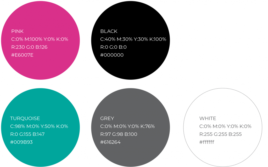
Primary colour breakdowns
PINK
C:0% M:100% Y:0% K:0%
R:230 G:0 B:126
#E6007E
BLACK
C:40% M:30% Y:30% K:100%
R:0 G:0 B:0
#000000
TURQUOISE
C:98% M:0% Y:50% K:0%
R:0 G:155 B:147
#009B93
GREY
C:0% M:0% Y:0% K:76%
R:97 G:98 B:100
#616264
WHITE
C:0% M:0% Y:0% K:0%
R:255 G:255 B:255
#ffffff
Secondary colours
At times it may be necessary to use additional colours. This could include a graph or chart, or even to segment a document into sections. This complimentary palette has been developed to work alongside our primary colours.
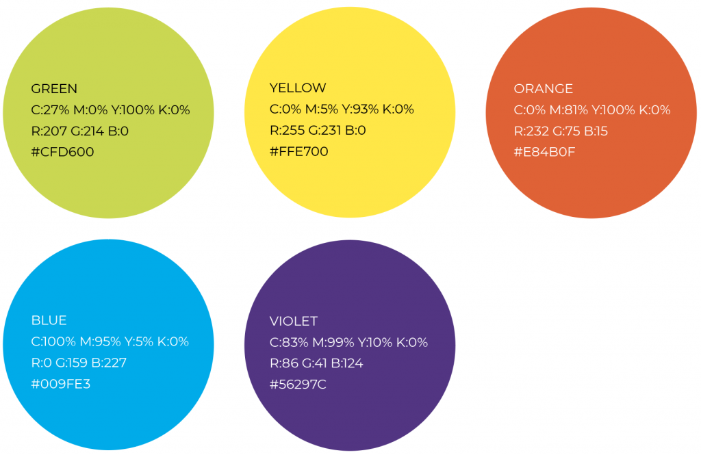
Secondary colour breakdowns
GREEN
C:27% M:0% Y:100% K:0%
R:207 G:214 B:0
#CFD600
YELLOW
C:0% M:5% Y:93% K:0%
R:255 G:231 B:0
#FFE700
ORANGE
C:0% M:81% Y:100% K:0%
R:232 G:75 B:15
#E84B0F
BLUE
C:100% M:95% Y:5% K:0%
R:0 G:159 B:227
#009FE3
VIOLET
C:83% M:99% Y:10% K:0%
R:86 G:41 B:124
#56297C
Top tip:
Please use the secondary colours carefully and sparingly. The colours should never completely replace or dominate primary colours.