I previously shared an article about the 7 art elements, and I mentioned that those were the building blocks of any artwork. So today, I am willing to introduce you to the principles of art, and these will be the cement that holds the building blocks of your artwork together.
To get straight into it, the principles of art (often called principles of design as well) are:
- Rhythm
- Balance
- Emphasis
- Gradation
- Harmony
- Variety
- Movement
- Proportion
In the article on composition, I explained that artists should care about composition because it helps draw a path for the viewer’s eye to follow, giving them a guided way to understand the artwork, starting from the focal point and going to other elements in order of importance. Art principles, on the other hand, are the way to build a correct and even attractive composition in any artwork.
I personally think that some of these art principles are more important than others. However, as an artist, you should have a general knowledge of every art principle and how it could make or break your art until you develop a fingertip feel for the perfect combination in every artwork through observation only.
1- Balance
Balance is the first art principle and the most obvious, in my opinion. A balanced artwork means that the visual weight of elements is evenly distributed all around the work. An imbalanced artwork gives the viewer discomfort.
To achieve a balanced composition (link to this), you can either rely on symmetry, asymmetry, or radial symmetry:
- Symmetry: where both sides are exactly equal.
- Asymmetry: Both sides aren’t exactly equal, but the weight is evenly distributed and balanced all over the artwork.
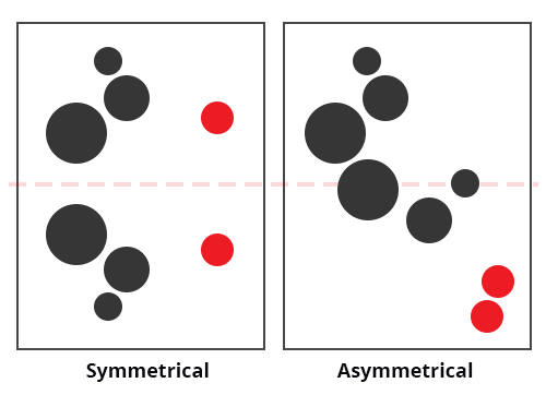
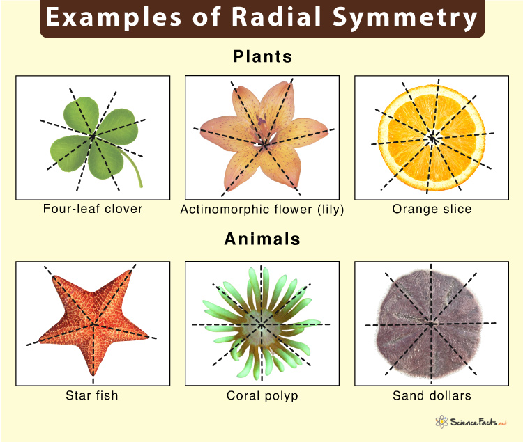
- Radial symmetry: creating similar weights divided around a central point.
2- Proportion
If you’ve never studied art, you might have been trying so hard to understand and practice proportions, especially in figure or portrait drawings. However, it’s not as hard as you think it is and it’s not only about anatomy.
Proportion as a principle of art means how different parts (elements) of an artwork are put together. It also means the relative size of one object or element in comparison to another. We use proportions to compare sizes, shapes, and quantities. In a portrait, depending on the style, getting your proportions right gives your art life.
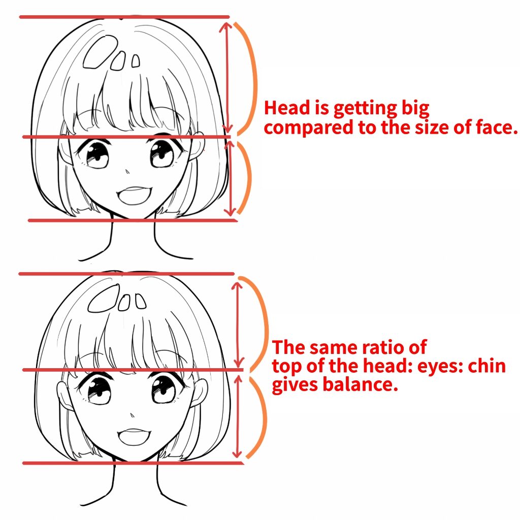
In the drawing above, as the manga style uses more realistic proportions, you can notice that by drawing the eyes slightly below where they should be, the entire harmony of the character’s face feels off. The thing is, the viewer’s eye won’t be able to spot the error but will be drawn away as the mind will label the art as bad or confusing to look at. It is for this reason that you should make sure to master proportions, especially if you’re a portrait or character artist.
To master proportions, you need to master scales in the first place. What goes where? Drawing a man on the same scale as a tree and giving both of them the exact proportions will inevitably rub you drawing from any sense of scale or proportion. Overlapping both objects, on the other hand, will tell you which item is closer and will give your work the overall feeling of harmony.
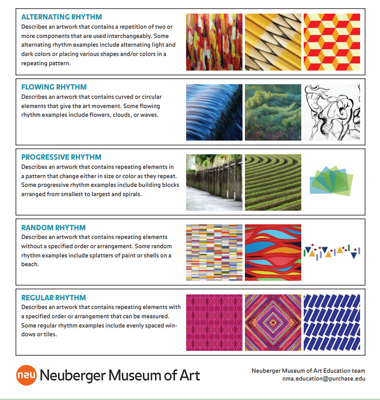
3- Rhythm
I can explain this art principle through repetition and pattern. Think of a mandala or any sacred geometry shape. It is the result of basic elements (circles, lines, spaces…) being repeated to create a rhythmic work of art. The reason these visual representations are relaxing to draw and look at is that they respect the principle of rhythm perfectly. Too much repetition in art, though, might make your artwork boring.
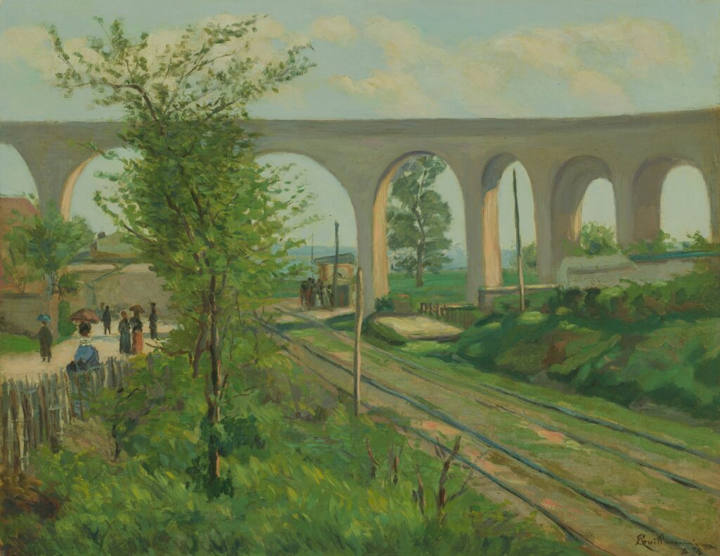
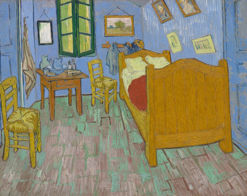
The visual tempo of your work is created through repetition and pattern and my favorite artist who used rhythm often in his artworks and perfectly did that is, of course, Vincent Van Gogh.
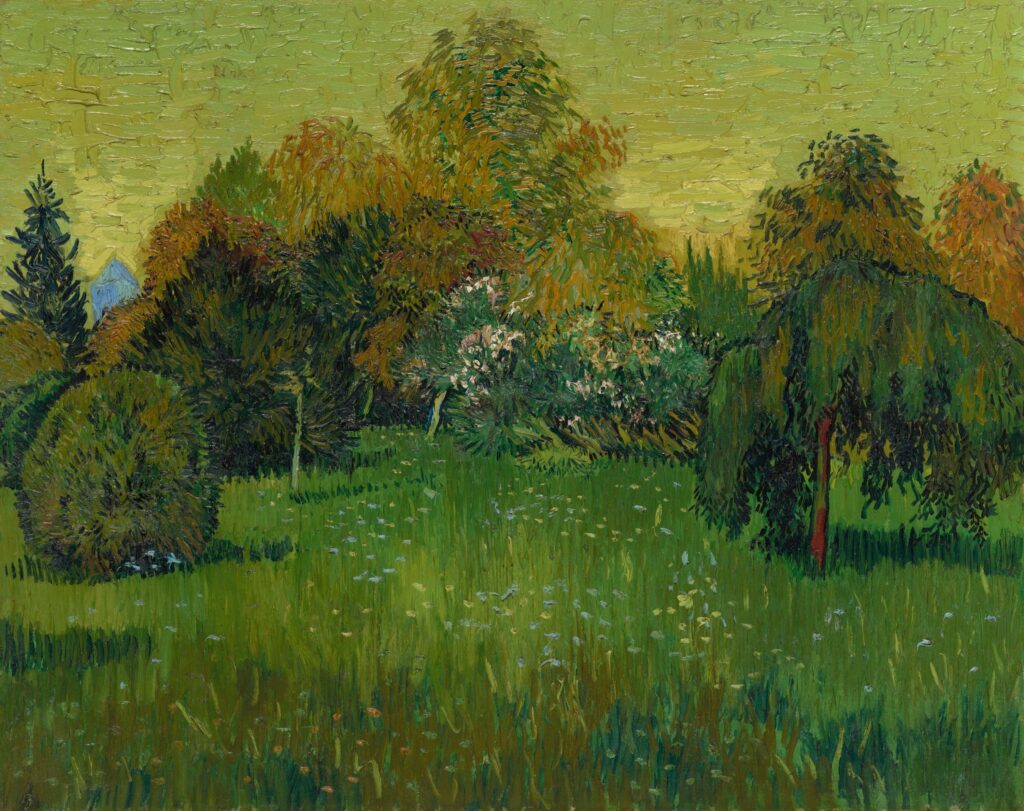
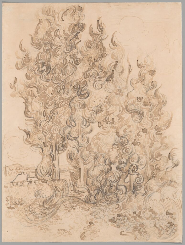
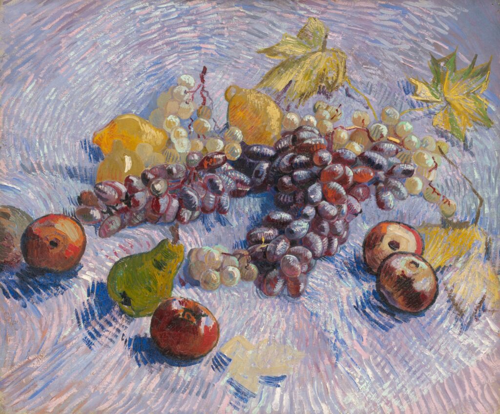
You can notice the rhythm in the brush strokes, the color repetition, and even the technique used in VanGogh’s artworks. Rhythm though exists in many types.
Randon rhythm: Random rhythm is natural and alive. Like falling snow, it has no exact pattern.
Regular rhythm: Following an exact pattern over and over. It is the most boring.
Alternating rhythm: Chess boards are an alternation rhythm. Because it’s alternating between white and black squares
Flowing rhythm: Water would be a good example of flowing rhythm but for art, it describes an artwork that contains curvy elements that show a flowy movement.
Progressive rhythm: it’s slowly changing from small to big, or big to small, or even from slow movement to fast movement. Perspective is also a progressive rhythm.
The following sheet is a great explanation with examples from the Neuberger Museum of Art.
Leave your email here if you want to have this guide from the Museum sent to you.
4- Emphasis
Emphasis is utilized to draw the attention of a viewer to the focal point, or the main subject of an artwork. In a portrait, for example, the artist normally wants you to look at the subject’s face first; therefore, the artist will utilize color, contrast, and the right placement for the viewer’s eyes to catch the face of the subject first. You can emphasize your focal point in many ways (check out my composition article).
A work of art, as I have previously mentioned, may contain more than one focal point, but one usually takes precedence over all others, since having many areas of focus with equal importance confuses the observer. Over two focal points in one artwork aren’t recommended.
5- Gradation
Gradation is used in so much visual art because it’s pleasurable to look at.
Gradation is often talked about mostly in value and color, but in reality, any art element could have gradation, like changes in size, shape, and texture. The point of gradation, like any other principle, aims at keeping the focus of the viewer for as long as possible in the artwork. Any gradual change in a certain element that could help connect the composition is called gradation (short lines to long lines, small to larger shapes, etc.).
Gradation, therefore, creates harmony and movement throughout the piece.
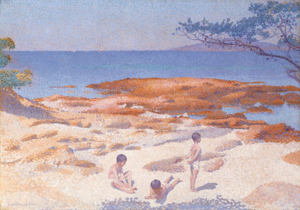
In this piece, the gradation is happening in both color and technique. The blue becomes progressively lighter as we go from the center upwards, and the orange, which is a complementary color to the blue, becomes gradually lighter and softens into blue as we go downward. (See the color schemes post for more on this topic). The other part of gradation is the dots used by the artist. The paint dots gradually go from bigger to smaller, which emphasizes the focal point in this artwork. Can you guess the focal point of this painting? correct! The kids are the focal point since they were painted in lighter values, which guides the viewer’s eye to them first then around the whole artwork.
6- Harmony
Harmony in art is the way distinct parts of an artwork are meant to come together toward one vision or idea.
Harmony is visually achieved by combining similar or related elements.
- Good color combinations
- Similar shapes
- Good texture combinations
On another note, harmony also requires some contrast, otherwise, too much harmony can become boring and dull.
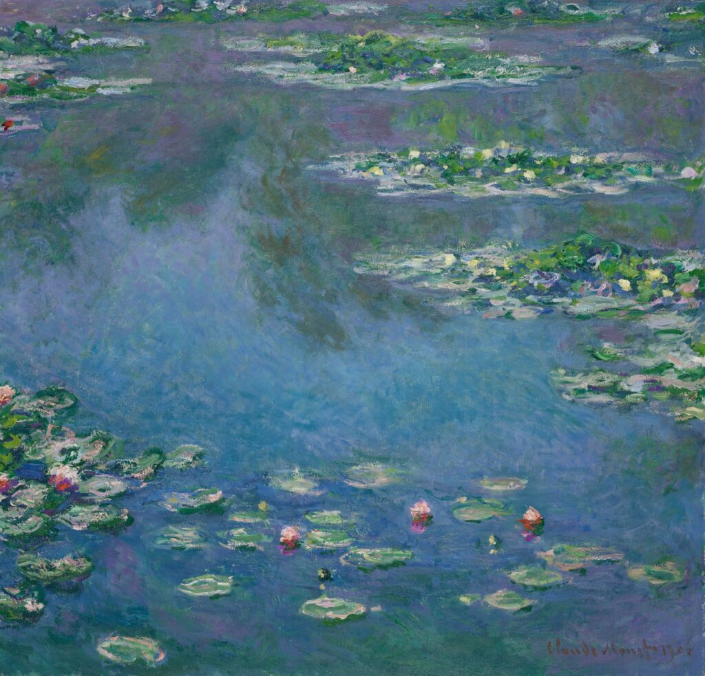
If you see Monet’s art, you can see how choosing a harmonious color palette for the artwork creates real visual pleasure. Yet, contrasting the softness and unity in color with a little bit of texture is what gives a sense of perfection to Monet’s art, in my opinion.

7- Variety
This principle is the soul of balance in art. As I mentioned in the harmony part, too much harmony could be monotonous and gives boredom to the viewer in no time. So in order for your artwork to be really harmonious and pleasing to look at, you need to use different elements to create interest and contrast. Different shapes, textures, and hues. The secret is to know how to include various elements of art in a correct composition and respect all the principles mentioned in this article.
8- Movement
I only recently realized the importance of capturing movement in artworks. If you look at my first art, you can easily spot how fixated everything was. I knew little to nothing about composition and the flow of visual expression, so I typically placed the focal points of my art in the middle of the painting giving them a powerful yet static feeling. Movement in the art could be included in many ways, painting actual movement, pushing your focal points slightly to a third of the canvas, or painting the illusion of movement through clever placement of the visual elements (think of Vincent van Gogh’s energetic brushwork).
Conclusion
Learning and mastering the elements and principles of art is something your future self will love you for. And if you have further questions on how you can do that, feel free to leave them alongside your remarks and additions in the comments sections.
5 Comments