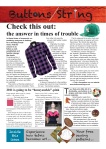
When you are on the consumer site of a print product you will probably never notice the way the news and stories are laid out for you – only if it is done badly.
But the design of things on a page highly influence the way you read and how you perceive what is written.
Always depending on what kind of print product you are having in front of you different rules of design need to be applied to match your expectations and probably habits.
Shared features
They all need something like a (colorful) banner on top of the front page that clearly displays information like the name, price, date, internet address etc..
Furthermore they would all try to start high with their texts, then go low and never go up as high as they started.
All of them would not mix too many type faces. Normally you would not come across more than three in the same product.
And then they would mix something light with something bold, a serif font with a sans serif one to make the page interesting and to underline importance.
Differences
One big difference is the use of pictures.
While broadsheets and probably newsletters try to use informative pictures, tabloids clearly aim at some sort of scoop and magazines allow decorative pictures.
They also differ in the use of colors.
Newsletter and magazine design can be much more playful by using uncommon (i.e. pink, neon green) or bright colors. (Read more on newsletter design.)
While broadsheets and tabloids seem to be more restricted.
You find a lot of rather cold colors (i.e. dark blue or green) in broadsheets sometimes paired up with warmer colored pictures.
Tabloids are not called “red tops” for no reason – the bright red attracting the eye and indicating urgency, danger and excitement. (Read more on tabloid design or magazine design.)
Observe your habits
Of course these are just very few features of the design the mentioned print products.
Have look at my InDesign works in all these fields and you will definitely be able to spot more.
And the next time you read a print product with a good layout you will probably notice how your eyes are automatically drawn to the most important stories and features.
(Read here how you can use newspaper design to improve your website.)


