The piece is mostly about charting the result of reinvesting dividends in various scenarios, but some points emerged along the way.
1) Dividend reinvestment does not beat the return averaged over a period, which suggests there’s no benefit from variation about the average yield caused by market fluctuations.
2) If the yield goes high enough, the benefit from the period of high yield can’t be undone by a low yield during a period the same length, no matter how low the yield is.
3) The second point suggests that not beating the return averaged over a period is not as limiting as it looks.
4) Using long term data, dollar cost averaging did not turn market fluctuations into gain, though it reduced the risk of bad timing.
5) Because dollar cost averaging does not turn market fluctuations into gain, it’s likely that dividend reivestment does not do so either.
I don’t remember anyone specifically claiming that dividend reinvestment or dollar cost averaging turned market fluctuations into gain. I thought they might, I investigated, and concluded they don’t on average, although there will be cases of such gain.
Charting the results of dividend reinvestment in various scenarios with purely fictitious data might seem odd, but it allows changing one variable at a time and observing the effect.
There’s some arithmetic in the piece, but the nearest I get to algebra is the formula:
Return = Yield + Dividend growth + Yield*Dividend growth
The math adds to the piece but is not essential.
The charts take no account of inflation, risk, or any dealing costs.
I wasn’t even thinking about Dividend Reinvestment Plans when I started. I’d learned that the South African and Australian stock indexes beat the US on average since 1900. The data was on an inflation-adjusted and dividends-reinvested basis. I thought, with dividends reinvested, outperformance could possibly be the result of higher yields. Yields depend on valuation, whereas an inflation-adjusted price index (without dividend reinvestment) reflects the performance of the businesses with less effect from valuation, although companies buying their own stock get a worse deal when valuations are high.
A hypothetical version of ‘the usual’

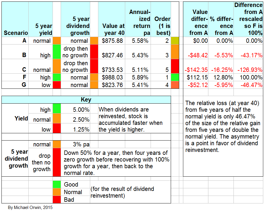
Scenario A, the “base case”
In the first case, every year has the same 2.5% yield, the same 3% rate of dividend growth, and a 3% interest rate on “banked” dividends assumed throughout forty years. Later I compare scenarios and use this as the base case. The value of the initial shareholding tracks the value of $100 earning 3% interest (resulting in the red and grey dashed line).

Most of the outperformance of the reinvestment strategy disappeared when the accumulated dividend was added, earning an assumed 3% interest rate (the same as the dividend growth rate), but there was still significant outperformance. You are only usually shown the equivalent of the red and green lines, and not the orange bars which include the value of dividends banked and interest earned. When I say “banked”, I mean for a risk-free return without being specific about how to get it, and the interest rates I used are not meant to predict the average over the next forty years. I avoid issues connected with treasury bonds like the yield curve, varying capital value, safety and inflation, I just pick a constant interest rate for each chart.
The assumption of constant yield and dividend growth is of course unrealistic. Later scenarios where the yield doubles for five years are just as unrealistic. It’s only by keeping the scenarios simple that I can show the effect of changing one thing at a time. Readers who prefer reality-based charts can find “Coca-Cola”, “Realty Income Corporation” and “Tweedy Browne” below, for links.
Calculating return
In each scenario I assume $100 is invested in a stock at the end of year 0. The share price is always determined by the dividend and the yield. The dividend always starts at $1 per share, and dividend growth and the yield are the inputs assumed for a scenario. The share price growth for each year over the previous year includes the effect of the dividend growth and the yield. Year 1 is the first year of ownership, benefiting from dividend growth. The year 0 dividend of $1 is not received. There’s more info under “Spreadsheet tables and formulas” near the end. I only show images of the tables and formulas for scenarios A and B, but there’s a link to instructions for how to recreate the tables.
All my tables simulate dividend reinvestment year by year. I checked the growth produced by dividend reinvestment with a formula which gives the result when the yield and dividend growth are constant:
Return = Yield + Dividend growth + (Yield * Dividend growth)
It’s usual to just add the yield and the dividend growth. There seems to be no problem with that, unless the number for yield, dividend growth or the length of the period are particularly high (see my piece “The approximation Return = Yield + Dividend growth is nearly always close enough“). I derived the formula myself, I don’t mean I invented it, just that you might want to check my work, here. I prefer to use the formula which my work shows to be correct, and using it here means I can report zero difference between the spreadsheet simulations and the formula, instead of reporting a miniscule difference.
The formula works for the stream of dividends, where the only yield that matters is the yield when you buy in. It works for a year’s dividend plus the capital appreciation you get if the yield stays constant.
More relevant, the formula agrees with the year-by-year spreadsheet simulations for dividend reinvestment over a series of years, even if the yield and dividend vary during the period, provided the yield is the same at the start and the end. The mutual confirmation is reassuring but I can’t rule out the formula and spreadsheet simulations having some common error.
I assumed the dividend was a simple annual event, to avoid getting bogged down in the mechanics of quarterly dividends, or any effects from the delay between announcing the dividend and the payments being received.
If the dividends are spent on beer, the initial investment still gets the return calculated so long as the dividend growth stays constant (and the yield, if including capital appreciation rather than only the value of the dividends). However, to compound the return you need to reinvest.
For the scenario in the previous chart, with 2.5% yield and 3% dividend growth:
Return = 3% + 2.5% + 3% * 2.5%
= 5.5% + 0.075%
= 5.575%
Applying that return to $100 over 40 years, you get
$100 * 1.05575^40
= $100 * 8.7588
= $875.88
(The hat sign, “^”, is a calculator and spreadsheet function which saved me from having to multiply 1.05575 by itself 40 times. 1.05575 is just 1 plus the return 5.575%.)
The result $875.88 is the same as the number in my spreadsheet for the value with dividend reinvestment in year 40.
Comparing the “base case” returns
To keep the number of charts down I don’t show this kind of chart for other scenarios. Later I compare returns for dividend reinvestment across some of the scenarios.

When the dividend is banked, the return falls as the proportion of cash accumulated rises (the proportion of cash starts at zero).
Other charts where parameters are held constant
The next chart shows the effect of increasing the yield to 10%, keeping the dividend growth rate and the interest rate the same.
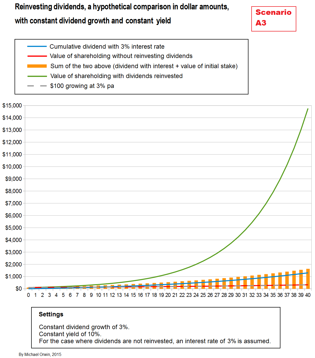
The outperformance has become massive. However, an assumed 10% yield is not compensating for any risk when there’s also an assumed growth rate of 3%.
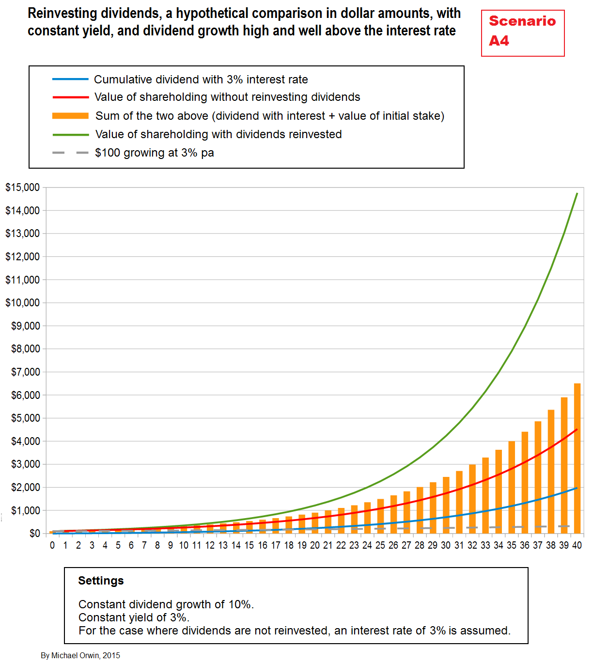
In the next chart I swapped the high yield for a high rate of dividend growth, with 10% dividend growth and 3% yield instead of 3% dividend growth and 10% yield. The result for dividend reinvestment is exactly the same, which is unsurprising because both results agree with the formula for total return, and the formula is symmetric – if you swap the terms “Yield” and “Dividend growth” around, you end up with the same formula, because Yield + Dividend growth rate is the same as Dividend growth rate + Yield, and the order of multiplying the two terms doesn’t matter either.
The “bank-it” policy is better in the high dividend growth scenario (though it’s not as good as the dividend reinvestment policy). After forty years, most of the value of the “bank-it” policy is due to the appreciation of the original holding, produced by the rising dividend. It also generates more cash, at $1,979.87 (including interest) compared to $1,304.82 in the high yield scenario. In the high yield version, the stock generates more cash in the early years, but then the cash only compounds at the interest rate. In the version with high dividend growth, the dividend payments in the later years have benefited from the high rate of dividend growth.
Dividend growth ~ Yield ~ 40 yrs reinvestment ~ 40 yrs banking dividends
3% ~ 10% ~ $14,763.74 ~ $1,631.02 (previous chart)
10% ~ 3% ~ $14,763.74 ~ $6,505.79 (next chart)
A reality check with the S&P 500
This excursion to reality is not objective or precise, because it involves reading off a chart, which is in “S&P 500: Total and Inflation-Adjusted Historical Returns“. Find “Inflation-Adjusted Data”. The chart shows a decline between around 1969 and 1982. The chart is on a log scale, so when the index drops, the size of the drop in the chart (measured in inches or pixels) corresponds to the percentage fall. The numbers used to mark the scale on the Y axis are not logs. Just going by the scale, without reinvestment the slide from peak to trough was over 50% (from 4 to under 2), while with reinvestment the drop was under 50% (from 9 to 5).
Initially, dividend reinvestors were hit just as much as other investors, through lower stock prices and reduced dividends, but as the bear continued, reinvestment benefited from the higher yield, which meant that stock was accumulated faster (charts on multpl.com). Having more stock was good when the bull market got going. The yield chart also shows a spike to around 14% after the crash of 1929. Investors weren’t happy, but it was a time of fast stock accumulation for anyone who reinvested dividends. The faster compounding in a bear market is a well known effect, sometimes called the “bear protector”, see “Dividend Reinvestment: The Bear Protector And Total Return Accelerator” December 28, 2015 (theconservativeincomeinvestor.com). The piece uses the tobacco company Philip Morris as an example.
When a market has a significant fall, investors would generally have been better off putting recent dividends in the bank, but there’s a point when most of the drop to the bottom is complete and the effect of a higher yield takes over. That does not automatically extend to comparing a higher yield stock to a lower yield stock in the same market, because yield reflects the market view of risk and prospects, and comparing across stocks is not the same as comparing the whole market across time. The US market has recovered many times.
In “S&P 500: Total and Inflation-Adjusted Historical Returns” (linked to above), the tables under the chart show that reinvestment gave a 4% outperformance in the 1970s, which isn’t all that much above other decades. That may be partly because decades are arbitrary periods and “the 1970s” does not exactly match the bear market or the period from the start of the bear to recovery.
Compression in charts
The chart in the S&P 500 link above used a log scale, which avoids a problem called “compression”. I illustrate the problem with a chart.

There’s another chart of the S&P 500 with and without dividends reinvested here. The narrowing gap when the lines are low will be the result of compression. Dividend reinvestment will always outperform the corresponding price index, because the dividends reinvested give a free lift to the reinvestment chart, while being ignored in the price index chart (I correct for that in my hypothetical charts). I don’t use logs in my scenario charts, or point out when compression might be an issue.
Five years different to normal
Next, instead of holding everything constant for forty years, I have an initial period of variation followed by going back to normal, near the start so the long term effect can be seen.
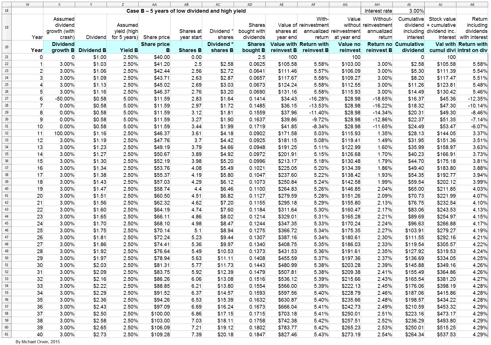
In the next chart, dividend growth is interrupted by a 50% drop and four years of stagnation (no growth), along with a doubling of the yield to reflect a lower valuation. Initially, reinvestment of the dividends is not as good as banking them with interest, but reinvestment outperforms fairly sharply when there’s a sudden recovery, with a year of 100% growth (which gets back to the highest dividend paid) followed by the resumption of constant growth (set at 3%).
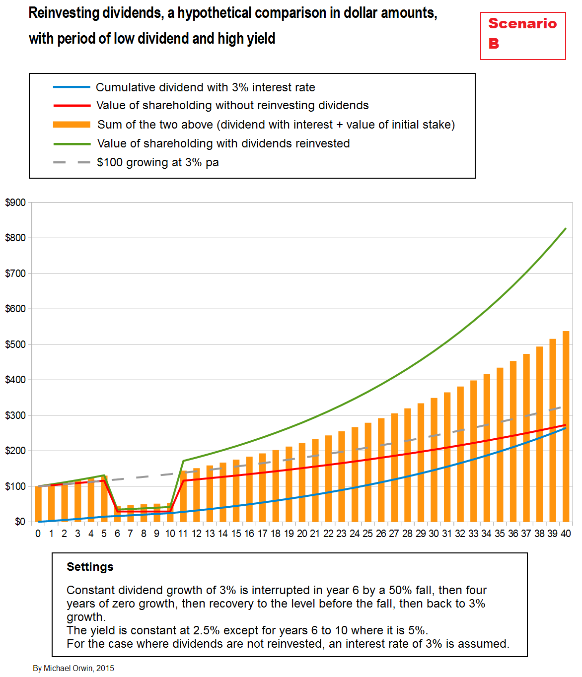
The next chart is like the previous except the yield is kept constant (at 2.5%, instead of jumping to 5% and falling back to 2.5%). The initial pain is not as bad (for any strategy, i.e. reinvesting or not), but the eventual gain is less than in the previous scenario, reaching $733.53 instead of $827.46 (on the initial $100, so the value has multiplied by 7.3x instead of 8.3x).

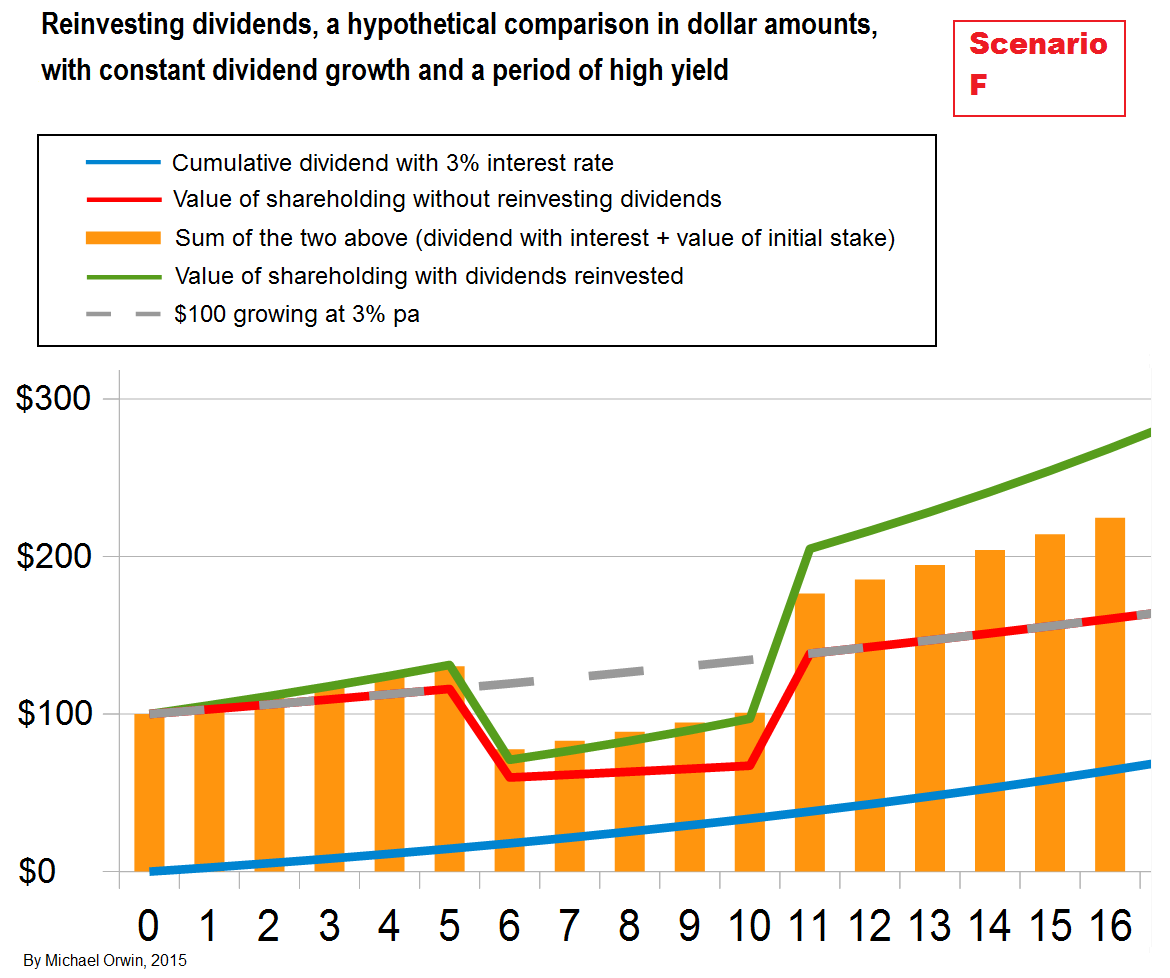
The best combination (of the yield and dividend growth settings) is when the yield doubles but the dividend keeps rising, for a value multiplication of 9.9 times. In the scenario, the share price pain of the higher yield is repayed as gain when dividends are reinvested:
The following table compares the results from reinvesting dividends in the main “five years different” scenarios, including scenario A where everything was held constant. See also “Comparing scenarios by value” below, for a chart.
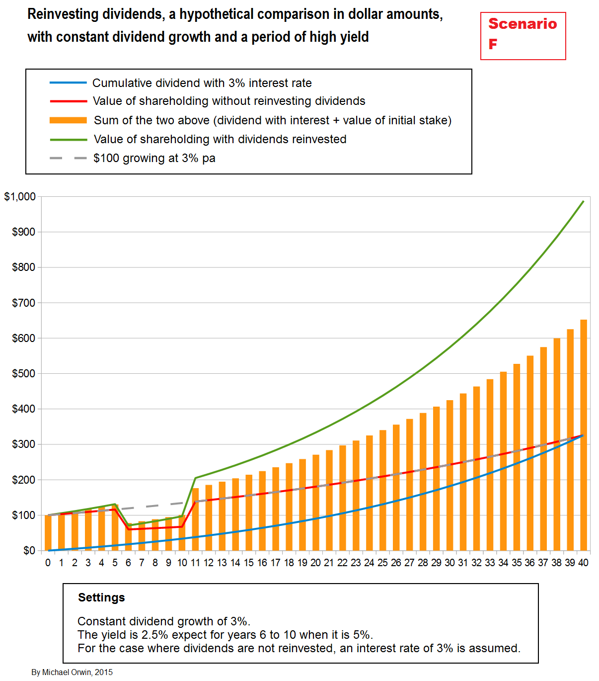
The next chart revisits scenario F, zooming in on the period where the yield doubled (dividend growth stayed constant). It gives a closer view of the initial drop in value, the faster growth while the yield is high, and the jump to permanently higher value when the yield reverts. The simple assumptions make the effect clear. The real world is more messy, but the effect has been noticed (and sometimes called the “bear protector”).
I haven’t finished with the ‘Five different years’ theme, but I need to see if the performance of dividend reinvestment in the charts above is anything special.
A period of high yield helps, but is it magic?
To investigate the performance boost to the dividend reinvestment strategy, provided by the five years of high yield in the previous two charts, I compare the performance to the effect of combining the yields (2.5% and 5%) and the dividend growth (of 3%). The result is the same, in my spreadsheet and from applying the formula for total return. To see that proved, you’ll need to make your own spreadsheet as well as follow the math, so skip the math if it doesn’t appeal.
This time before using the formula I’ll turn the percentages into decimals, so the 2.5% yield becomes 0.025 and the 3% dividend growth becomes 0.03.
Return = Yield + Dividend growth + (Yield * Dividend growth)
= 0.025 + 0.03 + 0.025 * 0.03
= 0.055 + 0.00075
= 0.05575
(a return of 5.575%)
The return compounded over 35 years will multiply value by:
(1 + Return)^35
= 1.05575^35
= 6.67787
(For anyone baffled by the “^” sign, the number on its right is the number of times you multiply the number on the left by itself, so 2^3 = 2*2*2 = 8.)
For a 5% yield and a dividend growth rate of 3%:
Return = Yield + Dividend growth + (Yield * Dividend growth)
= 0.05 + 0.03 + (0.05 * 0.03)
= 0.08 + 0.0015
= 0.0815
(a return of 8.15%)
The return compounded over 5 years will multiply value by:
(1 + Return)^5
= 1.0815^5
= 1.47956
Multiplying the two multiples together gives
6.67787 * 1.47956
= 9.88031
which agrees with the $988.03 on my spreadsheet for the scenario, in year 40. The scenarios start with $100, and the ratio $988.03/$100 = 9.8803 which is only very slightly out because of rounding. You can make out the number is close to $1,000 in the chart (before the zoomed-in version).
In other words, for the scenario, the gain from reinvesting dividends was just what you’d expect from the formula for total return based on yield and dividend growth. That doesn’t mean reinvesting dividends is bad – it doesn’t work magic, but it’s still an automatic way to capture a high yield when it becomes available.
For a simpler comparison I made a chart with the same period of high yield, but zero dividend growth, so only the yield needs to be considered.

After forty years of dividend reinvestment, $100 grows to $302.89, with a total return of 2.81% pa (slowly going down as the boost from the period of high yield has less effect on the percentage return).
The multiplier from 5 years at 5% is 1.05^5 = 1.27628.
The multiplier from 35 years at 2.5% is 1.025^35 = 2.37321.
The product of the multipliers is 3.02888.
The result 3.02888 rounds to 3.029, the same multiplier that grew $100 to $302.90 with dividend reinvestment. In simple terms, the gain produced by dividend reinvestment was exactly what you’d expect from the yield.
Back to “Five years different to normal”
The next chart is like scenario F (the previous two charts), except that instead of the five years of high yield being continuous, they are scattered irregularly. The end result is the same, with dividend reinvestment turning $100 into $988.03 after 40 years (the same as in the case where the high yield years were continuous).

To check that the benefit from a period of higher yield does not depend on sharp movements, instead of five years at 5% (double the usual 2.5%), I set the yield to increase in 0.5% steps to 5%, then step back down. That meant replacing four years of 5% with eight years with a numeric average of 3.75%, which is about half the increase (on average) for twice as long. The result after 40 years is only 46 cents different, with the ‘dividends reinvested’ value at $988.03, compared to $988.49 for five years at 5% yield. Note that while the ‘dividends reinvested’ value did not fall as sharply as the value of the initial shareholding, it very slightly underperformed banking the dividends on the way down. The marked outperformance came in the recovery, which took five years in the scenario.

The next chart is like scenario F but with the yield moving in the opposite direction, with five years at 1.25%, and a 2.5% yield for the previous five years and the following thirty years. With dividend growth still set at 3% throughout, the yield dropping by half translates to the share price doubling (plus an effect in the year from the 3% dividend growth). The value at the end is $823.76, less than for the constant-yield case (scenario A) which ends with $875.88. The share price joy when the yield went down would have been followed by disappointment when the yield went back up. It took thirteen years to overtake the peak value in the last year of the low-yield period, for dividend reinvestment and also for the “bank the dividend” case.

Apart from the pyschology, there’s a permanent relative loss in the scenario from the five years of reinvesting at the lower yield, with $823.76 worth of stock in year 40 compared to $875.88 in scenario A, where the yield stayed constant at 2.5%. The difference of $52.12 is 5.95% of the scenario A value, and the 5.95% relative loss applies indefinitely, starting in year 11 when the yield reverted (because the two scenarios have the same yield and dividend growth from then on). The relative loss is only about half as big as the relative gain in scenario F, when the yield doubled to 5% for five years. The relative gain in scenario F is $112.15 by year 40, or 12.80% of the scenario A value, and is 2.15 times as big as the relative loss in scenario G, or 115% bigger in percentage terms. Although the scenarios are hypothetical, the asymmetry is a theoretical point in favor of dividend reinvestment.
Year 10 would have been a good year to exit. If I ended the chart at year 10 it would have given a biased view of the performance of dividend reinvestment, at least without balance from a chart where the yield ended lower than at the start. The yield is the same at the start and the end in all my charts, but it’s worth bearing in mind that the difference between the yield at the time of purchase and any later year is a factor in the overall performance, although the effect from that difference in yield will diminish over time. If the yield drops by half for a given dividend and size of shareholding, the value of the shareholding doubles, but while that’s significant it’s not as significant as the multiplication in value which can occur over decades of holding. To see the effect of the start and end valuations being different, find a year in a chart where the valuation is different, and hide the chart up to that year or after that year.
Cycling the yield
In this section I set the yield to cycle, between 2% and 3%, which may seem like a small difference, but if the dividend stays the same, if the yield rises from 2% to 3%, then the share price drops by a third. To isolate the effect of the varying yield, I initially assumed zero dividend growth. I also set the interest rate to 2.5% so the return can be compared to the approximate average yield. (On a technical note, the geometric average would be more appropriate, but the difference is too small to matter on a chart. The geometric average of the peak and trough is obtained from the square root of 1.02 * 1.03, which equals 1.024988, giving a 2.4988% return, only 0.0012% different to 2.5%.)

The performance shown in the chart above is poor compared to previous charts, but that’s to be expected because I assumed no dividend growth. There’s no noticeable outperformance from reinvesting dividends over banking them at 2.5%. Obviously the relative performance depends on the assumed interest rate. There’s also no visually obvious reduction in volatility, with the green line looking just as variable as the red line.
The next chart is like the previous except I assume periods of dividend growth which alternate with periods of no growth. The dividend only grows when the yield is falling. Reinvestment outperforms banking the dividend, but I wouldn’t call it spectacular. Again the assumed dividend growth is not as good (on average or overall) as in most of the previous cases.

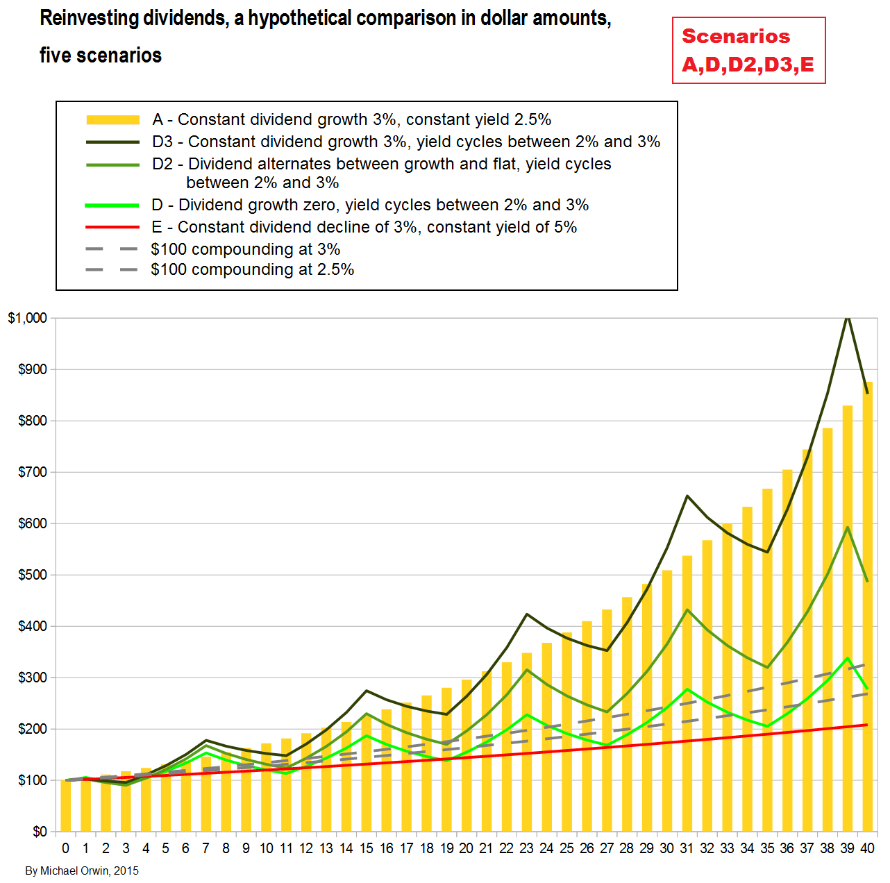
Next, in scenario D3 I set the dividend growth to a constant 3%, the same as in the first scenario, A. So in D3 the yield cycles between 2% and 3%, whereas in scenario A the yield was a constant 2.5%. The interest rates are different, at 2.5% for scenario D3 and 3% for scenario A, but that does not affect the result when dividends are reinvested. With dividends reinvested, there isn’t a big difference between the end result of the two scenarios, with A giving $875.88 and D3 giving $877.86. The scenarios are compared in a later chart.
The difference between A and D3 is a rather small $1.98. It’s mostly accounted for by the fact that in D3 (the scenario where the yield cycles), the numeric average yield is actually 2.5063%, slightly higher than the constant 2.5% yield in scenario A. By setting the yield for year 38 to 2.00% instead of 2.25%, the average yield in scenario D3 is brought down to 2.5% (to 7 decimal places, i.e. 2.5000000%), and the value at the end becomes $875.72, just 16 cents lower than the result without cycling in scenario A. It makes very little difference which year’s yield I reduce by 0.25% to get the average yield down to 2.5000000%, the result is always that D3 is 15 to 17 cents short of A. Making the version of scenario A where the yield cycles but has the same average, and starts and ends the same, has not increased the value accumulated by reinvesting the dividends.
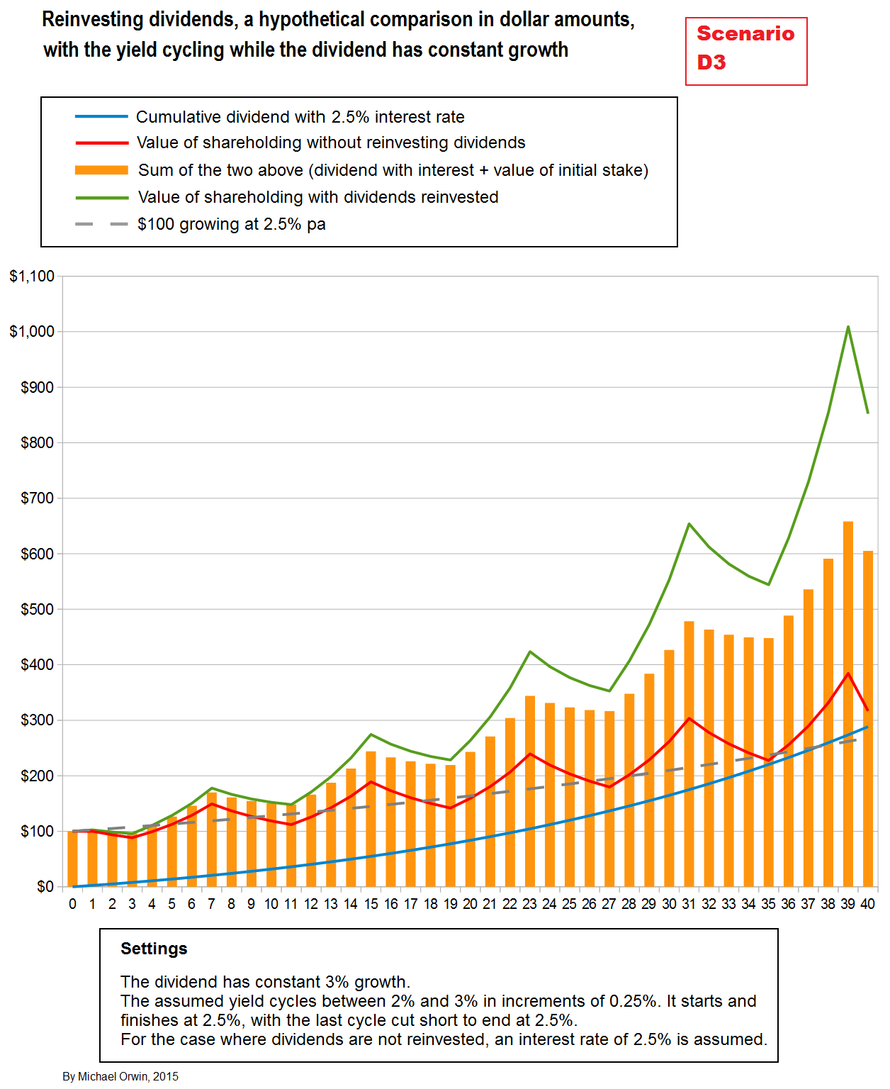
I also calculated the returns I’d expect from the yields and the 3% dividend growth, using the formula Return = Yield + Dividend growth + Yield * Dividend growth. The result was that compounding at the returns I calculated would multiply value by 8.778628, which agrees with scenario D3 on the spreadsheet, where $100 is turned into $877.86. It looks as if the order of the years’ returns makes no difference to the end results when dividends are reinvested, so long as the yield at the start isn’t changed and the yield at the end isn’t changed. In the scenario, yield variation by itself did not add to the value, though the average yield did.
The text from here to the next chart is fairly mathematical, and I’ll summarize it first for anyone who doesn’t want the detail. The summary is meant to be simple, but it’s at the cost of precision.
1) A return fluctuating around 2.5% gives less growth than a constant return of 2.5%. The principle holds for any return, e.g. a return fluctuating around 4% gives less growth than a constant return of 4%.
2) It follows that when dividends are reinvested, a yield fluctuating around 2.5% gives less growth than a constant yield of 2.5%.
3) Reinvesting the dividends is commonly supposed to benefit from fluctuations, because more shares are bought when they’re cheap and fewer are bought when they’re expensive.
4) It seems to follow that I’ve debunked a supposed benefit of dividend reinvestment.
5) That isn’t true, because of a subtle point. A yield that looks like it fluctuates around 3% probably isn’t in a meaningful way. If you say the average yield between 1% and 5% is 3%, you are applying the arithmetic mean, which is not appropriate to the situation.
6) Adding 3% is the same as multiplying by 1.03. If I call 1.03 the “yield factor” for 3%, then the appropriate average is the geometric average of the yield factors.
7) The result of dividend reinvestment always agrees with the geometric average of the yield factors. That needs more explanation –
Suppose dividend reinvestment tripled value over four years. If you calculate the geometric average of the yield factors and call the result “F”, then multiplying F by itself as in F*F*F*F would get you 3. There are four “F”s in the multiplication because there are four years, and the result “3” coresponds to tripling value.
8) The points above don’t seem to imply any benefit to dividend reinvestment from share price volatility. There is such a benefit – a period with a sufficiently high yield needs a longer period of low yield to undo the benefit, or a yield so low that it provides a good exit. I deal with that closer to the end.
Anyone who can’t follow my math or who thinks life’s too short can skip to the next chart.
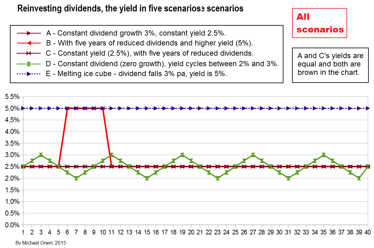
First I have to explain my term “numeric average yield”, which I’ll abbreviate to NAY. It’s just the arithmetic mean, so the NAY of 2%, 4% and 9% is (2+4+9)/3 = 15/3 =5%. I used the term “numeric” because at first I thought the arithmetic mean of the yield might be spurious, when applied to a sequence of years. You can make the calculation for any normal numbers (not all numbers, e.g. complex numbers), including pointless averages like the population of a city and the square root of 2. I now find the arithmetic mean of the yield to be useful, and further down I write about it usually being a close approximation of the real average. Maybe I should have changed the term to “arithmetic mean of the yield”, but “numeric” is in many of my charts and I didn’t want to spend yet more time on this. “Return” rather than “yield” has to be used when dividend growth is non-zero, and when dividend growth is zero, the yield is the return, apart from valuation effects from the yield changing. While I’m in confession mode, the scenario labelling does not give consecutive letters to similar scenarios. B, C, F and G are all “five years different” but I’d already made the D and E type charts before F and G.
Considering scenario F where the dividend growth was zero, the yield cycled through 2.50%, 2.75%, 3.00%, 2.75%, 2.50%, 2.25%, 2.00%, 2.25%, then back to 2.50% to repeat the cycle. The numeric average yield for a whole number of cycles will clearly be 2.50%, but that’s only an approximation of the annual return generated by dividend reinvestment. The multiplication in value from each cycle can be calculated from the product
1.025 * 1.0275 * 1.03 * 1.0275 * 1.025 * 1.0225 * 1.02 * 1.0225
(though for a stock’s yield you have to imagine a revaluation back to 2.50% at the end, to avoid the complication of a changing valuation).
I used yield factors (my term), turning 2.50% to 0.025 and adding 1 to get 1.025. The product of those eight numbers is 1.218359. Calculating the growth from the numeric average over eight years, 1.025^8 = 1.218402. Using the numeric average of the yields (plus 1), there’s a tiny bit more growth (0.000043) than from multiplying out the actual yields (plus 1). It’s the actual yields that are right. The numeric average is a good approximation for yields varying between 2% and 3%, even though a stock price of $100 at a 3% yield is worth $150 at a 2% yield (for the same dividend) which is quite a big difference. To show how the approximation is less accurate for bigger swings in the yield, consider a return alternating between 0.5% and 4.5% for eight years. The multiplication in value over the eight years can be calculated from the product
1.005 * 1.045 * 1.005 * 1.045 * 1.005 * 1.045 * 1.005 * 1.045
or more quickly by 1.005^4 * 1.045^4 = 1.020151 * 1.192519 = 1.216548
The numeric average return is 2.5%, and the effect of compounding at 2.5% over eight years has already been calculated as 1.218402. The variation around the numeric average has reduced the multiplication of value by 0.001854, which is more than previously (the reduction was only 0.000043), because the variation was bigger. Note that while I used the term “return”, the return equals the yield when dividends are reinvested and there is no dividend growth. I use the term “numeric average” because sometimes the average is meaningless, depending on the context, while any list of normal numbers can be averaged, such as a city’s population and the square root of 2. When I say “average”, I mean the arithmetic mean, as in 4 being the arithmetic mean of 2, 4 and 6.
The reinvestment of dividends is commonly supposed to benefit from variation in yields caused by variation of the stock price. My examples indicate that variation about the numeric average of the yield gives less multiplication of value than is the case if the yield stays constant at the numeric average.
There are two issues here. One is that the numeric average is only a close (usually) approximation of the average that really matters. It’s close if there are no very high yields, and if the valuation is the same at the start and end of the period the average covers. More important is the point that if the yield had less variation, there’s no guarantee that it would still vary about the same average. Or, a sequence of yields is what it is, and has the effect that it has, and while I decided averages were worth charting, it isn’t worth putting too much weight on the fact that the numeric average return is not achievable.
I’ll show that the geometric average of returns is a poor approximation of the effect of alternating returns, using the previous case of 0.5% and 4.5%. The geometric average of 0.5 and 4.5 is given by the square root of 0.5 * 4.5, which equals 1.5. Compounding by 1.5% over eight years multiplies value by 1.015^8 = 1.126493. That’s a poor approximation of the 1.216548 multiplier I calculated for the case, and the arithmetic mean of 2.5% gave a multiplier of 1.218402, a much closer approximation.
Taking instead the geometric average of the returns after adding 1, it equals the square root of 1.005 * 1.045, which equals 1.024805, and 1.024805^8 = 1.216548. That’s not an approximation, it agrees exactly with the calcultion for four years at 0.5% and four years at 4.5% (to 24 decimal places), and uses essentially the same method. In other words, outside of my spreadsheet (which simulates year-by-year), my calculations of the growth provided by various returns are calculations of the geometric average of the returns after adding 1, except that I omit the last step of taking the nth root, where n is the number of years. Therefore applying the geometric average will get the same result, and it seems pointless to look for an inferior average to use as a benchmark.
The numeric average return can be regarded as a good approximation of the geometric average return, with more error for larger variation. It’s used in some of my charts, because it helped to spot errors (one was found) and anomalies (none found), and also because I find it hard not to think of the average between 2% and 4% as being 3% (for example) when it’s really 2.995%. The numeric average return is always more than what you’ll actually get from a sequence of returns. I can’t prove that but I could explain it. There’s nothing wrong with using the arithmetic mean to average returns across stocks, rather than across time, and that applies commonly to yields. $100 worth of stock yielding 2% will pay $2 in dividends, and $200 worth of stock yielding 4% will pay $8 in dividends, for a total of $10 in dividends, giving a joint yield of $10/$300 or 3.3333%, which is what you’d get from the arithmetic mean of the yields, weighted by the value of the shareholdings.
In a further attempt to see if variation in the yield can produce an extra benefit from dividend reinvestment, I made another chart, with the usual yield of 2.5% shooting up to 10% every six years, with no dividend growth. I set the assumed interest rate to 3.7135% (after rounding). The growth at 3.7135% is shown with a dashed line. It’s the rate which gives the same growth over six years as five years at 2.5% followed by one year at 10%. On the chart, the value with dividends reinvested only occasionally catches up to the dashed line. That’s the result of having the years with the low yield first, and the year with the high yield at the end (of each six year cycle). If the cycle is shifted so the first yield spike is in year one (a year after buying), then the value of the holding with dividends reinvested stays ahead except for the spike years.
The usual scenario chart is followed by a chart showing relative performance.
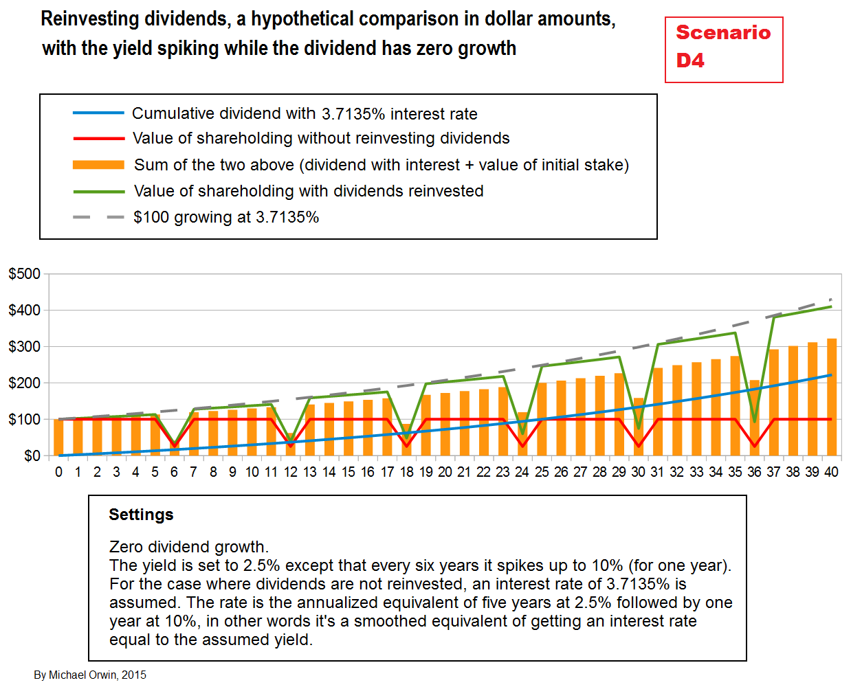

In the chart of relative performance above, the blue line represents the banked dividends, and the red line represents the value of the initial shareholding, and both are relative to the notional value of $100 growing at the numeric average yield. The blue line and the red line add up to the orange bars which represent the value of the “bank the dividends” policy, again relative to the numeric average yield. The general decline of the orange bars shows that the policy significantly underperformed the numeric average return. As expected, the dividend reinvestment policy only drifted slightly below the numeric average return (comparing the value produced by each) when the yield was the same as at the start. It follows that the dividend reinvestment policy beat banking the dividends in the scenario (except in the yield-spike years).
The lower part of the chart shows that apart from the peaks, the result of dividend reinvestment increasingly underperforms the numeric average return, but only slightly (1.301% in total, not pa) over 40 years. It would be more accurate to say that the numeric average increasingly over-estimated the performance from reinvesting dividends, though not by much.
The numeric average return is a notional quantity, and it includes the benefit of a high yield without the volatility that results when the yield goes up due to a share price drop. It’s different for the dividend reinvestment policy, which is subject to that volatility. That’s why in the yield-spike scenario, the relative performance of dividend reinvestment has the big dips, and the same applies to the red line for the initial shareholding, and the orange bars which include the red line values (with volatility reducing as the banked cash grows).
There was a conundrum that puzzled me for a while. Dividend reinvestment did not beat 3.7135% pa, the return for dividend reinvestment over each cycle. The rate was assumed for the interest rate in the “bank it” policy. The “bank it” policy includes the initial stake, the value of which underperformed 3.7135% pa. The underperformance of the initial stake explains why “bank it” underperformed 3.7135% pa, even though that’s the interest rate assumed for banked dividends. The problem is, the dividend reinvestment policy also includes the initial stake, the value of which underperforms in exactly the same way, so how does dividend reinvestment beat banking the dividends? The answer must be that the return on the reinvested dividends is higher than 3.7135% pa, by enough to make the joint return (on the whole thing) 3.7135% pa. In other words, the red line applies to dividend reinvestment just as much as to banking the dividends, and if dividend reinvestment had the equivalent of the blue line (for everything except the initial stake), it would beat the blue line.
I show that with two charts, for D4 ‘normal’ and D4 relative to growth from the numeric average return. They’re without the usual chart paraphenalia. The dark blue line is the green line minus the red line, and it tracks the value of only the shares bought with dividends (or their relative value in the second chart). The distance of the light blue line under the dark blue line represents the underperformance of banking the dividends compared to reinvesting them, and it’s the same distance as between the orange bars and the green line. The orange bars and the green line both include the value of the original purchase, while the light and dark blue lines do not.
The significant result is that the return from reinvesting the dividends was greater than the return from banking them (excluding the initial purchase). Because the assumed interest rate was set equal to the return over a six year yield cycle (or a whole number of them), the return from reinvesting the dividends must have been greater than the return over a six year yield cycle. That provides some compensation for buying at an above average valuation (a below average yield), and given the uncertainty of future yields it’s a reason to be cautious about stopping dividend reinvestment when valuations are above average (though it’s hard to quantify that without backtesting with real data).
Those are the only two charts with a line for the value of shares bought with dividends, because my charts have enough lines in them and readers can mentally note the difference between a green line and a red line when they want to.


Variations on scenario D4 include starting in a yield spike, and the yield spiking down instead of up. Starting in a yield spike is excellent for both dividend reinvestment and banking the dividend, with no major change in how much the first beats the second. If the yield spikes down to a quarter of 2.5% (which is 0.625%) instead of up to 10%, then outside of the spikes, banking the dividends increasingly outperforms reinvesting them, by 34% at year 40. Still outside of the spikes, banking the dividends for 3% interest doesn’t quite beat earning 3% on the initial $100, because the shares bought at the initial purchase don’t increase in value.
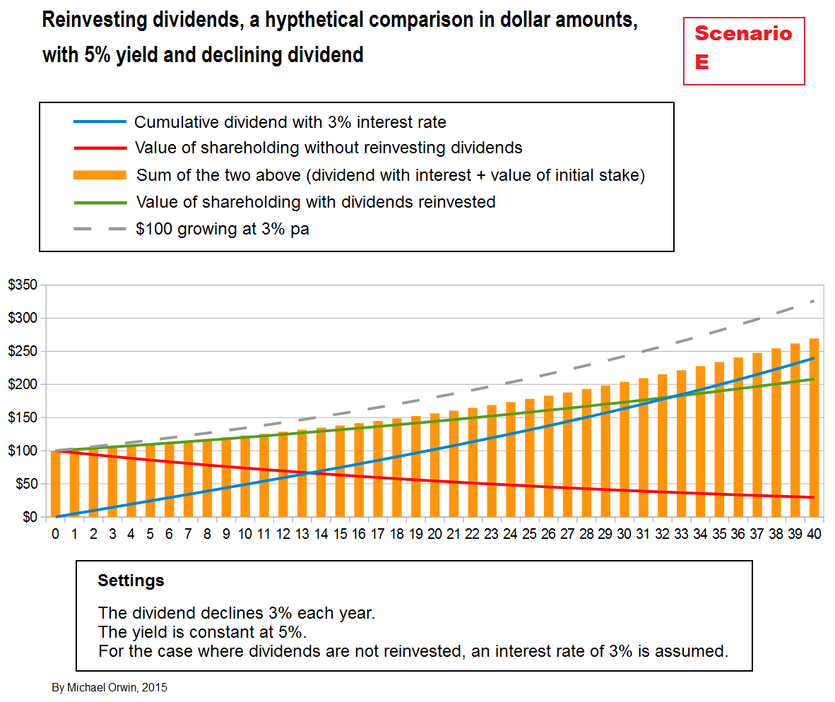
A melting ice cube
The last scenario represents a “melting ice cube” investment, with a falling dividend. The assumed yield makes it overpriced, and therefore a poor investment. With dividends reinvested, the end value is over $200 but the total return stays under the dashed line representing growth at 3% pa. It also underperforms banking the dividend with a 3% interest rate.
A chart for the melting ice cube that only showed the red and green lines could give the impression that reinvesting the dividend had rescued a poor investment, at least until the low growth was spotted and the opportunity cost noticed. The orange bars show there was no rescue, though of course they depend on an assumed interest rate. The orange bars track the green line closely when the interest rate is set to 1.9%, which means that given the assumptions, the investment plus the reinvestment of dividends is as good as banking them when the interest rate is that low (ignoring the risk of holding stock).
Sensitivity
Now you’ve seen a few charts, I’ll comment on sensitivity, though for brevity it’s quite sketchy. Whenever an amount is compounded over forty years the result will be a multiple of the initial amount and sensitive to the rate of compounding. My formal analysis of sensitivity is very limited and I can’t generalize from it. My subjective impression is that the overall picture is not sensitive to the details. The effect of the yield being higher for a few years is generally recognizable for a small change or a big change, for three years or six years, so long as the effect is not obscured by a bigger change in the dividend. The return generated will of course depend very much on how much higher the yield is, and for how long.
If I set the rate of dividend growth in scenario A to 3.1% instead of 3%, the value with reinvestment grows to $910.54, compared to $875.88 at 3%. That’s a 3.96% increase in the result, from a growth rate 0.1% higher. Compounding 0.1% pa over forty years amounts to an increase of 4.08%. The ratio of the two percentages is 3.96% / 4.08%, which equals 0.97, and it seems like a reasonable measure of sensitivity. I wouldn’t call the sensitivy high if it’s less than 1.0. It’s possible to generalize the ratio into a definition of “dividend growth rate sensitivity”, but my attempt had too many words. In any case, if you calculate sensitivity the way I did, it’s specific to a scenario, and I can only say that at least one scenario has a dividend growth rate sensitivity (as I’ve described it) that is less than one. The effect on the “bank the dividends” strategy is an increase from $652.41 to $671.89, a 2.99% increase.
At 3% dividend growth, the outperformance factor of dividend reinvestment was $875.88/$652.41 = 1.3425 or 34.25% (over the 40 years, subject to the scenario assumptions). At 3.1% dividend growth, the outperformance was 1.3552 or 35.52%. The outperformance factor increased by 0.0127.
The outperformance in terms of dollars added increased by $15.18, from $223.47 (at 3%) to $238.65 (at 3.1%). Calculated as a percentage of the original investment of $100, that’s a 15.18% extra increase. Annualized over 40 years, it’s an extra 0.354% pa. To put that into one sentence, adding 0.1% to the rate of dividend growth increased the gain from reinvesting dividends by the equivalent of 0.354% pa on the original investment. The second rate is 3.54 times the first, and the ratio is a measure of the sensitivity of the scenario’s reinvestment advantage to changing the divdend growth rate. Unfortunately the ratio is specific to the scenario and the small change I tested. A comprehensive sensitivity analysis would probably make an article by itself and be full of math.
Comparing scenarios by value
The previous charts compared reinvesting the dividends to the result of banking with an assumed interest rate. This section compares the value generated by dividend reinvestment in different scenarios. I don’t include every scenario, because there are so many, and scenarios with 10% yield or dividend growth will obviously be much better than the others.
The first chart combines a selection of the “five years different” scenarios, along with the first case represented by yellow bars, where yield and dividend growth are held constant at 2.5% and 3%. The only scenario which beats the ‘constant’ case is F, which is similar except for the higher yield (5%) for five years. During the period of higher yield, the share price was lower and in a real situation shareholders might not have been confident that the pain would result in gain.
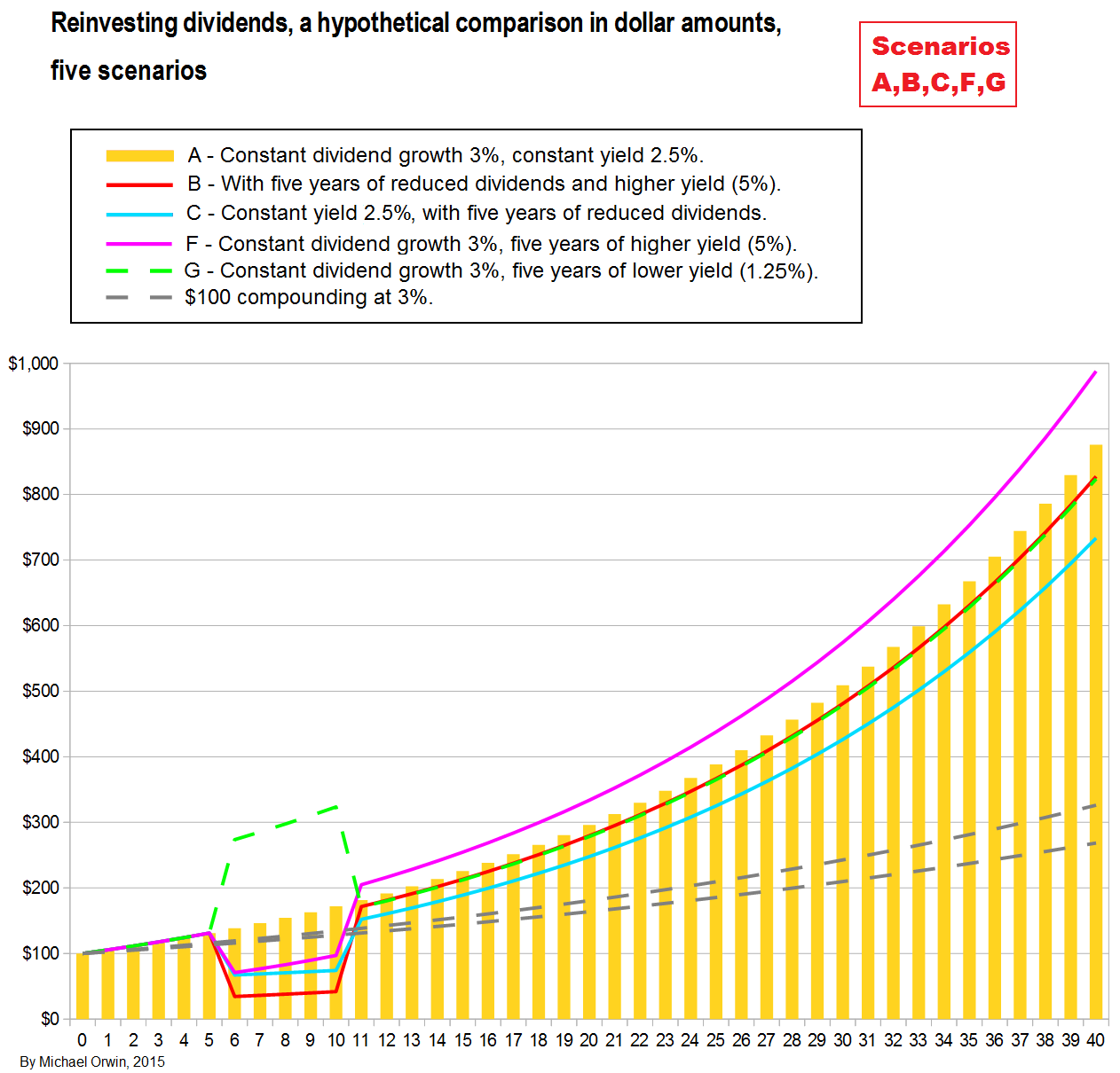
I’ve included the ‘melting ice cube’ with the cyclical yield cases, but it’s quite different and the fact that it’s the worst performer doesn’t mean much. You can see that the best cyclical-yield case does not beat the constant “yellow bar” case (it slightly underperforms, as described earlier). They have the same dividend growth and the cyclical-yield case had a very slightly higher average yield (by the arithmetic mean).
Comparing scenarios by return
The returns charted here are cumulative, meaning that in year 9 (for example), the growth from year 0 to year 9 is annualized, meaning the equivalent Compound Annual Growth Rate (CAGR) was calculated and charted.


The next chart shows the effect of a spreadsheet error – it did not include dividend growth (of 3%) for year 1 over year 0, and it happens to show the effect of temporary below average performance on a usually steady performance. The annualized return for scenario A is no longer constant, which shows as the yellow bars rising towards the level in the previous chart but never quite reaching it. It’s hard to see any difference for the other scenarios.

Asymmetry
I’ll describe an asymmetry which theoretically favors dividend reinvestment, but I doubt that it has much effect in practice. A share price can double, or it can half. It can go up by 110%, but it can’t go down by 110%. The second of those is an absolute mathematical asymmetry (there are non-mathematical asymmetries, such as the lack of upwards equivalents of flash-crashes). When I compared a case where the yield varied, to a case where the yield was constant and equal to the average yield of the varying case, there was an implicit but false assumption that any below average yield was just as likely as the yield the same distance above average. That may be true for small variations, but there are cases where it obviously breaks down. A yield can move from 1% to 3% more easily than it can move from 1% to -1%, which if it means anything would mean the company raising cash from its shareholders. The change from 2% yield to 3.9% is big. The change from 2% to 0.1% is the same numerically (1.9%, in the other direction), but the effect is massive, at least if the dividend doesn’t plummet. For the same dividend, if the yield falls from 2% to 0.1%, the share price must have multiplied twenty times, a rise of 1900%. The clue I saw to the asymmetry was that for a normal yield of 2.5%, the long term benefit from five years of 5% yield looked bigger than the long term loss from five years of 1.25% yield (comparing scenarios F, G and A – see the chart under “Comparing scenarios by value”, above).
The next chart includes five years of 5% yield, five years of 1.25% yield, and a yield of 2.5% the rest of the time.

From year 21, after the periods of higher and lower yield, the performance of dividend reinvestment in the scenario is between two dotted lines representing scenarios A and F. The performance is better than for A, where the yield was held constant at 2.5%. It’s not as good as F, which had the period of higher yield and no period of lower yield. Dividend growth was the same in all the scenarios on the chart, and so was the interest rate although it’s not relevant to the comparisons made here.
I thought, how low would the yield have to go in the low-yield period to cancel the benefit of the high yield period. The answer is 0.06%. That’s so low that without the dividend plummeting the share price shoots off into bubble territory, sending the value of the shareholding off the scale.
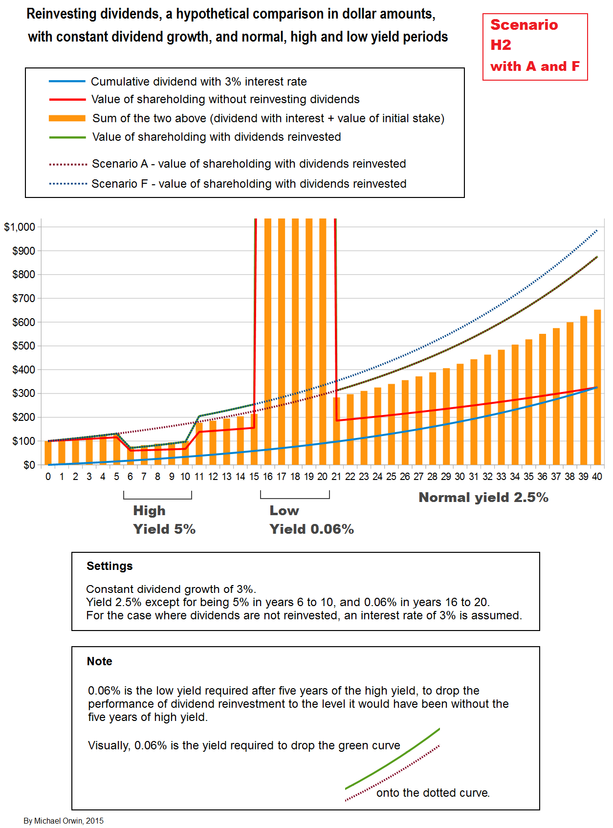
Here I’ve rescaled the chart so you can see how the bubble dwarfs the rest of it.
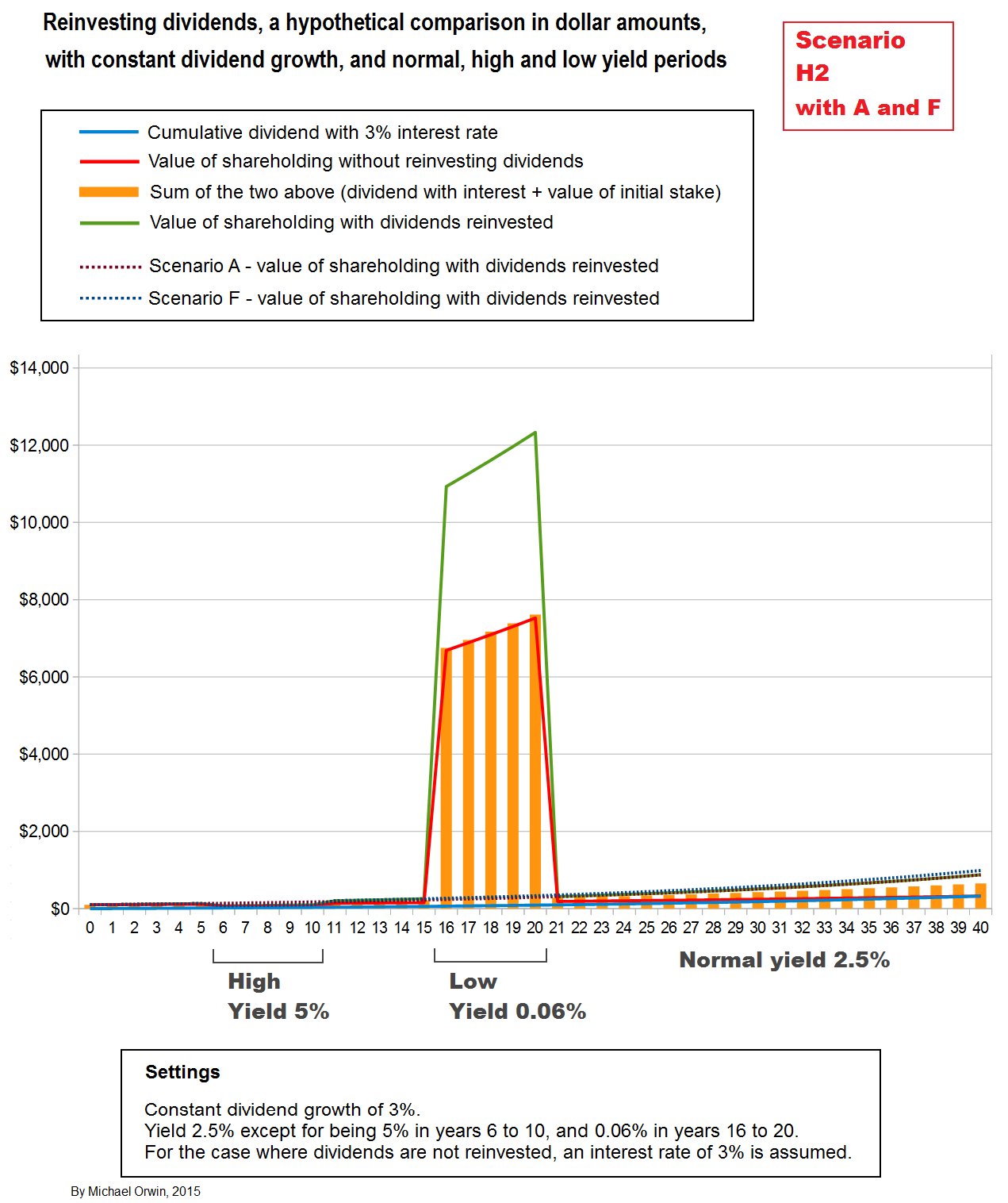
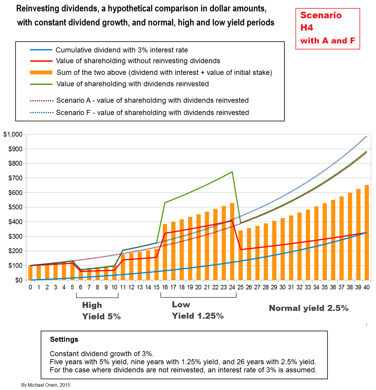
So after benefitting from 5 years of high yield, the dividend reinvestment policy only loses the benefit through 5 years of low yield if the policy is continued through an enormous bubble. That’s given the assumptions, crucially that the dividend continues to grow, or at least not fall. The chart for scenario H6 below shows the effect of slowing dividend growth. I’d say the benefit of the first period of high yield is mostly retained for several years, showing some resilience to dividend growth slowing.
I also checked how many years of the 1.25% yield would be required to erode the benefit of five years at 5%. The answer is ten. After nine years the end value is $884.73, after ten years it’s $873.94, and for the “base case” scenario A it was $875.88, which is only $1.94 more than the ten-years-at-1.25% case. The next chart shows that nine years is not quite enough to erode all the benefit.
The next chart is for the same scenario, with everything compared to the growth you’d get from the numeric average return (NAR, although I put ANR in the graphics). The year 9 average is based on the yield and dividend growth up to and including year 9 (and it’s like that for any year). NAR isn’t affected by the valuation at the year it’s calculated for, and the green line for dividend reinvestment has big moves which reflect changing valuation (i.e. yield). Otherwise, dividend reinvestment drifts slowly below what you’d get from the unobtainable NAR rate. The more steep the decline of the dashed line for 3% growth, the better NAR is outperforming it, and that’s also true for dividend reinvestment apart from valuation shifts.

The next chart shows the effect of repeating five years of 5% yield followed by five years of 1.25% yield.

The end result after the periods of variation from 2.5%, is as good as for scenario F, which had one five year period with high yield (5%), and no periods with the low yield. For the performance relative to NAR –
The results here indicate that theoretically, the dividend reinvestment policy benefits investors when the yield varies, if the variation is big enough for the natural asymmetry of share prices and yields to have an effect. It depends on dividend growth being reasonable, and in extreme cases it depends on abandoning the policy in a bubble. I had to say “indicate” because none of this counts as mathematical proof. I said “theoretically” because of some work I’ve done with real world data for a version of dollar cost averaging, which showed that while it reduced risk, it did not increase gain.
With the result of dividend reinvestment never being quite as good as from the (unobtainable) numeric average return, and exactly as good as the geometric average, the only remaining possible benefit to gain (rather than reducing risk) from the policy seems to be that if there’s a period of sufficiently high yield, the performance can only be undone in a period the same length by a yield so low that it’s improbable and would provide an excellent exit, or by a longer period of low but less extreme yield (assuming the low yield is from a high share price and not from a lower dividend).
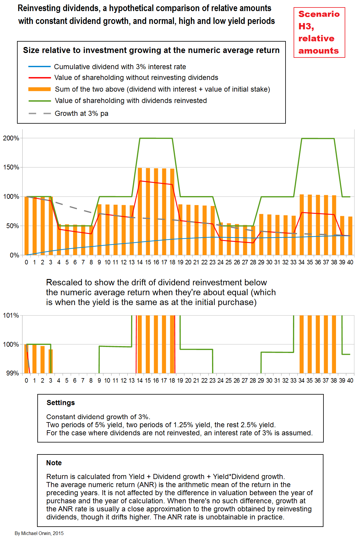
The next scenario, H5, is like H3 (with the repetition) except for having zero dividend growth. If the yield had stayed constant at 2.5%, the value with dividends reinvested would have followed the same path as the dashed line, which represents $100 growing at 2.5% pa. The case “constant 2.5% yield, zero dividend growth” for dividend reinvestment would follow the same line. The outperformance is represented by the distance of the green line above the dashed line. Though fairly minor, the outperformance is entirely due to the variation of the yield from 2.5%, while reinvesting dividends. There is a smaller outperformance over the orange bars, which represent banking the dividends with 3% interest. The variation in yield from 2.5% has allowed that outperformance, even though the assumed interest rate on the banked dividends is greater than the average yield.

The return with dividend reinvestment measured at year 40 is 2.80% pa, below the numeric average of the yield which is 2.8125% pa. What matters is not that value compounded at a rate slightly less than the numeric average yield, but that it’s relatively hard to lose the gain made in the high yield years so long as the dividend holds up, as described previously (mentioning bubbles, good exits, and a longer period of low yield).
In scenarios H3 and H5 the yield went high and low twice. So far I haven’t varied the dividend growth much, so the last scenario is a variation on those with the same yield, but dividend growth starts at 6% and declines 1% every five years, starting at year 4. The first half is relatively more feasible, with a higher rate of dividend growth and the yield volatile but going down, resulting in faster growth in the value of the shareholding. In the second half, the falling yield repeats while the dividend growth has slowed and becomes negative near the end, and the combination is less realistic.

In the “relative” chart next, the dashed line for growth at 3% turns up near the end, showing (indirectly) that dividend reinvestment underperformed 3% growth (while the dashed line is increasing). That’s the result of dividend growth hitting zero and turning negative, with the yield not high enough to keep the return above 3%. The dashed line is not affected by swings in valuation, but it’s lower the higher the yield and dividend growth are.

In the following table I calculated the growth predicted by the formula “Return = Yield + Dividend growth + Yield*Dividend growth”. It agreed with the spreadsheet simulation result for year 40 with dividends reinvested.

Charting the inputs
In the two charts below I haven’t matched the inputs to every scenario they were used in (and “All scenarios” is out of date after charting new ones).
The dividends are simply the result of the growth rates I set, and the $1 assumed for the initial dividend (per share).

The yields are set directly.
Spreadsheet tables and formulas
I usually show all my work, but in this case there are many tables and they’re quite repetitive, so I only show scenarios A and B.
I have instructions for how to make your own table, in “Recreate a dividend reinvestment spreadsheet table“. I might have tried too hard to make them idiot-proof. Anyway, you can copy and paste the headings and formulas which should save some work. When you have a table it isn’t hard to change the inputs or make copies. The instructions are for the tables as shown below, which don’t include the relative charts or $100 growing at 3% (as used for dashed lines).

The formula-view images don’t show all the rows, but formulas in the rows not shown can be predicted from the pattern.


Asymmetry and dollar cost averaging
I said above that my results indicate an asymmetry which benefits dividend reinvestment, in theory, because a good enough period for buying can’t be undone by a bad period for buying of the same length, no matter how bad it is (“good” here means cheap, and “bad” means too expensive). I can describe that more easily for dollar cost averaging, though the price swings are meant to illustrate the principle rather than look realistic.
Suppose a stock had averaged $10 in a sideways market, and an investor started buying $100 worth every month.
If in the first month the price was $9, the investor would get 11.1111 shares.
If in the second month the price was $11, the investor would get 9.0909 shares.
The investor would have acquired 20.202 shares, and would only have acquired 20 at the average price, which represents a gain of about 1%. That isn’t much, and a 10% cheaper purchase in one month could be undone by a more expensive purchase the next month.
Suppose the stock price fell to $4. The investor buys 25 shares, saving $6 on each share compared to the average price (assuming the real value is at least $10 per share). That’s a total saving of $6 * 25 = $150. Next month the price shoots up to $1,000 and the investor buys 0.1 shares. The average price paid for the two months is $200 / (25 + 0.1) = $200 / 25.1 = $7.9681. No matter how expensive the stock was in the next month, the benefit of paying a fixed amount at the much cheaper price cannot be undone by a higher price the next month. Also, such a way-above-average price would usually provide a good exit.
If the price was $20 for the next two months, the purchases would be for 5 shares, twice. The average price over the three months would be $300 / (25 + 5 + 5) = $300/30 = $10. The one very good month for buying could be undone by two quite bad months for buying, On the face of it that represents an asymmetry in favor of dollar cost averaging, but my work with real data found that while dollar cost averaging reduced risk, there was no systemic gain.
Dollar cost averaging with real data
A linked piece below (find “by Gregg S. Fisher”) is about a study which showed that dollar cost averaging did not beat investing a lump sum at the start of the periods studied. That’s hardly surprising, given the general growth of stock prices (as the author acknowledges), and it will generally be more true the longer the period being studied. To take an extreme case, a lump sum invested in 1900 would clearly be worth more now than if the amount was spread out over all the years since. There’s some similarity between dollar cost averaging and reinvesting dividends, but one difference is that dividends are not available the moment you buy the stock, so comparing dividend reinvestment to a lump sum at the start is not as reasonable as for some cases of dollar cost averaging. None of that is meant as a criticism of Fisher’s work.
I’ve done my own research, but to show it I’d need permission from parties who own or show the data, which I don’t have. I compared annual investment to investing every ten years, with ten series of “every ten years” investment, starting at different years. I call those series 10yr0, 10yr1 etc. up to 10yr9, with 10yr0 starting in the first year, 10yr1 starting in the second year, etc. Annual investment had a performance very close to the average for the ten year series. In a similar exercise comparing monthly investment to twelve series of annual investment with different start months, covering January 2000 to October 2015, there was a tiny underperformance of 0.11% by monthly investment when the amounts were fixed. Assuming the amount invested grew at 0.4074% per month (equivalent to 5% per year), there was 0.11% outperformance for monthly investment. Both the 0.11%s were for the entire period (not per year). I saw no evidence of a systematic gain from dollar cost averaging generated by price fluctuations. My source was multpl.com/s-p-500-historical-prices/table/by-month, and they give the sources Standard & Poor’s and Robert Shiller and his book Irrational Exuberance for historic S&P 500 prices, and historic CPIs.
By giving an average performance, more frequent investment reduced risk. Some “every ten years” schemes were hit by making an investment shortly before the crash of 1929, while schemes that missed that and invested at the low prices that followed accumulated stock faster. In my opinion my result can be generalized to say that frequent regular investment reduces timing risk, and can be regarded as a time based version of diversification.
I prefer to give more detail of my methods when I can, and it’s reasonable if a reader does not give much weight to work only seen by myself.
The four step journey
In order of discovery:
1) Dividend reinvestment doesn’t beat the average return, which suggests there’s no benefit from variation about the average yield.
The performance of dividend reinvestment in all the scenarios I tested did not beat what you’d expect from the annual return for each year, calculated by:
Return = Yield + Dividend growth + Yield*Dividend growth
It did not beat the geometric average of the years’ returns, and could not because the same mathematical steps are used to calculate the effect of compounding the annual returns, and to calculate the geometric average return.
The performance of dividend reinvestment very slightly underperformed what you’d have got from the arithmetic mean of the returns (which I’ve called “numeric average return”). It seems more accurate to say that the arithmetic mean is usually a close approximation of the geometric average for the kind of numbers you see for annual returns, though if there’s any variation in the series being averaged, the arithmetic mean will always be higher.
Note that my scenarios all finished at the same yield (i.e. valuation) they started at. When that’s not the case, you’d need to multiply by a revaluation factor before getting the average (before division for the arithmetic mean, or taking the root for the geometric mean).
2) If the yield goes high enough, the benefit from the period of high yield can’t be undone by a low yield during a period the same length, no matter how low the yield is.
The asymmetry suggest that point 1) is not a limiting as it seems, and dividend reinvestment could turn market fluctuations into gain, at least in theory. The asymmetry was confirmed in hypothetical scenarios. Plus, if the dividend holds up, a very low yield is likely to indicate a good exit point.
3) Dollar cost averaging does not increase gain.
At least that’s the conclusion from my own study.
4) The result for dollar cost averaging is likely to apply to dividend reinvestment.
To average the dollar cost of investing, you need the frequency and dollar amount of the investments to be independent of the market price. Although the dividend sets the amount to be invested and is also likely to affect the market price, the market price does not necessarily affect the dividend. The market price could affect the dividend for a company which buys back its own stock when it’s cheap, instead of raising the dividend, but in such cases there will be less variation in the stock price and therefore less scope for stock price variation to be a source of gain for dividend reinvestment.
When the dividend is not affected by the market price, dividend reinvestment is sufficiently similar to dollar cost averaging that I don’t expect it to turn market fluctuations into gain.
The average cost for dividend reinvestment will be a weighted average, but that’s likely for any real scheme of dollar cost averaging if the period is long enough, because it won’t usually make sense to keep investing the same dollar amount indefinitely. My tests of DCA included applying a growth rate to the amount invested, which also makes the average cost a weighted average.
It looks like real-world data has destroyed a theoretical advantage for dividend reinvestment. There could be a risk-adjusted gain, through reducing the risk of bad timing. There are other considerations for dividend reinvestment.
Tentative opinion
For some stocks, for some shareholders, in some periods, it may be worth turning off the DRIP (Dividend Reinvestment Plans, see the links below). When the market is far above the usual valuation, most stocks are likely to be overvalued, and saving dividends to deploy when stocks are better value is worth considering. By avoiding reinvestment when valuations are high (scenario G), shareholders keep the advantage of reinvestment when valuations are low (scenario F).
Reasons to be tentative
I don’t blame anyone for prefering an automatic system. Maybe the worst mistakes are made by investors who excercise judgement frequently.
I don’t want anyone to sell or turn off DRIPs just because the word “bubble” is being used. Apparantly some analysts were calling a bubble in the early 1990s (see Forbes), when the real bubble didn’t peak until 2000.
DRIPs save paying broker fees.
Valuations and CAPE
To be a little more blunt, investing when valuations are high means buying less business for your money, with less sales, earnings, cash flow and dividend per dollar. One metric for the valuation of markets is CAPE, the Cyclically Adjusted Price Earnings ratio. It’s reason for existing is that earnings can be cyclicaly high as well as the PE being high. multpl.com chart the Shiller PE ratio from 1881. I have not found the long term average on the site. You can calculate it yourself or check gurufocus or Wikipedia (I calculated a mean of 16.63, and median of 16.16, using annual data plus an October 2015 value).
The use of CAPE (aka “Shiller p/e”) has been attacked for comparing recent earnings with earnings from long ago, which are not comparable due to changing accounting rules, for example. See “In defence of the Shiller p/e” by Buttonwood, May 18th 2011 (economist.com).
Instead of comparing the current CAPE to the very long term average, I prefer to compare to the average CAPE over the latest 60 years (which is based on 70 years of earnings data). I’m guessing that the risk of the 60 year average reverting to the long term mean is less than the risk of the long term mean being out of date. My use of the sixty year average could be seen as a compromise between the conventional use of CAPE and the criticism that today’s earnings can’t be compared to very old earnings. I calculated CAPE/(60 year average) to be 1.28 on October 16, 2015, compared to 1.50 for CAPE/(long term average) calculated for the same date using data going back to 1871. I used data from multpl.com, and they give as sources Standard & Poor’s, and Robert Shiller and his book Irrational Exuberance (Amazon).
Using CAPE to see when markets are at unusually high valuations and discontinuing reinvestment while that’s the case does not mean an investor has to become a day-trader.
It’s easier to give an opinion based on the market valuation than for the valuation of a company.
Warren Buffett’s wonderful stocks
Warren Buffett has spoken about his preference for quality stocks, with an economic moat. Apparently it took some time for Charlie Munger to convince him that a wonderful business at a fair price was better than a fair business at a wonderful price. His experience with Disney, which performed excellently after Buffett sold the stock for a good profit, affected his views about selling (see “Warren Buffett’s $12 Billion Disney Mistake” June 6, 2014 (joshuakennon.com). The advice I’ve seen from Buffett about selling wonderful stocks is only to sell them when they stop being wonderful, with no mention of valuation. It raises the question for anyone who doesn’t like disagreeing with Buffett, if you shouldn’t sell such a stock, should you stop reinvesting dividends.
Selection bias
You can’t research dividend reinvestment for long without finding the chart showing how well it worked for Coca Cola stock. Or Pepsico. I had to go looking for this PDF – “Overview of BuyDIRECT A Direct Purchase and Dividend Reinvestment Plan for the Common Stock of Lehman Brothers Holdings Inc.“. It’s not worth reading, it’s just evidence that dividend reinvestment was available for a stock that zeroed, and presumably some people used the service.
Charts for dividend reinvestment in a major index like the S&P 500 don’t have selection bias, so long as the period is representative, which is more likely the further back it goes.
Links
“What is a Dividend Reinvestment Plan?” by Jared Cummans, Feb 25, 2015 (dividend.com)
“DRIPs 101: A Guide to Dividend Reinvestment Plans” by Michael Flannelly, Dec 19, 2014 (dividend.com). It includes a link “A Brief History of Dividend Tax Rates”.
“lowest cost DRIPs” (dripadvice.com) A list of them.
“Reinvesting dividends in a taxable account” (bogleheads.org)
“Why Dividend Reinvestment Is One of the Smartest Investing Moves You Can Make” by Matthew Frankel (fool.com). There’s a chart from about 1996 up to August 2015, for the effect of reinvesting dividends in Realty Income Corporation (NYSE:O). The piece is ‘pro-DRIP’, but points out disadvantages, and gives a short explanation of the lower tax rate paid on reinvested dividends.
“Reinvesting Dividends vs. Not Reinvesting Dividends: A 50-Year Case Study of Coca-Cola Stock” (joshuakennon.com). The author justifies ignoring tax, saying that investors can now use Roth IRAs.
Investopedia’s “The Perks Of Dividend Reinvestment Plans” says it’s a misconception that you don’t pay tax on reinvested dividends, but they don’t mention Roth IRAs. (I can’t advise about US tax and investors need to be sure about it.)
Tweedy Browne’s Papers and Speeches page has PDFs, including “The High Dividend Yield Return Advantage”, which has a chart showing the effect of reinvesting dividends from 1900 to 2000, for the US and the UK. There’s also a chart showing that dividend growth and total return outpaced inflation and valuation expansion, 1800 to 2000.
“Warren Buffett Does A Beautiful Job Of Explaining Dividends, And Why Berkshire Isn’t Paying One” by Sam Ro, March 1, 2013 (businessinsider.com). It links to the relevant letter to shareholders and has a full quote from it.
“Does Dollar Cost Averaging Make Sense?” by Gregg S. Fisher, Oct 3, 2011 (forbes.com). DCA reduces risk but makes less profit than investing a single lump sum, because stocks generally go up, over a long enough period, so on average the sooner you’re in, the better.
The (Any) Stock Reinvestment and Dollar Cost Averaging Calculator! – The calculator only needs a stock ticker and a start date, although you can set the initial amount and the end date if you don’t like the defaults. It’s easy to use, but it only went back as far as 1981 on the tickers I tried. There’s a warning about sticking to American stocks because it doesn’t cover splits. It gives the current value and the annualized return, but it doesn’t say how well the stock performed without reinvestment. It’s hard to avoid survivor bias if you just think of ticker symbols to enter.
You can value stocks in 1970 by looking at all the dividends paid since then. Such valuations did not justify the wild swings seen in stock prices. See”Bob Shiller’s Nobel” October 15, 2013 (johnhcochrane.blogspot.co.uk). Robert Shiller did the research, and he also developed CAPE, which is often refered to as “Shiller’s PE”, although smoothing out cyclical earnings goes back at least as far as Benjamin Graham. The article soon gets technical and mathematical, but it eases up a bit and has conclusions like the uncertainty of future dividends is about right for accounting for the volatility of yields, and high valuations usually predict low future returns.
Wikipedia’s entry for Robert J. Shiller includes his record of well timed warnings about over-exuberant markets.
Bringing together earnings, dividends and share buybacks, “A New-and-Improved Shiller CAPE: Solving the Dividend Payout Ratio Problem” March 22, 2015 (philosophicaleconomics.com). The author thought CAPE needed to be adjusted for the dividend payout ratio, because dividends are an alternative to investment, which grows earnings, but further work showed the adjustment was not needed. It’s a serious piece of work that gives a good understanding of CAPE, but without algebra and it’s easier to follow than academic papers. One conclusion is that markets are expensive and therefore returns are likely to be low. Plenty of investors would agree, without knowing all this stuff, for example value investors who can’t find enough stocks with a margin of safety.
The subject isn’t directly relevant, but the methods are, in “Beer before Steel: Ranking 30 Industries by Fundamental Equity Performance, 1933 to 2015” September 27, 2015 (philosophicaleconomics.com). The author needed to separate performance into fundamental progress and the change in valuation between the start and end of the period considered. In my hypothetical cases, I could simply set the same valuation at either end. The author adds dividend growth and the yield, whereas I also added the product of the two. The author does that for an index, monthly, and I’ve checked that monthly calculation gives nearly all of the effect of including the “Yield * Dividend growth” product. Then 1 is added to the return, to calculate an index for each month with the formula 1 + yield + dividend growth.
From Business Insider but on Yahoo, “Market history is calling, and it’s saying stock performance will be crappy for another ~10 years” by Henry Blodget, October 4, 2015 (yahoo.com)
Robert Mattei used hypothetical scenarios to show the effect of dividend reinvestment before I did, in “When To Stop Reinvesting Dividends And When To Sell” May 28, 2015 (seekingalpha.com). At present the author’s warning looks well timed. The piece is very different to this one.
There are more links at the bottom of my piece “The effect of valuation on long term total return” (find “Further reading”). They are mostly about the effect of yield on total return, with some more specifically about dividend reinvestment, and nothing about CAPE or the current state of the market. (The piece is shorter than this, has no charts and a lot of arithmetic.)
That’s all, thank you for reading this.
DISCLAIMER: Your investment is your responsibility. It is your responsibility to check all material facts before making an investment decision. All investments involve different degrees of risk. You should be aware of your risk tolerance level and financial situations at all times. Furthermore, you should read all transaction confirmations, monthly, and year-end statements. Read any and all prospectuses carefully before making any investment decisions. You are free at all times to accept or reject all investment recommendations made by the author of this blog. All Advice on this blog is subject to market risk and may result in the entire loss of the reader’s investment. Please understand that any losses are attributed to market forces beyond the control or prediction of the author. As you know, a recommendation, which you are free to accept or reject, is not a guarantee for the successful performance of an investment.
