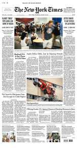
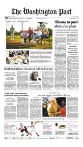
The grid is the building block of newspaper design. It helps ensure that all the pages look like they belong in the same newspaper, that the text appears in a readable width and not one big blob, and it allows the advertising department to sell ads in the same basic units.
The Journal now is based on a five-column grid. You can see what I mean on the right. Many newspaper designers and editors prefer a six-column grid, because it allows for more flexibility, especially in the display of photographs.
Most of the Top 10 best-designed newspapers in the world as determined by the Society of News Design are now using a six-column grid, although not all of them. We’ve asked Gayle to use a six-column grid as a starting point for our redesign.
Here are the SND Top 10 award winners from earlier this year:
- Los Angeles Times
- Times of Oman
- Washington Post
- National Post
- New York Times
- Politiken
- La Presse
- Boston Globe
- i
- The Virginian-Pilot
Courtesy of the Newseum’s daily collection of front pages from around the world, here are the front pages of some of those newspapers from Aug. 18 so you can see what they look like.


Is our paper any skinnier than those other papers? Do we have as much space to work with? That would be the only concern.
Otherwise, it’s a helluva good idea to study what the best are doing and adopt it for our purposes.
Of these paper, the Globe looks the cleanest, the easiest to comprehend.
LaPresse has an interesting idea, using the front page essentially as a magazine cover, but given how right our news hole is, I’d say the Globe notion of running more copy on front is the better idea. It’s also what our readers are used to, and a big part of what we sell is the tradition of the paper, the way our news has always been presented, so La Presse looks like too radical a departure for me.
Our paper is actually wider than several others, including the National Post — take a look sometime when you have both of them in front of you. La Presse is not the only publication to use a “menu”-style front page. The Gazette in Montreal and the Winnipeg Free Press, among others, do so. The Newseum has a daily look at the front pages of newspapers around the world — you can see some of the interesting and sometimes strange variations on front-page design.
It might be a fun change to flow the text around the photo – like in the Virginian Pilot – once in a blue moon.
Ron
Would we be locked into a six column grid for the fronts if six is chosen for the paper? Being able to switch between five and six columns for the fronts allows the designer to better play the art.
Is the gutter remaining the same width? More white space would be nice.
Yes, there’s always an opportunity to modify the layout of A1 in various circumstances. If you look at today’s front page of the New York Times, for instance (at the Newseum’s “Today’s front pages” section), you’ll see that one portion of the page is on a four-column grid with the rest on six columns. However, I’d like us to stick to a six-column laydown as much as possible.