Oct
Tips
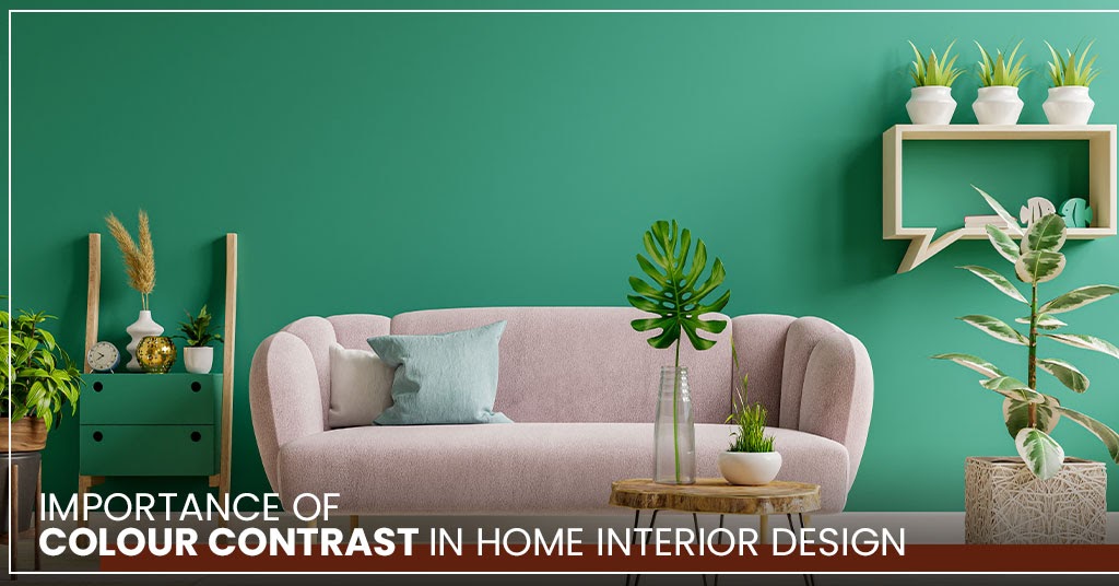
Importance of Colour Contrast in Home Interior Design
Some house interior colours make your breath catch when you first see the theme cause the colours are so spectacular and fit together. While seeming to be empty, like something is amiss.
The secret behind it? Contrast.
Contrast is an important element while planning to paint. It is a way of creating visual impact and gives a focal dimension to the interior and is one of the most efficient and successful ways to break up monotony and dullness.
Let your dream come true if you’ve finally decided to paint contrasting colours for the living room or to your home’s interior design feature! The challenging part is choosing which colour combinations would work the best for your house in Sydney.
The simplest way to do this is to pick one colour and then pick the other colours that will contrast well with it. You can create your own colour combinations, however, the following examples may help you decide.
Keep reading to discover how you can apply contrasting colour techniques in your interior paint colours.
1. Contrasting Light and Dark Colours

These primary colours, when implemented correctly, can add a significant dose of visual appeal to the living room while also connecting it all together. The strongest impact can be created by choosing colours from opposite ends of the colour wheel as two colour combinations for the living room. Black and white will never go out of style. If you prefer a more colourful look for your Sydney home, choices like blue and orange or purple and yellow could be used. Doing this will provide a soothing background for your contrasting colours to stand out.
2. Contrasting Cool and Warm Colours

The concept of warm and cool colours has been explored for ages. Regardless, the general idea is that red, orange, and yellow are warm colours, while green, blue, and magenta are cold colours.
The reds, oranges, yellows, and off-whites when used have all the qualities of warmth, in that they are bright and appealing, which yearn for warmth. Cool browns and greys, as well as cool off whites when used, have all of the qualities of coolness in their ability to soothe the eyes.
While our hearts want warmth, our minds yearn for coldness in order to perform at their best, contrasting these two colour combinations for the living room or any other room in your Sydney house works best when put together.
3. Contrasting Complementary Colors

Complimentary paint colours like red and green, yellow and purple and blue and orange are perfect combinations for your Sydney home’s interior.
If you’re not used to strong colours, complementary interior paint colours might be overwhelming. The trick is to know how to put them in the right amounts and combinations, and you’ll be pleased with how many fascinating combinations you can turn up with. These colours are bold and energetic, and contrary to common perception, they may also act as gorgeous home decor.
Must be interested in: 5 Quaint Ideas For Your Living Room
4. Contrasting Triadic Color Schemes

Instead of combining three or more colours that are next to each other on the colour wheel, you’ll choose three colours that are evenly spaced and use them to decorate the living room of your Sydney home.
These colours will give a harmonious appearance. Without the slightly ombre or monochrome, it will be a lot more dynamic and vivid. Because of the strong contrast, triadic palettes are actually incredibly striking paint colours for the living room.
When it comes to using contrast colours in your Sydney home, balance is key to success. Contrast is created by finding the proper contrasting colour combinations. It’s just as important to add contrast to your home’s interior as it is to buy paint or furniture. The stunning impression that the contrast effect creates is well worth the cost.
Exclusiveness is created by contrasting the house interior colour. But when done incorrectly, it may be edgy, dangerous, and reflect pretentiousness. The overall style should be balanced, but with some uniqueness. Thank you for reading!