

Take Control of Your Hyphenation
Hyphenated words are a necessary evil in most typesetting, especially in narrow columns in print. The downside is that they can reduce readability, in particular if there are many consecutive hyphens. But the upside is that hyphenation can create better looking, tighter rags in non-aligned margins, as well as to help achieve more even letter spacing in justified text by having more control over rags, making for a more pleasing appearance.
Hyphenation is one of the many typographic details that tend to be overlooked by designers and production artists who might take for granted that their software will handle these details in a professional manner. But while today’s design software is quite robust in their capacity to fine-tune type, it is up to the user to determine if, when, and how much to hyphenate, and to set the software preferences to behave accordingly. So how can one know when and how many hyphens to allow, and how to control this feature? Read on, as it the guidelines differ for print and digital media.

Narrow columns with no hyphenation can cause unsightly deep indents (left). A few well-placed hyphens can even out the rag (right).
Hyphenation in Print
Paying close attention to hyphenation in print is important, as they are a fixed entity that can be controlled and tweaked, unlike on the web where line endings can change for each viewer. Given that hyphenation settings are somewhat of a personal preference and sometimes a professional style, it is generally considered acceptable to have two consecutive hyphenated lines in a row, but no more. This is because it reduces readability by making the eye-to-brain translation work harder. In addition, try not to have too many hyphenated line endings in a paragraph, even if they are not in successive rows, as this too will affect readability. Another suggested rule of thumb is that it is typographically undesirable to have two-letter hyphenation breaks at either the beginning or the end of a word, and thus a line.

When hyphenation is necessary within narrow columns to improve a bad rag (left), using the default Hyphenation settings can result in too many consecutive hyphens, as well as undesirable two-letter breaks (center). Customizing the settings for a more conservative outcome will usually result in a better looking, more even rag (right).
Some people (designers and clients alike) dislike hyphenation and avoid it entirely. I caution against this all-or-nothing perspective, as the occasional hyphen in a mostly unhyphenated text can make a big improvement. For instance, wide columns can often go without hyphenations except for the occasional manually inserted hyphen to fix a bad rag here and there. In addition, setting text that contains numerous long words (such as medical or pharmaceutical copy), as well as text set in foreign languages with very long words (such as German), can result in a rag that is extremely deep and unattractive; in these instances, the addition of the occasional manually-inserted hyphen can improve the rag, making for a cleaner, neater appearance.
When setting copy with very long words, any width column can result in distracting, deep indent (upper). It only took one manual hyphen to improve this text block (lower).
Setting Up Your Hyphenation Preferences
Today’s design software allows you to customize the hyphenation settings to your liking. But if you don’t explore this option, you are stuck with the defaults, surrendering control of your type to your software.
The two main applications that are used by designers to set type for print are Adobe InDesign and Illustrator, both of which have controls for hyphenation that are located in the Hyphenation or the H&J panel. The default settings usually allow two-letter hyphenations (a no-no IMHO), as well as anywhere from three to unlimited consecutive hyphenations. This is an overly generous setting for most text, as it can result in reduced readability. At the bare minimum, I recommend changing the default settings to allow a minimum of three-letter hyphenations, and no more than two in a row. In addition, it is a good practice to deselect Hyphenate Capitalized Words, Last Words, and Across Columns, all of which can result in some unattractive and undesirable word breaks if left selected. (D)
InDesign’s Hyphenation Settings Panel has several other options to help you control your type. If you don’t want short words hyphenated, you can increase the ‘Words with at Least’ option to your liking. Hyphenation Zone and Hyphenation Slider are two other settings you can play around with to adjust the location and quantity of hyphenations. I confess I do not alter these settings, preferring to manually adjust rags in order to have complete control. But for large projects with lots of text and multiple pages, you might want to explore them to help automate your software to achieve the best results with the least amount of manual fine-tuning.

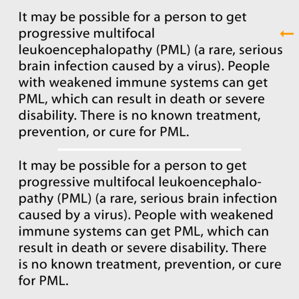
The default hyphenation settings in InDesign are shown on the left, with my suggest settings to its right.

The default hyphenation settings in Illustrator are shown on the left, with my suggest settings to its right.
When manually hyphenating a word within text, it is advisable to use a discretionary hyphen rather than a standard hyphen. A discretionary hyphen is visible when a word is hyphenated at the end of the line, but disappears if the text reflows and the word in which it’s placed no longer needs to break, eliminating the need for the hyphenation. This way you will avoid those nasty hyphenated words unexpectedly appearing in the middle of a line. Discretionary hyphens can be accessed in InDesign by choosing Type > Insert Special Character > Hyphens and Dashes > Discretionary Hyphen; or, by pressing Command+Shift +hyphen/Ctrl+Shift+hyphen.
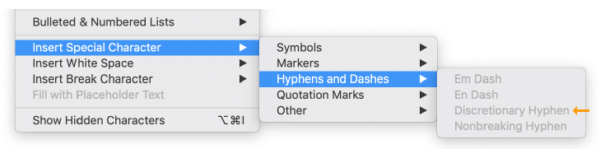
Discretionary hyphens are available in InDesign, and can be found under the dropdown menu under Type, towards the bottom of the column.
If tweaking your Hyphenation settings doesn’t generate the results you want, try manually re-breaking the troublesome lines. If necessary (and if ethically possible), edit your copy (or have your editor do this) to achieve a better flow. If your layout allows, sometimes adjusting the width of the column ever so slightly will result in fewer breaks.
Hyphenation on the Web and Digital Media
Currently, most web browsers as well as the CSS and HTML standards applied to them do not support hyphenation. While it is true that some very current versions will support the automatic insertion of hyphens to break a line, most users (especially non-designers) do not have or use these versions, so it is safest to assume lines will break after a full word. The problem with this is in a narrow column, as well as with text set using very large words, there will be more line breaks than usual, reducing readability.
In order to minimize disturbing deep indents, I recommend adding a word space before and after both en and em dashes (but not hyphens) that appear in text. This way, the browser can insert line breaks at those spaces as needed to improve the rag, which would not happen without the added word spaces.
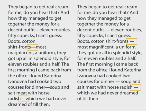
When setting text for the web or other dynamic (changeable) media, it is a good idea to add word spaces around hyphens to provide the option of more word breaks. If this is not done, one can wind up with deep, unattractive, and very distracting line breaks (left). The added spaces will improve potential bad rags (right).
When type appears in any digital media (often referred to as dynamic, meaning the type and images can change size and appearance, as opposed to fixed, as in printed media), including web CSMs (content management systems such as WordPress), blogs, e-books, apps and kinetic type, do your research first to find out if hyphenation is an option, and if so, set the preferences to whatever the job and your personal preferences call for.
More Resources To Master Type and Typography
CreativePro Week is the essential HOW-TO conference for creative professionals who design, create, or edit in Adobe InDesign, Photoshop, Illustrator, Acrobat, and Microsoft PowerPoint.
Featuring over 30 expert speakers and 75 sessions and tutorials, CreativePro Week offers five days of in-depth training and inspiration, all in one place. No matter your skill level, you’ll learn techniques and best practices you can start using immediately to improve your productivity.
Members get a special discount on registration! Sign up today.