As with all entertainment or media entities, its graphic identity creates immediate visual recognition with its audience while distinguishing it from competitors. Whether it’s the motion graphics preceding movies or merely the production company’s logo, the brand identity expresses the history, philosophies, and/or personality of the company and its work. Clearly communicating what Indievisual represents would involve an exploration in to exisiting identities, selecting the direction appropriate for Indieviesual, and most importantly going through the process of establishing what is Indievisual’s philosophy, attitude, and character in order to create the graphic which identifies it. Working with a limited (that is to say non-existent) budget there were a few challenges to overcome. Ironically, my graphic design background led me on a roundabout journey toward the final solution.
One of the most exciting projects for a graphic designer is creating a complete identity package for a client. Conceptualizing then realizing a identifying mark used across the client’s sphere of activities is one of the pinnacle challenges in graphic communication. How does a single mark or iconography sum up everything about a particular entity? Setting this as the starting point of the initial research, I began looking into existing logos. Because Indievisual is a magazine dealing with the Japanese independent film industry, examples were first drawn from entertainment companies.
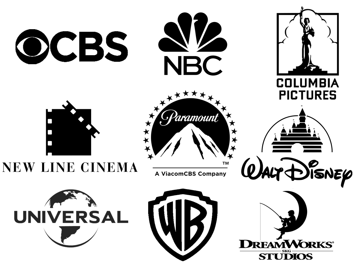
These companies have come to be known by their single mark alone through which their productions also become synonymous. They are succint in their imagery and clear in their branding. There are icons which, even without the associated words, can still identify the company such as the CBS “eye”, NBC “peacock”, the Columbia Pictures “maiden” (for lack of a better word), New Line’s “film frame,” or the Paramount “mountain and stars.” Some, however, do have distinct typography as well. The Disney script or the “WB” of the Warner Bros. shield are unmistakable and non-replicable, while Universal’s letters are an element of their overall globe logo. Dreamwork’s young boy fishing on the moon is a strong symbol, but so is the logotype which is featured prominently in the motion logo attached to its productions. This combination of logomark and typography became the initial direction I sought to take for Indievisual’s identity as an iconographic representation seemed appropriate for Indievisual. There certainly was a strong image from which to begin: Japan’s red circle represented in its flag. Film reels are round as well. So exploration began into how to represent Japanese independent cinema in pictographic form.
I dived in further into independent film organizations and production companies.
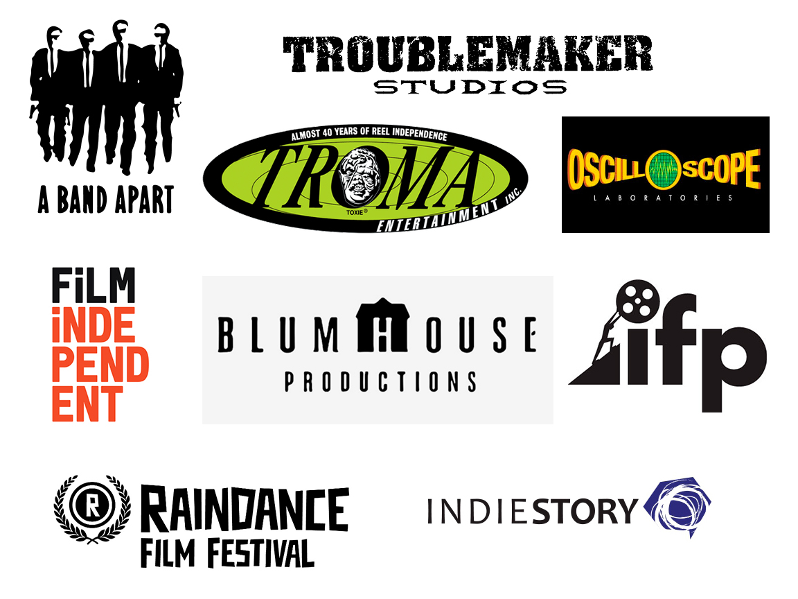
What can be gleaned by these is the defiant “attitude” and independent spirit these entities proudly communicate through their logos. Distressed lettertype, hand drawn imagery or typeface, or unconventional typesetting and layout highlight their less corporate, less commercial brand. But not always.
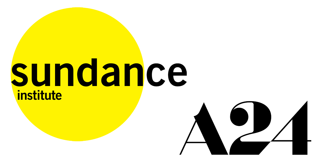
Some institutions and companies must still project a certain degree of professionalism and business reputability. Researching these variations in branding obviously led to further considerations about the proper direction to take Indievisual’s identity. Conceptual ideas began to take shape in my mind and the next logical phase was to begin drawing sketches. Fortunately, I came to an important realization before I actually began spending time doing so. I referenced entertainment companies because that is the topic or industry Indievisual covers, but I had not researched the very thing Indievisual actually is: a publication.
So, I went back and looked at the mastheads of newspapers and magazines, both well-established news outlets as well as entertainment magazines. Relying solely on a specific or customized typeface without (in most cases) iconography, the mastheads concentrate squarely on the letters to create brand recognition, simultaneously relaying both the publication’s identity and ethos.
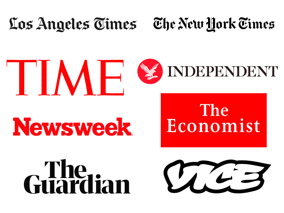
Newspapers such as the The Los Angeles Times and the New York Times with their deep history in print reporting continue to communicate this through the calligraphic Blackletter style typeface of their masthead. There is tradition and presitige in these letterforms just like the Roman square capitals of Time and The Independent. Meanwhile, The Economist typeface is not as classical but relies on an old-style serif which is no less traditional. Serifs are important to express a professionalism and seriousness that enhances their brand’s image of trustworthiness. More modern updates to this style include thicker slab-serifs as in Newsweek or the customized modern serif of The Guardian. Each express a history associated with printed, typeset publishing. Newer media outlets such as Vice, can project their “youth” through their untraditional, script-style typeface. Its similiarities to street art is by no means unintentional. Vice aims to prove they are breaking the bounds of traditional reporting and this attitude is well represented by their masthead.
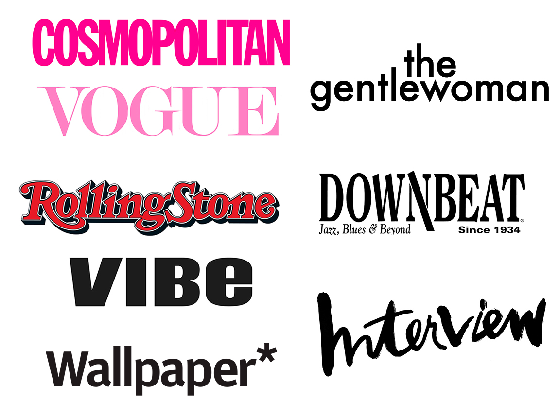
In fashion and music publications we see this holds true as well. Each of the mastheads and their typefaces are reflective of the publication’s history, values, and the audience to whom they appeal. Some have undergone redesigns in order to shift toward changing trends or audience tastes, but most will not stray too far from their familiar image without signficant editorial and/or ownership upheavals.
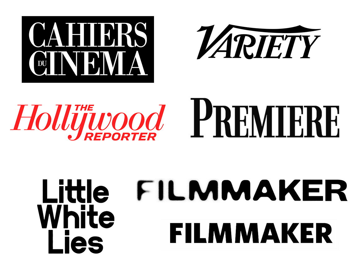
Naturally, we’ll find the same in entertainment publications. Well-established publications are obvious, not just in name but in their masthead typefaces, while in contrast magazines with a focus on independent film topics do the opposite, and in the case of Filmmaker magazine encompasses the breadth of filmmaking possibilities from the raw and unusual to solidly polished creations. But this, too, is a recent rebranding from their previous logo which utilized a customized block sans-serif. The difference in identity is stark. The new masthead seems to reflect a stronger individualistic spirit.
The research convinced me an iconographic logo was not necessary. Indievisual’s identity, as with other publications, should be expressed through typography. Moreover, I was able to identify that Indievisual’s character, topic, or intent should not be represented by classic calligraphic or roman square typefaces, rather it should be represented by typefaces leaning to modern styles seen in publications with a bit less tradition and an idiosyncratic spirit. And while modern serifs and sans-serifs would certainly be appropriate, I wondered what the extreme could be. I recalled the early days of music magazine Raygun and art director David Carson’s treatment of the masthead. They were unorthodox, visually distressed, and at times varied from cover to cover depending on the cover story. But this seemed too excessive and frankly outdated. Then I remembered Lagom magazine.
Lagom is a lifestyle magazine for creatives which unfortunately is indefinitely on hold. Nevertheless, Lagom‘s masthead is a beautiful cursive script typeface that is at once elegant and bold. The shapes and flares communicate a human touch, a handcraftmanship I felt essential when attempting to represent independent cinema. Among the many examples I researched, Lagom‘s stood out as being quite unique and memorable which is the measure of success for any logo or masthead.
Lagom‘s masthead demonstrated a publication did not need to rely on serif or san-serif typefaces. The most important aspect the typeface must convey is the character, ethos, and topics the publication aims to address. As long as these are represented, the appropriate typeface can defy norms.
I was tempted to immediately begin searching for typefaces, but bearing in mind the masthead needs to be representative of the publication’s character, I first needed to think about keywords which represent Indievisual. Obviously “independent” or “indie” is one pair. Others include “hand craftsmanship” as stated earlier, “cinephilia,” “film buff,” “individualistic,” “professionalism,” “propagandize,” “provocateur,” “self-run,” “personal,” “humanize,” “supporter,” “seek,” “aesthetic,” and “expressive.”
There are obviously some overlap among a few of the words, but the exercise forced me to truly think about what Indievisual will do, what it represents, and the principles that would guide its activities and therefore also form its image. As a collection of individual words, there were several directions which could be taken. However, coelscing them into a statement aided in summarizing this set of wide-ranging ideas. Essentially, I found they could be boiled down the following statement:
“A personal endeavor of a movie buff to humanize filmmakers and call attention to their individualistic works through a rebellious spirit but professional manner.”
Armed with this general statement, the search began for typefaces which could characterize this phrase and/or keywords. In Part 2, I will go over this process and cover the choice of final candidates as well as the reasons for deciding on the typeface utilized in the current masthead.
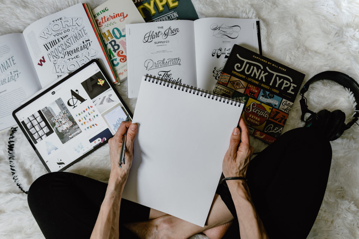
(Feature Image by Kelly Sikkema on Unsplash)