How To Effectively Debug CSS

Nelson Michael is a frontend developer and technical writer from Nigeria who enjoys building stuff and sharing what he knows through writing.
Published on

Finding and fixing bugs is part of our job as developers, so we must find a solution no matter how difficult the task seems. However, we could avoid many of these issues if we had a firm grasp of the tool or programming language we were using.
While CSS may appear to be innocuous at first glance, the relationship between the developer and the tool can quickly turn sour if you fail to learn and understand it correctly. This can result in you going back and forth and feeling frustrated as you work with it.
This article will explore some fundamental CSS concepts to help you know what to look for when you encounter CSS bugs and avoid some common errors entirely. Here's what we'll cover:
- Handling markup
- Understanding the CSS cascade, specificity, and inheritance
- Parent-child relationship
- Position
- Absolute vs Relative units
- Why the !Important rule can do more harm than good
- Media queries
- Debugging environments (Chrome dev tools)
- Tips and tricks
Great, let’s get right to it.
Handling Markup
Many developers fail to recognize HTML as a possible cause of a CSS bug, and as a result, they frequently overlook it and waste time looking for the wrong problem. While HTML is very forgiving, it can sometimes be the source of a common CSS issue, such as a misspelled class name or ID selector, which can take hours to fix. Let's take a look at some common problems with our markup and how to fix them:
- Misspelled Class or ID selectors: One of the most common errors in our markup is having selector names misspelled, and this is one of the first things to look out for; misspelled selectors mean we have styles that don't apply to any element on the page; this can be fixed by simply ensuring selectors have the exact spelling in our markup and stylesheet.
Let’s look at an example:
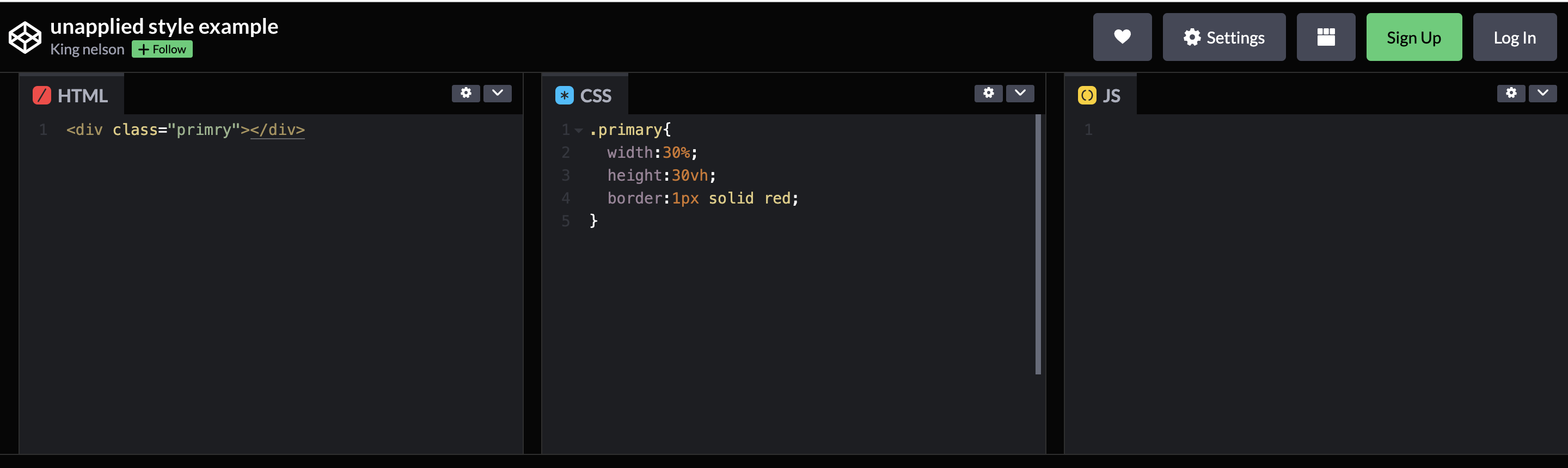
Have a look at the CodePen above, notice the class name on the div element is spelled as "primry" while the selector on the stylesheet is spelled correctly as "primary" this means our element would not have any styles applied to it. This error can be avoided by simply cross-checking our class or ID selector names.
- Decluttering Markup with Semantic HTML: One advantage of using Semantic HTML is that it cleans up our markup; instead of having div tags all over the place, we can use specific semantic tags that convey meaning. Because our stylesheets typically follow the same hierarchy as our markup, it makes sense to make them readable; this aids styling by providing a clear visual hierarchy to adhere to.
Furthermore, a cleaner codebase reduces the likelihood of bugs.
Understanding the CSS Cascade, Specificity, and Inheritance
Like any other programming tool or language, CSS has its own set of rules or guidelines that teach you how it works; understanding it may help you prevent a bug from occurring, which is unavoidable, by the way. Let's talk about a few of these rules:
The Cascade
CSS follows a top-to-bottom order, as the name cascading implies, which means that the order of CSS rules is essential. When two rules applied to an element have the same specificity, the one at the bottom of the list is always applied to the element.
Here’s an example:
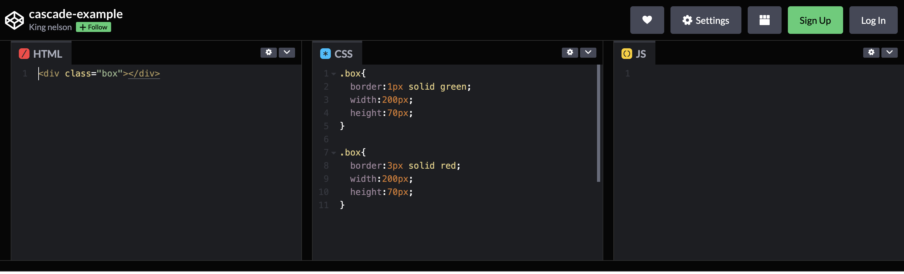
In the example above, we have two styles being declared, and they both have equal specificity, but the rule that comes last gets applied to the element. In addition, styles with a higher specificity score will always be applied to an element, regardless of its order in the stylesheet.
Specificity
When an element has multiple selectors, the browser uses specificity to determine which style rule should be applied. The style rules of a selector with a higher specific score are applied to the element.
ID selectors have a higher specific score because they select only one element in the entire markup, whereas tag name selectors are less specific. Consider the following example:
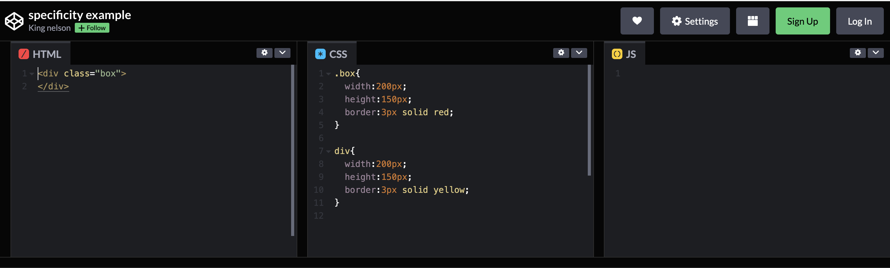
In the example, notice that even though the div selector comes last in the order, its style rules are still ignored because it has a lower specific score than the class selector.
Inheritance
Many people struggle with the concept of inheritance; we assume that everything from an element's size to its position is relative to the viewport, but this is not always the case.
Elements can inherit properties, such as color, font size, font family, cursor, and so on, from their parent elements unless those elements have their own style rules explicitly applied to them. Knowing that these characteristics can be inherited can help us avoid bugs. Here's an example:
And in our stylesheet:
Although we did not declare any style rules for the `p` element in the preceding example, it would still be styled by inheriting the style rules of the `div` element.
When you don't know why an element is behaving a certain way or why it has undefined style rules applied to it, it could be because it inherits its parent element's style properties. Here's a comprehensive list of all the properties that can be inherited.
Understanding the cascade, specificity, and inheritance concepts can help us avoid CSS bugs and save us a significant amount of time debugging. Let us now turn our attention to the parent-child relationship, where we will see the concept of inheritance in action.
Parent-child Relationship
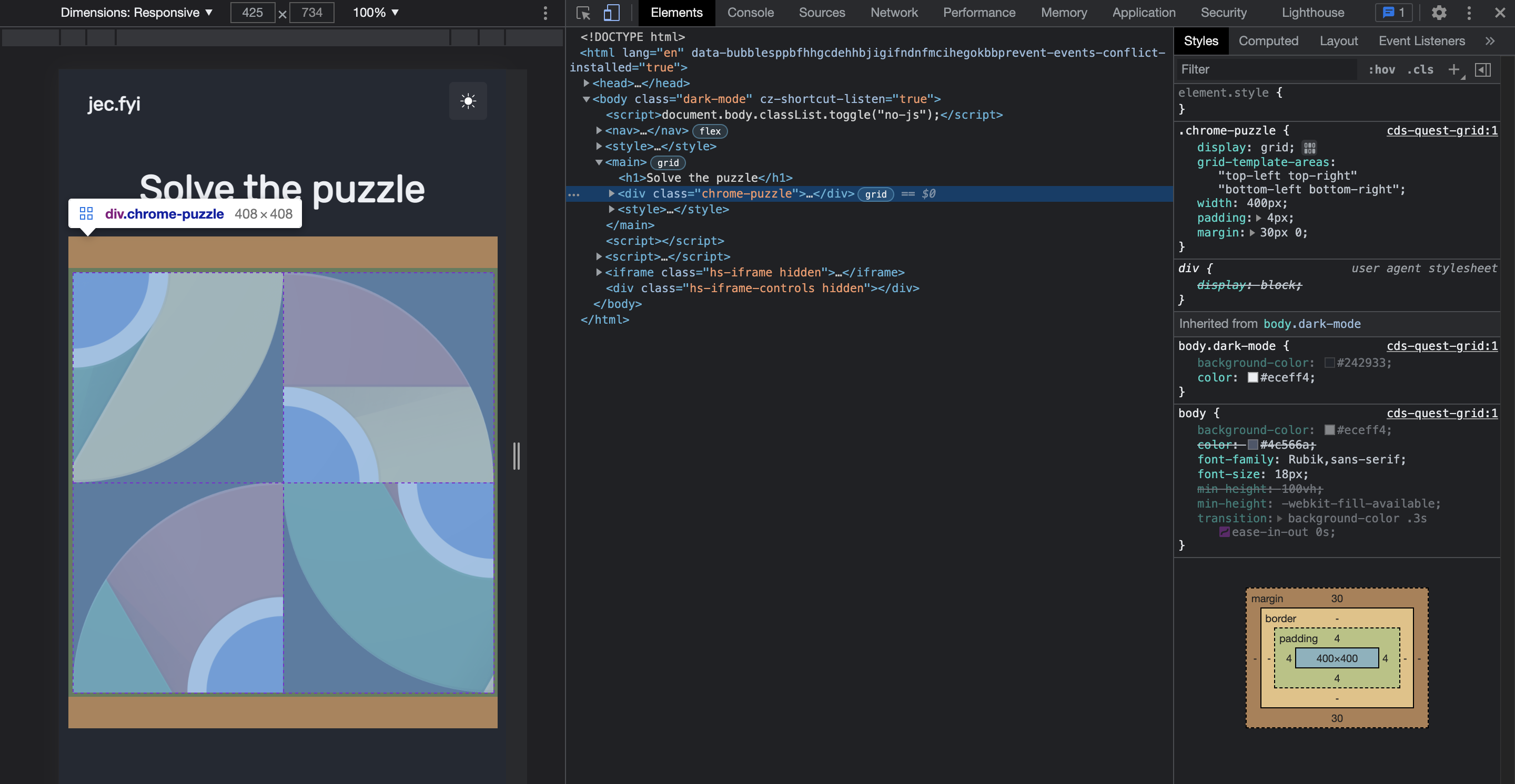
The parent-child relationship is another concept that would help you avoid CSS bugs. Properties such as width, height, or position of an element are always relative to its viewport, and the viewport is not always the browser window. Let's see the image below:
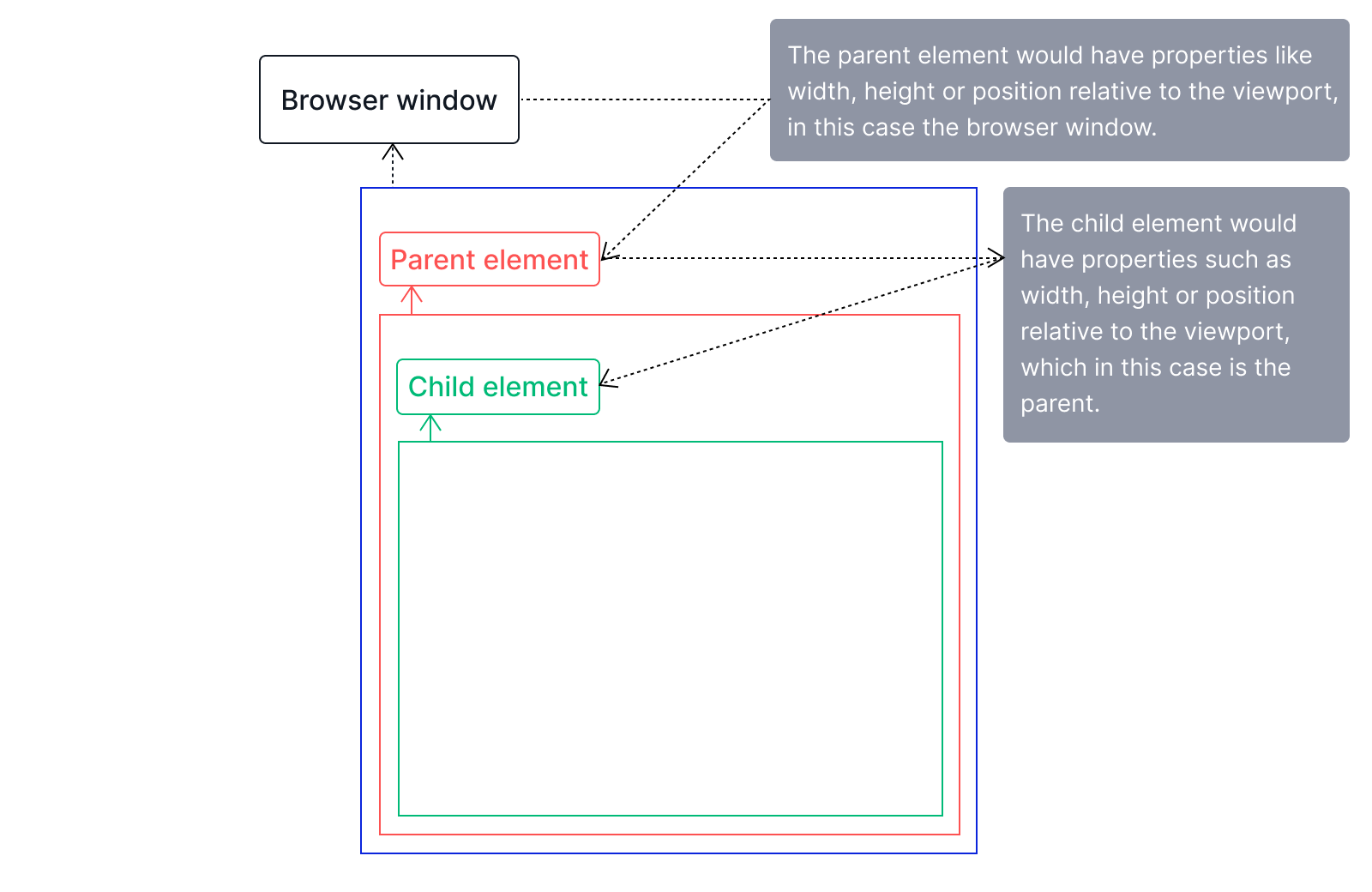
The image above depicts the concept of a parent-child relationship, which explains how the parent element can influence an element's width, length, or position. To further explain this concept, let's do some math using the relative unit percentage.
Say our browser window has a viewport width of 1600px: the body element, which is the overall parent element, will take 100% of that width, giving it a width of 1600px as well. Here’s how:
100/100 * 1600 = 1600px.
Now say we have two div elements inside of our body tag, a parent div and another nested div as the child element:
following the scenario we painted earlier, this would be our stylesheet:
Let’s go over the code, the div to which the .parent class is applied to takes a width of 80% and that translates to:
80/100 * 1600 = 1280px
which means the div to which the .parent class is applied to now has a width of 1280px. Now the div with the .child class which is a child element of the .parent div has a width of 60% and this translates to:
60/100 * 1280 = 768px
this value is in relation to its parent element which has a width of 1280px
The preceding example explains the concept of the parent-child relationship; when we get to the absolute position section, we'll see how this concept affects element position. The next thing we would look at is the position property.
Position
The position property allows us to place elements wherever we want on a webpage; it also adheres to the parent-child relationship when using relative units such as %.
There are five position property values: relative, absolute, fixed, sticky, static. In this article, we would only explain the absolute as it can be one of the leading causes of CSS bugs.
The position:absolute property removes an element from the page flow completely, implying that the document treats it as though it is floating out of the page flow without disrupting the normal page flow. While this can be extremely powerful, it can also be a debugging nightmare at times. When an element has an absolute position, it is treated as a child element of the body element, regardless of where it is in the markup. Attempting to manipulate its position would result in a change in position relative to the body element. But what if that is not what we want?
We can still have an absolutely positioned element that is relative to its original parent element while maintaining its absoluteness.
By simply giving the .parent element a position of relative, we allow our absolutely positioned .child element to be taken out of the page flow but still be positioned inside of its parent element.
Absolute vs Relative Units
CSS has two types of units: absolute and relative.
Physical units such as pixels, inches, and centimeters are examples of absolute units. These units are always the same size in relation to the viewport and are not affected by the lengths of their parent container or element. This means that a property with an absolute unit value will always be the same size regardless of screen size. So 200px on a mobile screen corresponds to 200px on a laptop screen.
On the other hand, relative units are affected by the length of another element, primarily the parent element. We saw an example of a relative unit, the percentage, in the Position section. Relative units are excellent because they ensure that the size of elements can be scaled across a range of screen sizes.
Relative units are preferable to absolute units when creating a website because they aid in responsiveness. Absolute units, such as px, do not scale across screen sizes, resulting in an overflow on the webpage and a jumbled appearance.
See here for a list of absolute and relative units.
Why the !important Rule can do more harm than good
The !important keyword ensures that a style rule is applied to an element regardless of specificity or cascade. It is a way to give style properties a higher specificity score than they naturally have. But, this is only instant gratification because it disrupts the stylesheet's natural cascade. Let's see an example that shows the implications of this keyword.
Now let’s style this p element.
Picture a scenario where you stopped working on this project for a long time but then came back to it and decided to change the font-weight and color. Let’s try that:
You define new values for the font weight and color property, but it doesn’t take effect. This is because the !important keyword has broken the natural cascade and prevented the old values from being overridden. If this were a larger codebase, then you'd be stuck trying to fix this bug that could've been prevented in the first place.
The !important keyword makes your code harder to maintain and prevents styles from being overridden. Instead of using the !important keyword, consider understanding and utilizing the cascade to your advantage.
Media-queries
Media queries allow us to define style rules for our webpage to look good on all screen sizes. They work with breakpoints that state at what point a style rule would take effect.
The above code block is an example of a media query that says when the viewport width gets to 600px or greater, the body should have a background color of black.
Generally, media queries override an already defined style rule or set new style rules on an element at a certain breakpoint. Check out this example:
In the example above, notice that we only defined new style rules for the width and height properties, but not the background-color. That means the div background-color would still be blue. With this effect we see the concepts of inheritance and cascade working together.
When a style rule is not defined in a media query it still holds its original style rule, sometimes we’re stuck wondering why an element is behaving the way it is. That’s because in some cases it is inheriting a predefined style rule. A perfect example would be centering an element using position and transform properties.
Now say we no longer want to center this element and we just want to move it to the left a little bit, at a certain breakpoint.
If you run the example above you’d notice that it wouldn’t work, that’s because we have a transform property blocking that rule from applying. In some cases, we need to reset properties to get them to work.
How do we fix the above problem? We can simply set the transform property to 0. transform: translate(0). Now we can move the element as we want.
Understanding how inheritance and cascade work in relation to media queries can save us from running into many responsiveness issues. Additionally, remember that some existing style rules must be reset when using media queries before new ones can be defined.
Debugging Environment (Chrome dev tools)
The Chrome browser gives you a wide array of tools to add to our debug toolbox. The Chrome dev tools allow us to debug anything from elements style properties to fixing layout properties such as grid or flex.
Debugging properties
There are cases where we do not understand why a style rule does not apply or is not working. The Chrome dev tools give us an excellent way to see what's working under the hood.
By right-clicking on an element you want to debug and clicking on Inspect element, you get access to the styles of that element. Everything from its style properties to its media query styles to its box model.
When an element has unapplied styles, you can quickly check to see why. On the styles tab, this is depicted by an overrule on the style property.
Debugging layouts
The Chrome dev tools also give us an easy way to debug layout issues. Here’s an article that shows how to debug grid layouts. In addition, here's a great article from MDN docs that shows how to use the flex debugger on the Chrome dev tools.
Tips and Tricks
A strategy to use when dealing with layout issues is giving the elements an outline with:
This way, you can tell if elements placed inside that container are where you want them to be. You can take this a step further by simply giving all elements on the webpage an outline:
This way, all elements on the page would have an outline. But it might not be very clear if all elements on the page have an outline of red. So how do you make sure elements have different colors? Here's how:
Using your right mouse click, click anywhere on the page you're working on, and select inspect element to bring up the chrome dev tools. Enter the code above in the console window after clicking the "Console" tab. If you do this, each element on the page will have its own distinct outline color, making it easier to identify any problems with your layout.
Conclusion
CSS can be tricky, and figuring out what to do and what to look for when you have bugs can be extremely difficult. We covered some fundamental CSS concepts and tips and tricks in this article to help you face any bug head-on.
Useful links
Data-rich bug reports loved by everyone
Get visual proof, steps to reproduce and technical logs with one click


Continue reading


Put your knowledge to practice
Try Bird on your next bug - you’ll love it
“Game changer”
Julie, Head of QA


Overall rating: 4.7/5
Try Bird later, from your desktop